

4 Stages of App Addiction (They're Designed on Purpose!)
Curious → Hooked → Deep → Gone. This week, 7 crypto apps mapped out exactly how design pulls someone down the rabbit hole.

Check out the newest Youtube Video
Handhelders,
This week was different. I didn’t plan it, but the seven designs I picked tell one story — the exact journey someone goes on when they fall down the crypto rabbit hole. From “it’s just an app” to... well, you’ll see.
The average app loses 77% of its users within the first three days. But some crypto apps? 52% still active after ninety days. That’s not luck. That’s design doing something very specific at each stage. And I think these seven designers accidentally mapped the blueprint.
Seven crypto apps. Seven different designers. Four stages. Let’s go.
Stage 1: The Sign-Up
“It’s just an app. I’m just looking.”
Apps that get users to do something meaningful in the first few minutes see double the long-term retention. A few minutes — that’s the window. And these two designers understood the assignment.
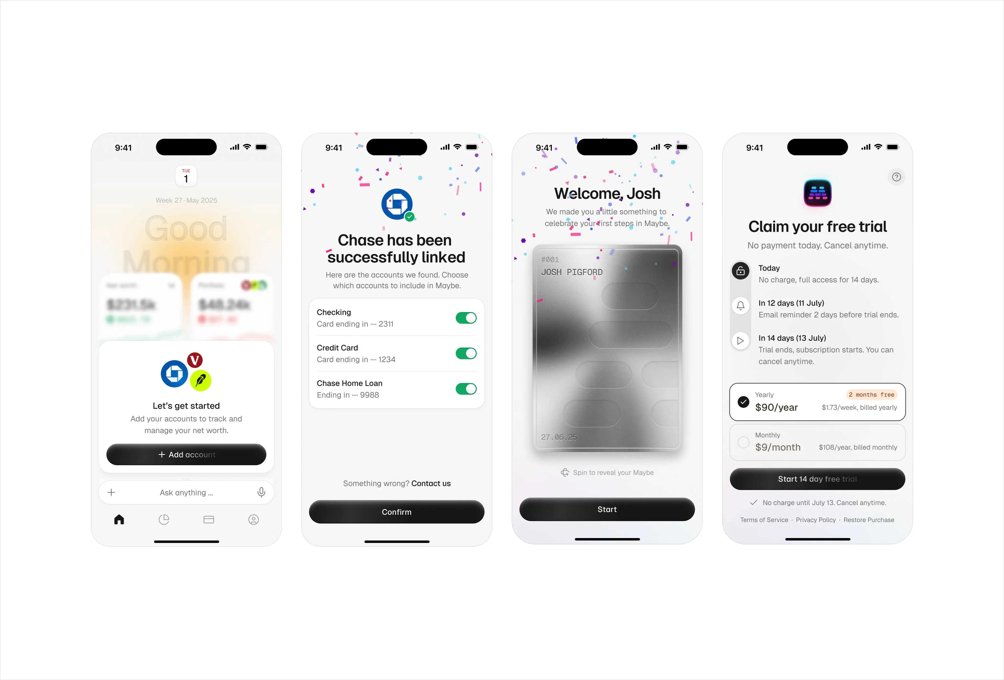
Justin is designing for Maybe, a finance tool moving into new territory. Most finance apps treat onboarding like a passport check — fill in the form, agree to terms, see you inside. Justin flips that. There’s a silver welcome card with confetti, a profile card that makes you feel like you’ve already accomplished something just by showing up. Positive emotional reinforcement in the first thirty seconds directly impacts whether someone comes back. And those little moments — the confetti, the card flourishes — they’re doing real work.
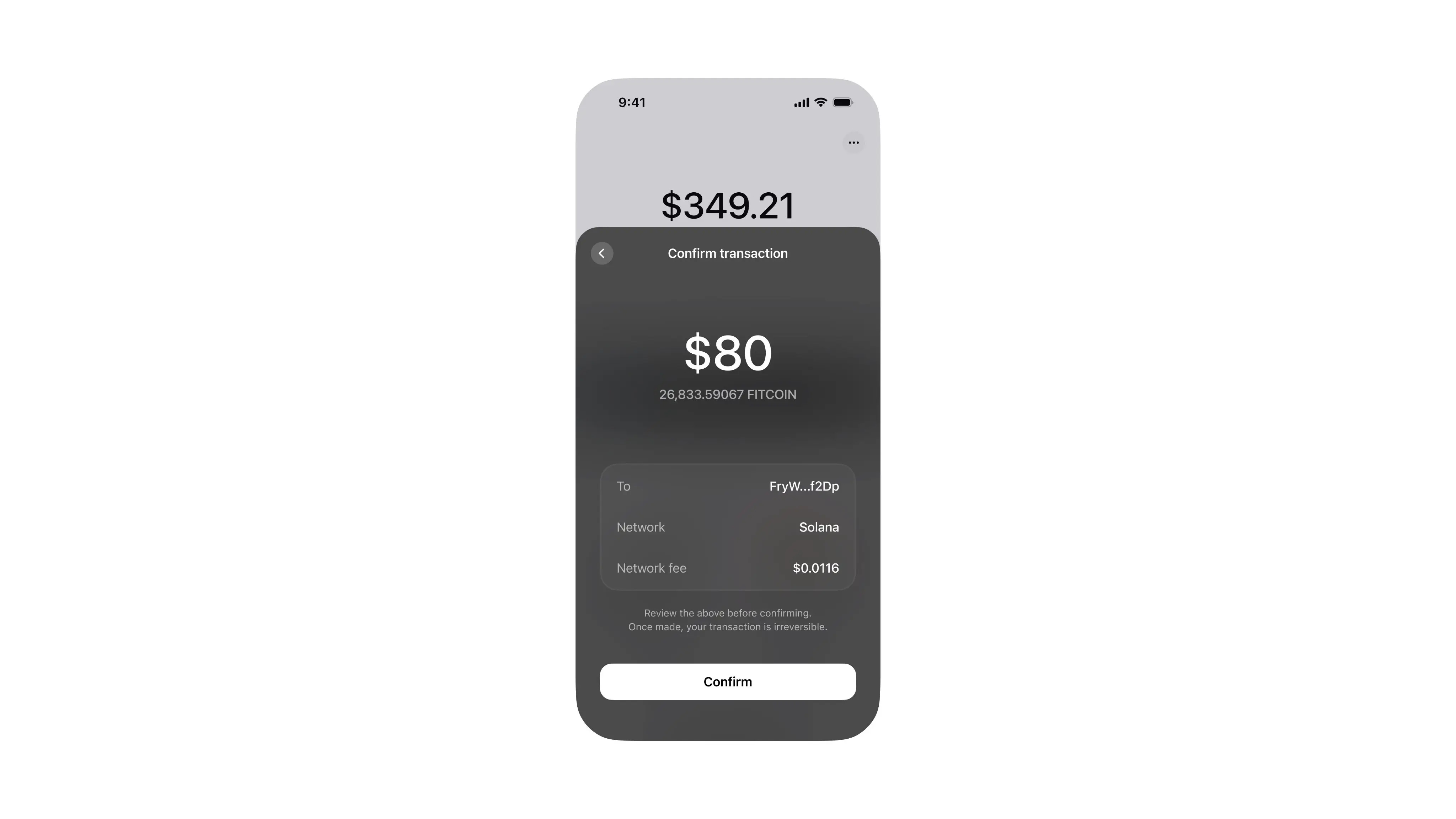
Then Henor handles your first actual transaction. A confirmation screen — and I love how unremarkable it looks. When you’re about to send crypto for the first time, you’re probably nervous. So what do you actually need? The amount, the coin, who it’s going to, the fee. That’s it. The transaction goes through. It was easy. It wasn’t scary. And now you’re thinking... maybe I’ll try another one.
The lesson: Retention doesn’t start with the product. It starts with how signing up feels. You don’t sell people on the deep end — you just make the shallow end look really inviting.
Stage 2: The Hook
“I’m not addicted. I just like to keep an eye on things.”
There’s a difference between someone who has a crypto app and someone who checks a crypto app. That shift usually happens on the home screen.
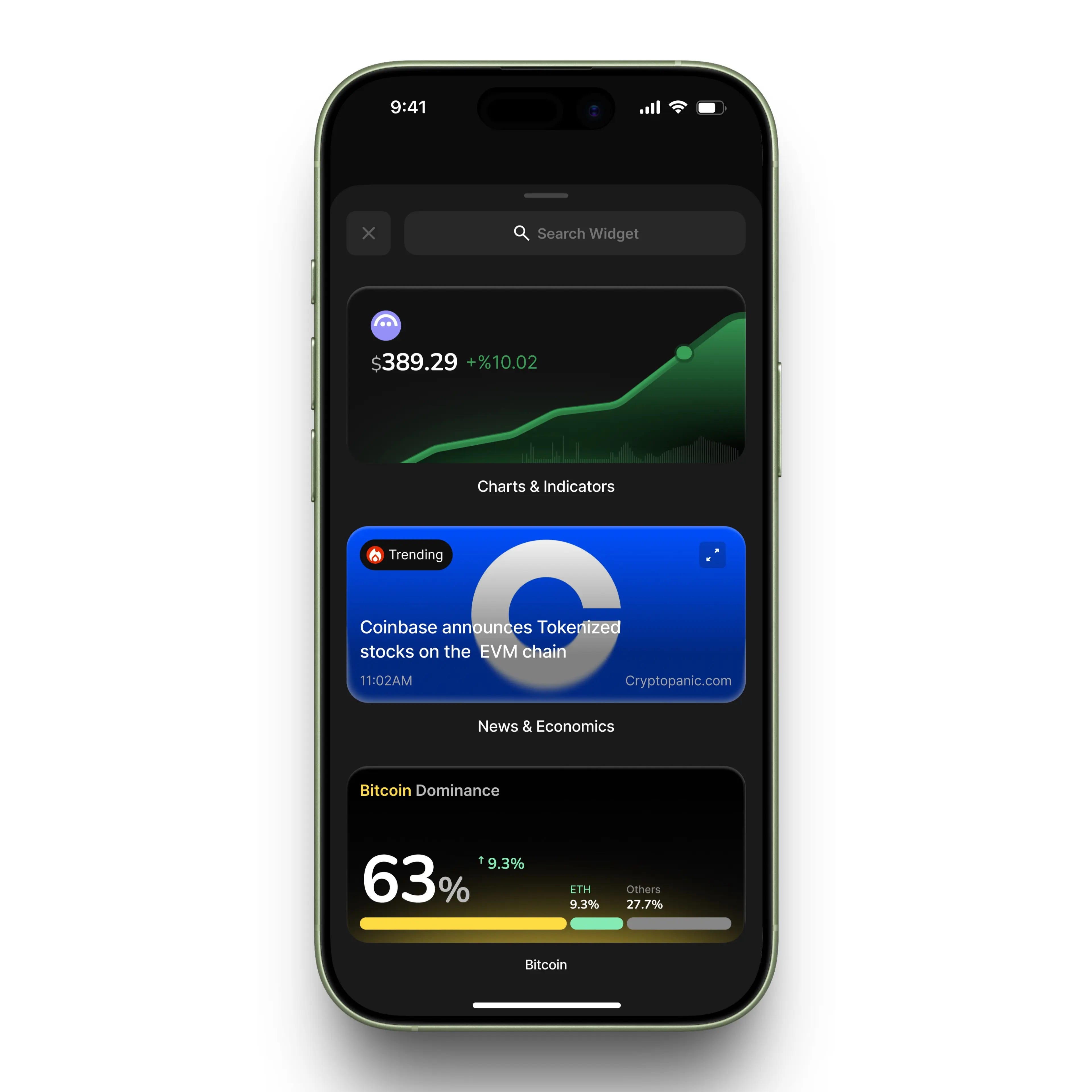
Kati designed something most designers completely overlook — widgets. When Apple introduced home screen widgets with iOS 14, it fundamentally changed how people interact with apps. If your app doesn’t make it to someone’s home screen, you’re basically relying on them to remember you exist. Kati built standalone widget experiences — an ARV graph, a news widget, a bitcoin tracker. Three different reasons to glance at your phone and think “oh, let me just check that.” These widgets don’t ask you to open the app. They just sit there, updating, catching your eye. You went from downloading an app to having live crypto data on your home screen, and you barely noticed the transition.
Bartek gets you staring. Three colours — black, white, and green. The green only shows up on the graph. By this stage, you’re not looking for excitement. You’re looking for control. And Bartek strips everything back to exactly that. A clean, calm tracker doesn’t feel like an addiction. It feels like being responsible. Which is exactly what you tell yourself before you realise you’ve checked it nine times today.
The lesson: The best retention tool isn’t inside your app — it’s on the home screen. If your product can exist outside itself in a widget, a notification, a glanceable moment, you’re not competing for attention anymore. You’re just part of someone’s day.
Stage 3: Going Deeper
“The money’s just sitting there. Might as well make it work.”
Up until now, you’ve been watching. Checking. Glancing at widgets. Stage 3 is when you stop watching and start doing. Gamified crypto platforms see around 73% more daily active users. Design isn’t just making things pretty here — it’s making action feel inevitable.
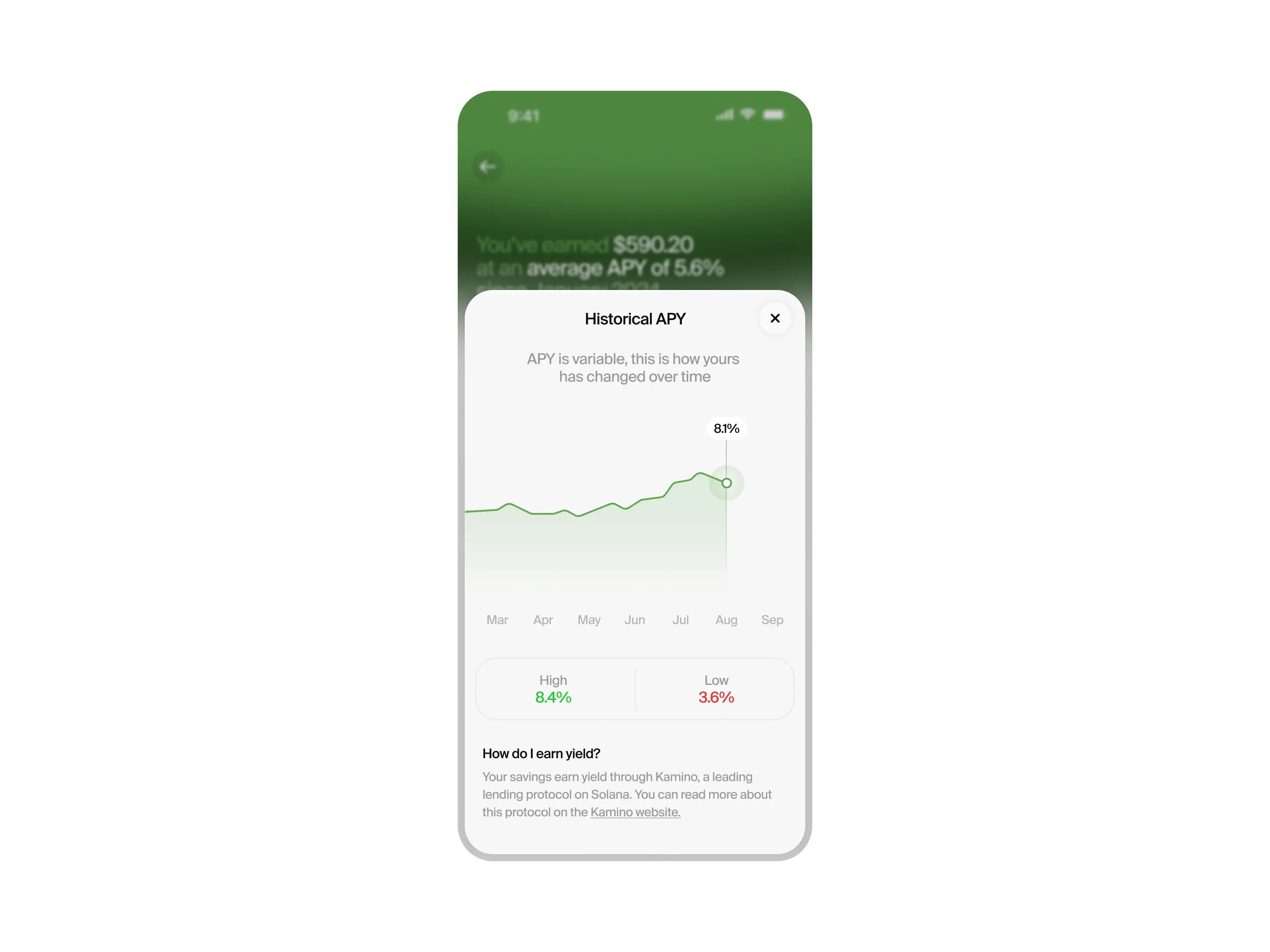
Josh Grazier makes you watch your money grow. The APY graph, the current rate, the monthly earnings — it’s laid out in this gradual hierarchy that feeds you information in the exact order you want it. Each piece leads to the next question, which leads to the next answer. You’re not just holding crypto anymore. You’re earning from it. And Josh makes that feel satisfying rather than stressful — which is probably why you start checking the APY chart at midnight.
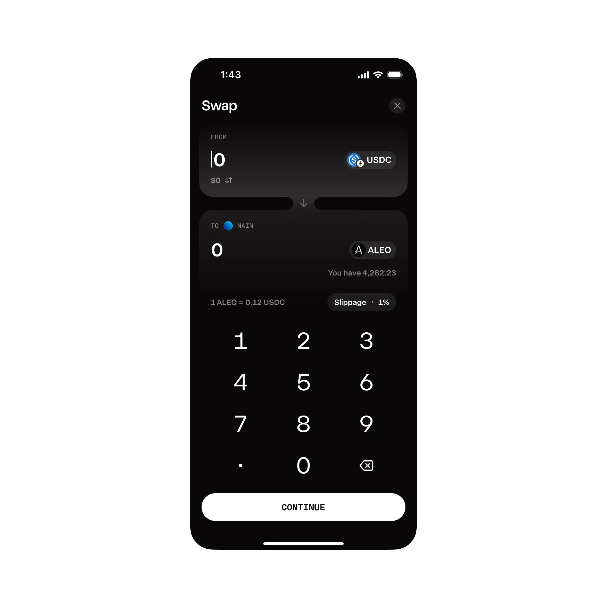
Alexander gives you the tool to act on that confidence. The connection between the “from” and “to” cards is the best execution of this swap pattern I’ve seen in any finance app — the gradient lightens as it connects to the “from” card, darkens as it flows into the “to” card, like value flowing from one place to another. Token swaps involve routing, gas fees, slippage — all invisible here. Just two cards, a gradient, and a button. It removes every reason to hesitate.
The lesson: Subtle design doesn’t just make things easier to use — it makes action feel inevitable. Josh and Alexander didn’t add features. They removed friction. And when doing something is easier than not doing it, people do it.
Stage 4: The Final Form
“This isn’t just an investment. This is who I am now.”
When crypto platforms introduce community features, NFT ownership, and competitive elements, 52% of users are still active after ninety days. Because at this stage, it’s not about money anymore. It’s about identity.
Vlad treats crypto as an identity, not a financial tool. The gradient rounded font that literally glows. The sunburst rainbow background. Crypto coins with hats flying through the air. You’re not an investor here — you’re a “crypto king.” You’re competing in challenges, collecting rewards. Your net worth isn’t a number, it’s your rank in the game. Every single element commits fully. Nothing is restrained. Nothing is pretending to be a sensible financial tool. It’s fun, it’s loud, it’s unapologetically itself.
The lesson: The deepest level of retention isn’t utility — it’s identity. When using a product stops being something you do and starts being something you are, that’s when people stay for ninety days and beyond.
The Takeaway
A 5% improvement in user retention can boost profits by 25 to 95%. And you don’t get there with features — you get there with how the design makes someone feel at each stage.
Justin makes signing up feel like a celebration. Henor makes the first move feel safe. Kati puts your data on the home screen. Bartek makes tracking feel responsible. Josh makes growth feel satisfying. Alexander makes action feel effortless. And Vlad makes it all feel like who you are.
Whether you’re building a crypto app, a productivity tool, or a recipe app — the question isn’t “what features do we need?” It’s “how should this feel at each stage?”
Congrats to Vlad, Kati, and Alexander on the podium this week.
That’s a wrap!
If you’re building mobile apps and any of this helped, share it with someone who ships. Follow the daily inspiration on X here, subscribe for the next drop, and tell me what you stole this week.
Want to be featured? Post great work and tag @handhelddesign, or submit directly here.
See you in the next issue.
Handheld is curated by me, Cam, a Product Designer specializing in mobile design. Follow me if you love mobile design as much as I do.
You give us more and more value each week. I’m loving this! Excited for next weeks 🤩🔥🔥
I really like how you break this 4 steps down with meaningful examples. Thanks for sharing.