Design Picks #019
This week Tom things teaches us how to add nostalgia to social and Dmitri brings back the gradient.
Handhelders,
I’m coming to you with the best mobile design work out there this week to help you with your current project. Let me know what you steal.
The Updates
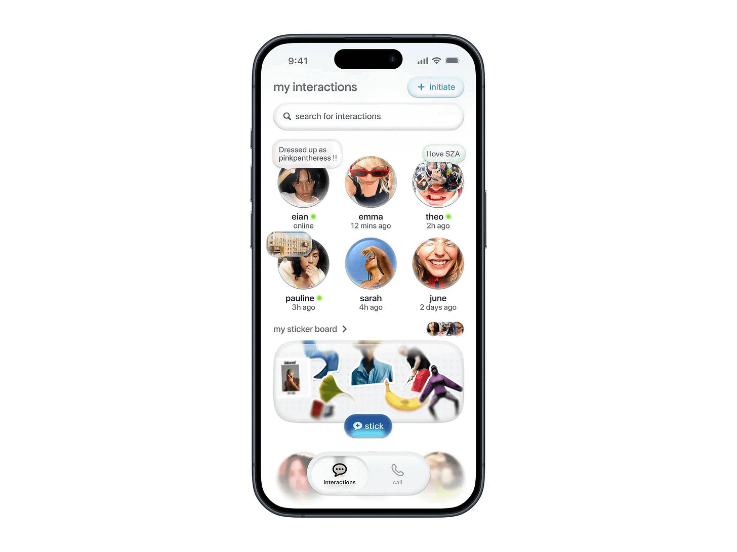
Interactive social hub by tom things
Tom Things is becoming one of my favourite designers for his nostalgic spin on modern mobile apps. The glassy, fisheye bubble effect across the elements adds a playful energy that social networks should try to incorporate.
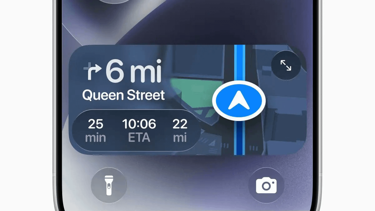
Real-time navigation snapshot by Elsie
Live activities feel like an under-served niche. They’re great opportunities to showcase the most useful actions in your app, and this is a strong example. I’ve got everything I need to navigate to Queen Street — thanks, Elsie!
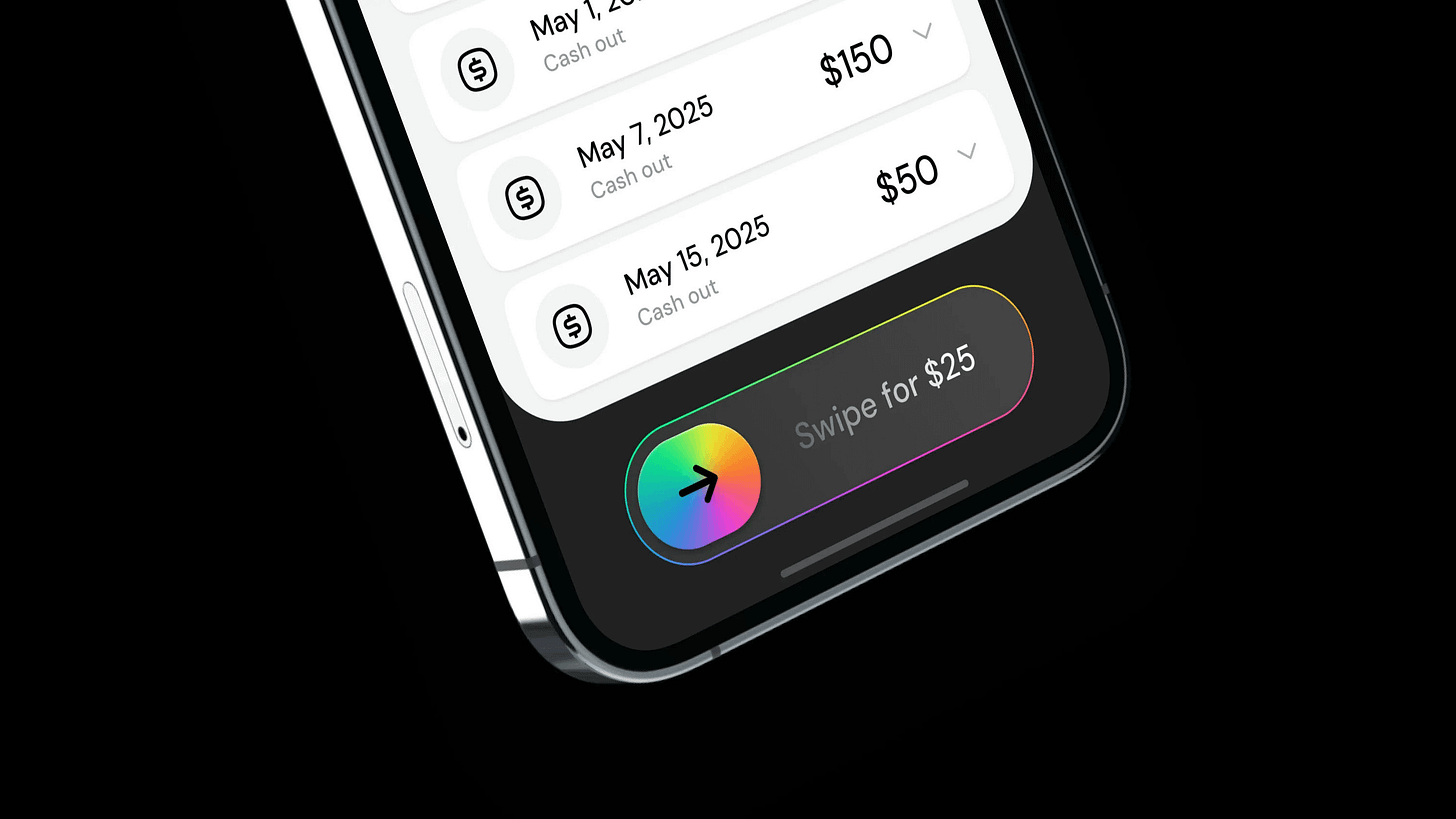
Cashout swipe interface by Dmitri Litvinov
I’ve been quietly thinking about bringing back gradient buttons, and Dmitri clearly read my mind. Financial apps don’t need to be stale. Our money is our life — let’s make it more enjoyable to interact with.
Health tracking dashboard by Batuhan
Batuhan really knows data visualisation. This is such an interesting take on showcasing fitness progress and results. The weight card is my favourite — the digital scale immerses me in the experience.
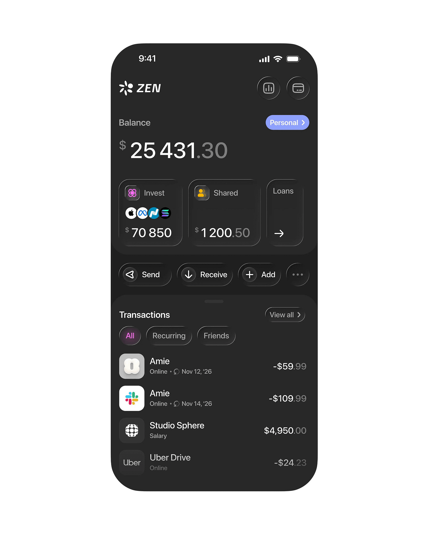
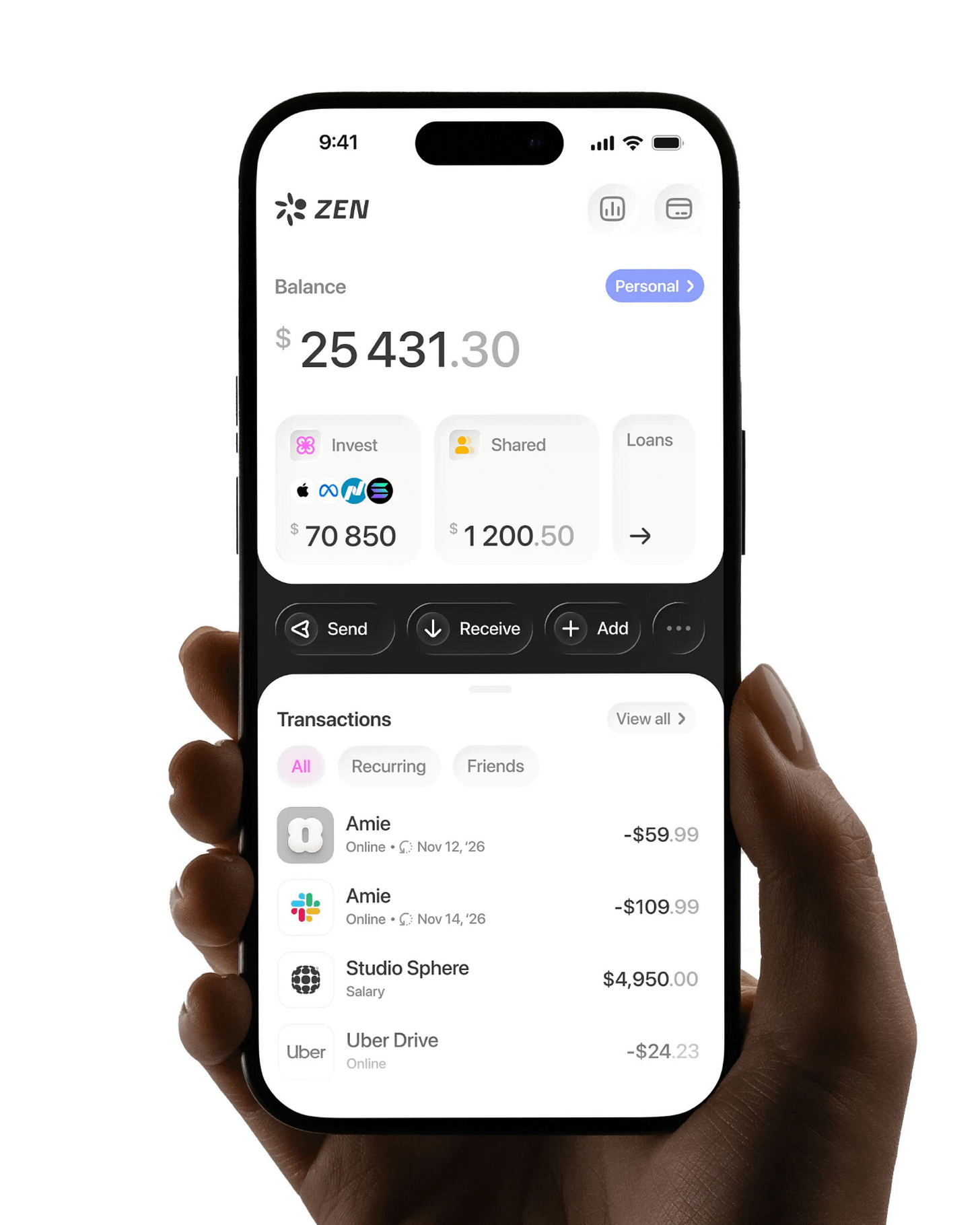
Zen finance dashboard by Studio Sphere
Funny enough, there’s an Amie subscription in this design. The split‑view interaction Studio Sphere uses was popularised by Amie’s mobile productivity app in recent years. It’s a great pattern for related information, cleanly separated by the actions used to interact with it. I love this take for finance from Sphere!
Zen finance dashboard by Studio Sphere
Because I’m a huge fan of light mode, I had to include this version too. No notes!
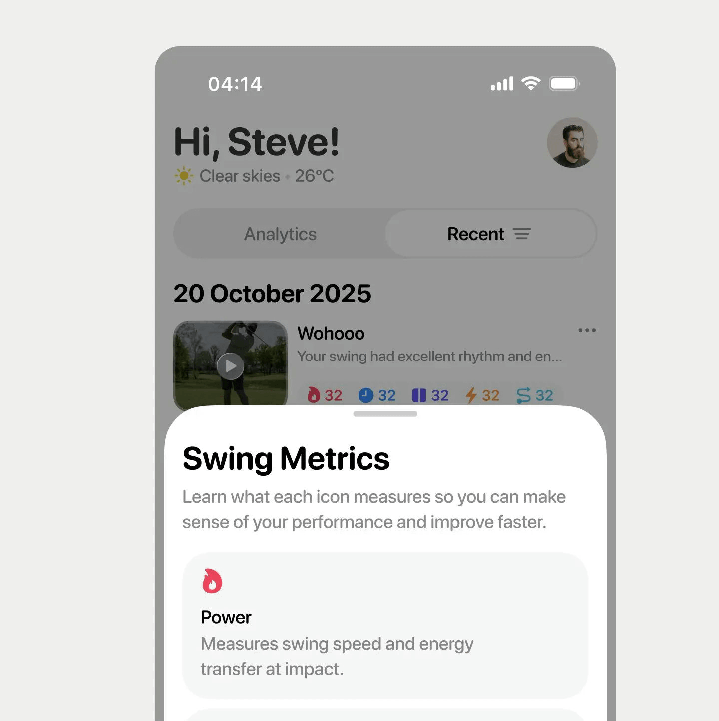
Golf swing insights by Steve Lauda
One thing that doesn’t get enough attention in mobile design is how to use icons well. Icons are a powerful tool for conveying lots of information in a small amount of space, and Steve understands this to the highest degree. Check out the “Wohooo” card behind the sheet to see what I mean.
That’s a wrap!
If you’re building mobile apps and any of this helped, share it with someone who ships. Follow the daily inspiration on X here, subscribe for the next drop, and tell me what you stole this week. I’ll feature the best.
See you in the next issue.
Are you a mobile design expert or know a design that should be shown off? It’s super easy to get featured on Handheld too. Fill out the form here → Get Featured!
Never miss an update by following us @Handhelddesign on X and subscribing to receive every new post - directly to your inbox.
Handheld is curated by me, Cam, a Product Designer specialising in mobile design. Follow me if you love mobile design as much as I do.


