Design Picks #020
This week Nachi crafts interfaces that balance minimalism with warmth, and Batuhan masters the art of health data visualization.
Handhelders,
This is the last issue of the year. Thank you for being here! Can’t wait to see you all in 2026. Big things are coming for Handheld and to help you ship your mobile design projects. Happy New Year!
And for the last time in 2025 — I’m coming to you with the best mobile design work out there this week to help you with your current project. Let me know what you steal.
The Updates
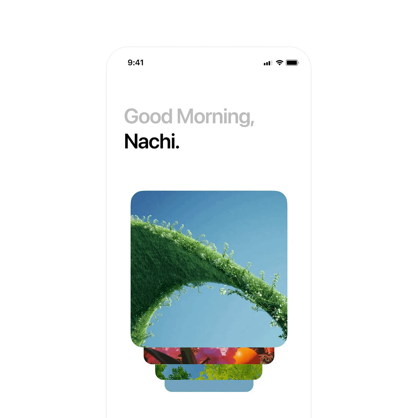
Morning visual greeting by Nachi
Nachi proves that minimalism doesn't mean cold. The magic is in the restraint — just two elements (text and card) create the entire experience. Steal this approach when you need to set a mood without overwhelming users with UI chrome.
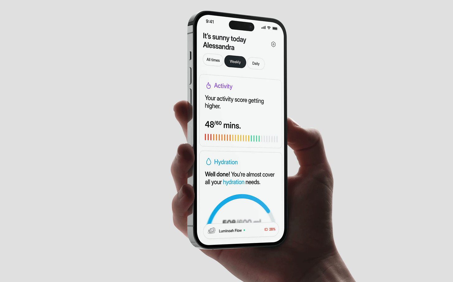
Fitness tracker dashboard by Batuhan
Batuhan's fitness dashboard shows that clean doesn't have to be boring. What's brilliant here is the use of color. Vibrant accents guide the eye to key metrics while maintaining that clean white base. This is textbook information architecture. Batuhan knows ball.
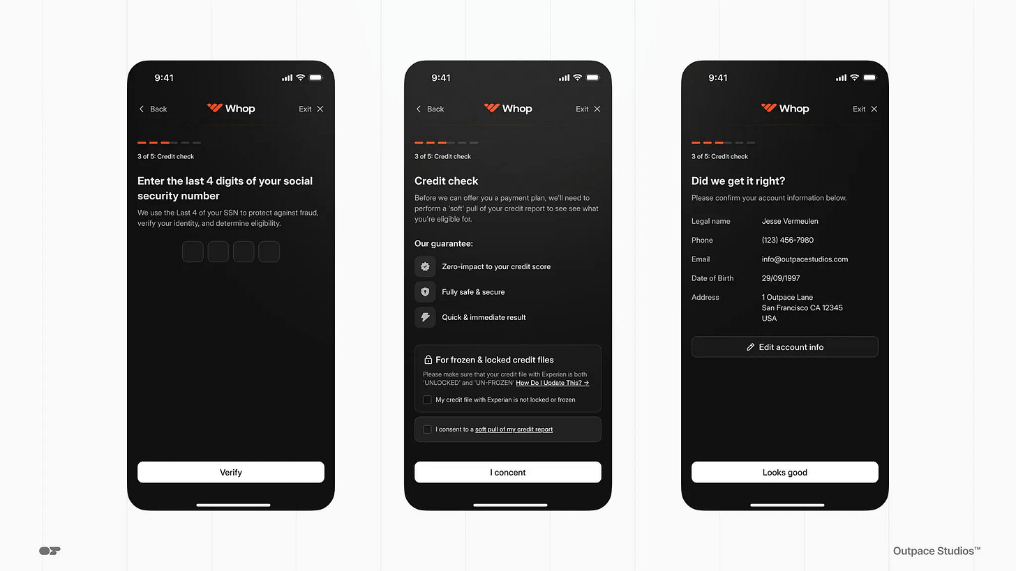
Credit verification flow by Outpace Studios
In finance, every interaction needs to feel secure, and the professional aesthetic communicates exactly that. This is how you build trust through design: simplify the experience by removing anything that feels uncertain. Steal this for any flow where users need to feel confident about data security.
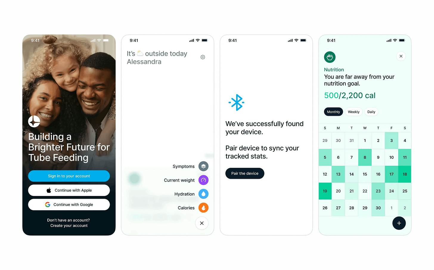
Connected health suite by Batuhan
Batuhan returns making device pairing feel friendly rather than technical. The spacious layout prevents the interface from feeling clinical. This is empathetic design: acknowledge that health tracking can feel overwhelming, then build an interface that makes it feel approachable. Love it, Batuhan.
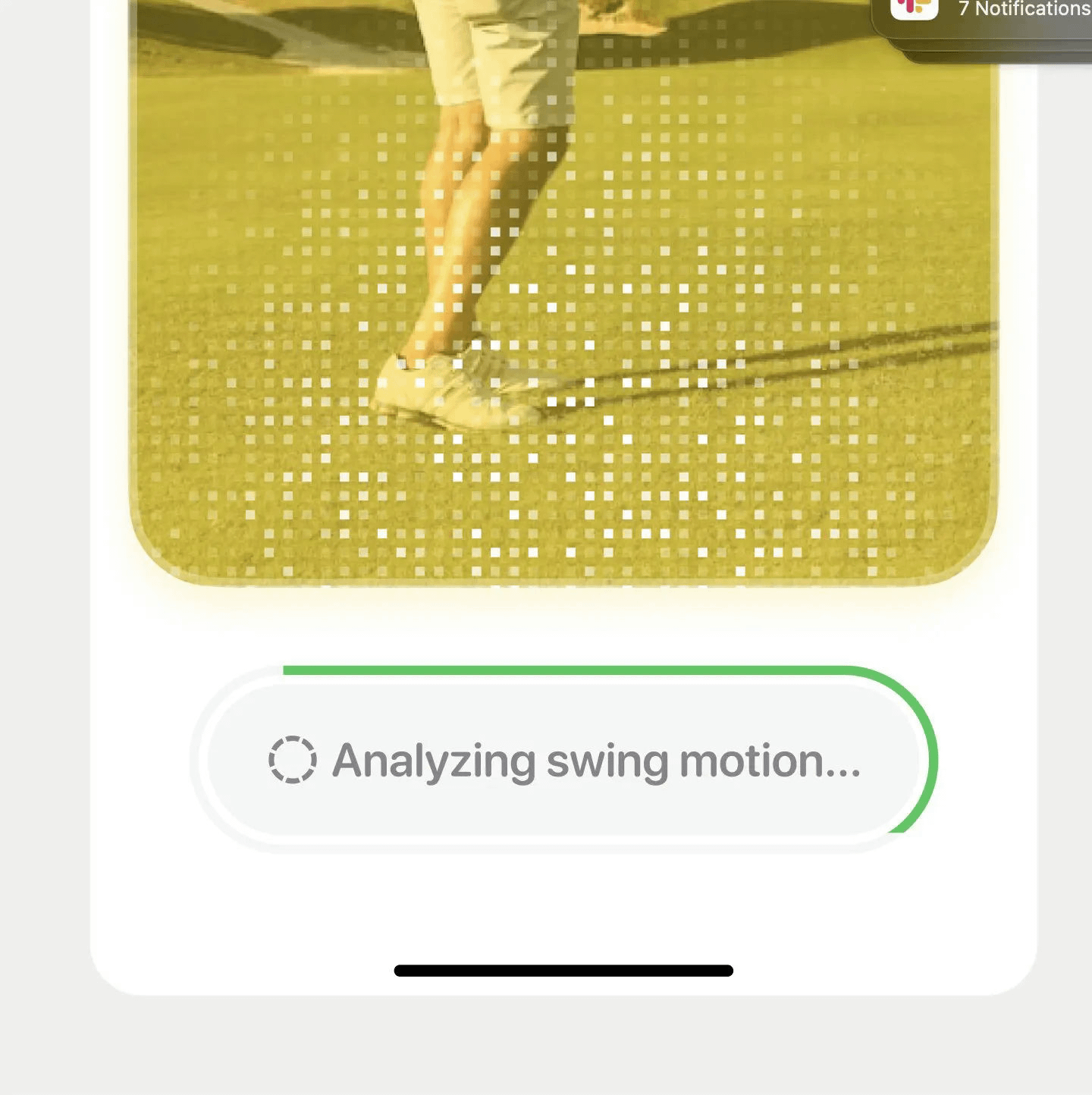
Golf swing analyzer by Steve Lauda
One thing we tend to miss when we design in screens and not in experiences is how we get from point A to B. Steve clearly didn’t miss that memo. I can only imagine how great this partnership between the flickering dots and loading stroke on the button make for a great loading state.
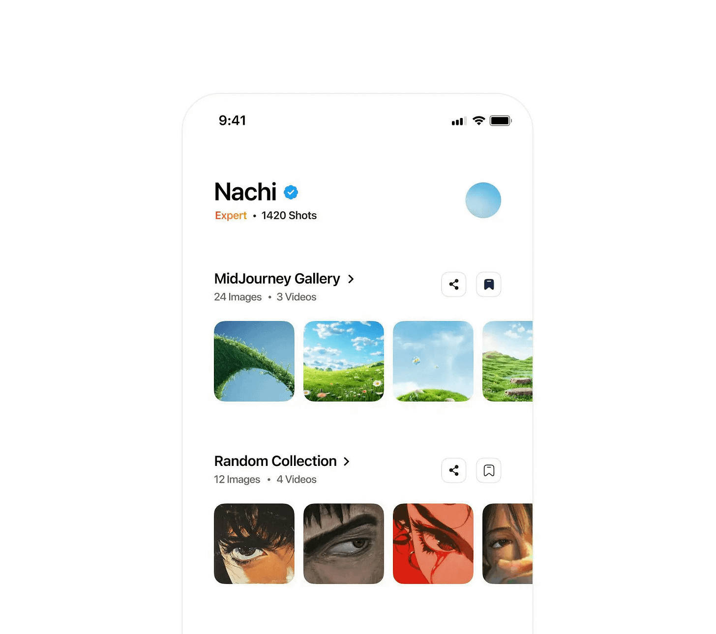
Artistic gallery browser by Nachi
UGC content is always hard to deal with in app design but Nachi knows what they’re doing. The ample whitespace really allows the content to breathe. Steal this for any content-focused app: let your content be the hero, make your UI invisible.
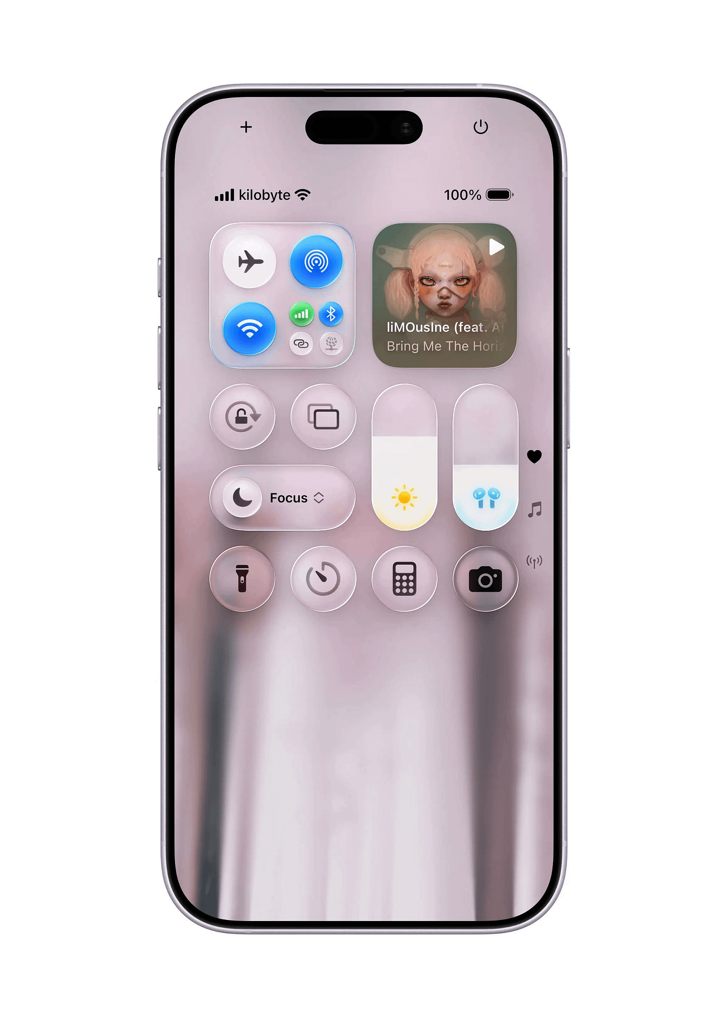
Custom control center by Kilobyte
I know this isn’t an app design but the visuals are so striking, I could never leave it out of Design Picks. If you’re not familiar with neumorphism, in short, it’s the art of blending minimalism with realism. Kilobyte takes a bit further with the addition of some liquid glass elements and great color highlights. There’s a lot to say here but I have to keep it short.
That’s a wrap!
If you’re building mobile apps and any of this helped, share it with someone who ships. Follow the daily inspiration on X here, subscribe for the next drop, and tell me what you stole this week. I’ll feature the best.
See you in the next issue.
Are you a mobile design expert or know a design that should be shown off? It’s super easy to get featured on Handheld too. Fill out the form here → Get Featured!
Never miss an update by following us @Handhelddesign on X and subscribing to receive every new post - directly to your inbox.
Handheld is curated by me, Cam, a Product Designer specialising in mobile design. Follow me if you love mobile design as much as I do.


I’ve loved all your issues this year. Ready for 2026!!!💪🏾🔥🔥