Design Picks #015
This week Dominik teaches us how to add depth to UI and Henor shows us their skincare routine.
Handhelders,
I’m coming to you with the best mobile design work out there this week to help you with your current project. Let me know what you steal.
If you haven’t already, check out the Resources tab where we’ll be dropping Figma files, code, prototypes and everything in between to help you design and ship faster.
The Updates
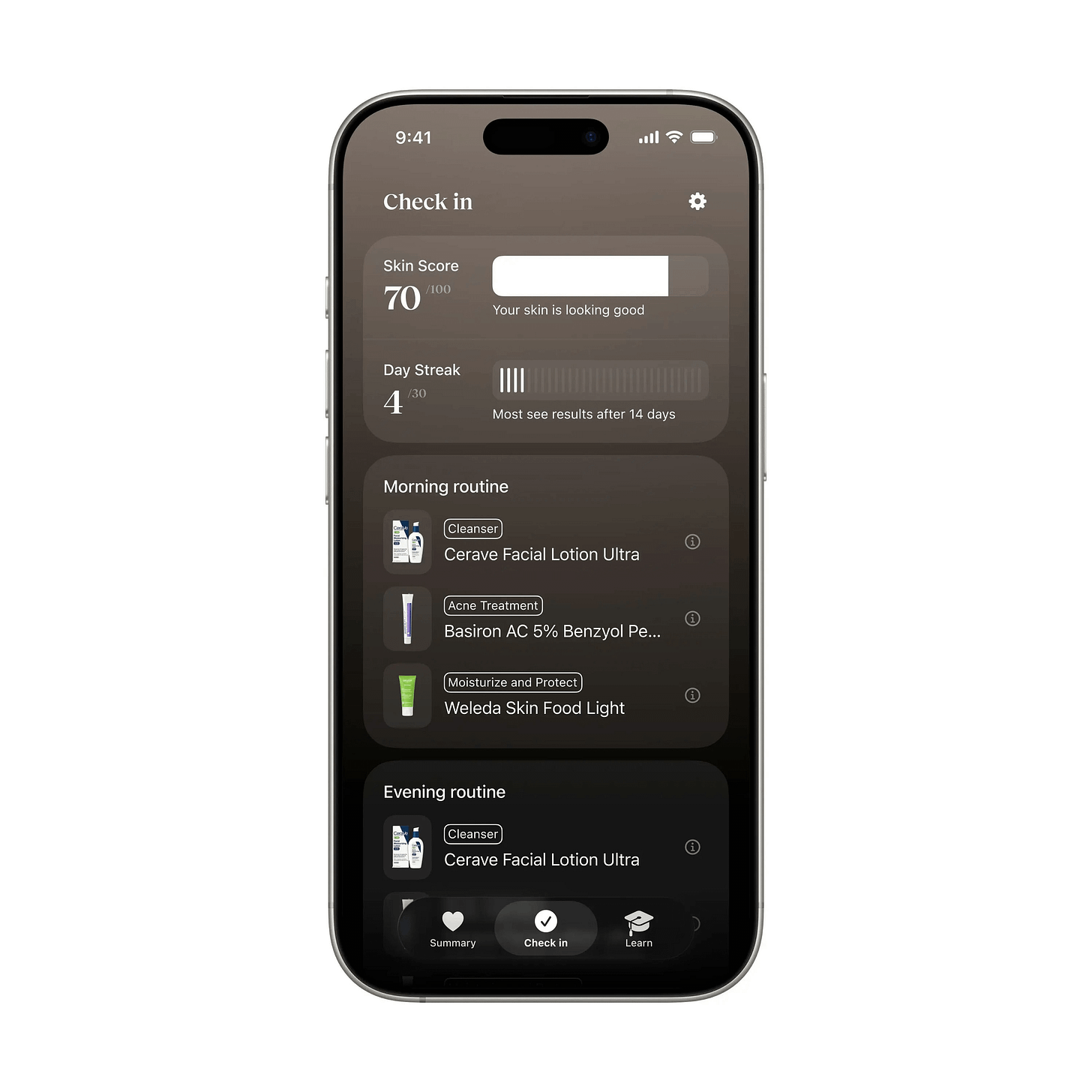
Skincare routine tracker by Henor Kelmendi
I love how the morning/evening stacks read like a checklist you actually want to finish — the helpers in letting you know what each product is *actually* for is a great touch. As someone that needs to take more care with my skin, when is this dropping, Henor?
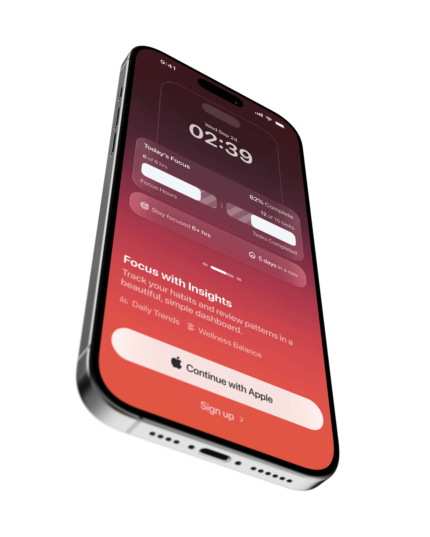
Focus time tracker by Studio Sphere
This focus tracker nails the psychology around getting things done: show me I’m at 6/8 hours and 82% — and I’ll make sure to sprint the last mile. Studio Sphere with another banger.
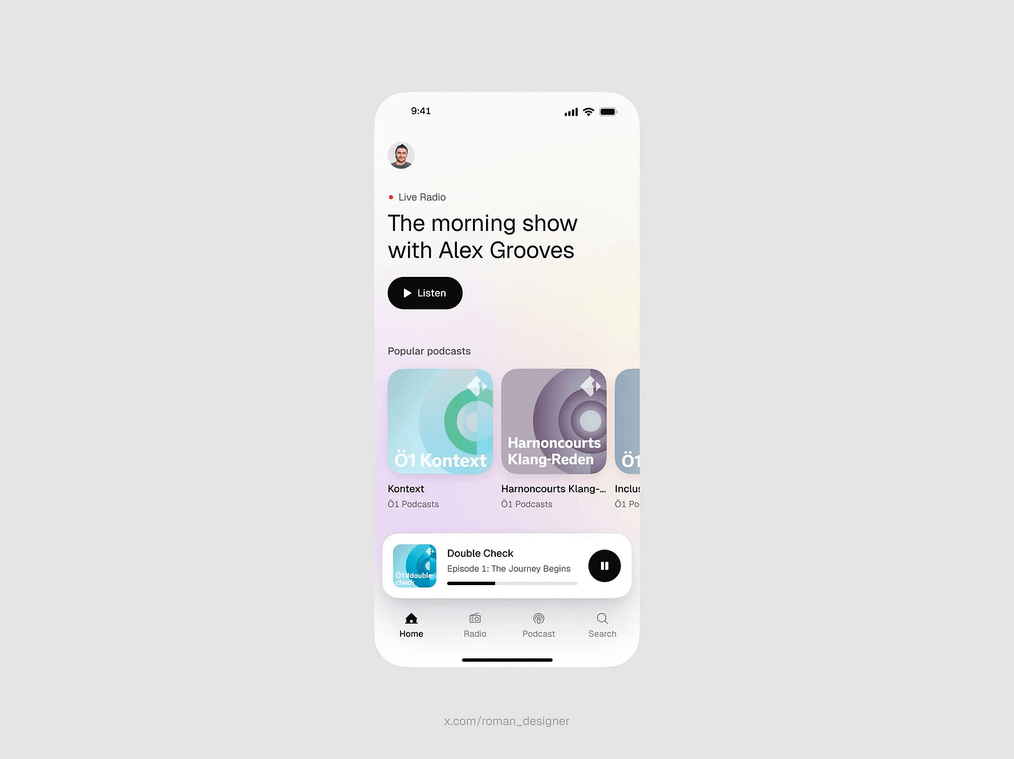
Podcast discovery portal by Roman Vasylovskyi
Roman deliberately uses colour and hierarchy that matches what the morning brain needs — soft pastels and a single bold “Listen” button. It’s a reminder to tint the UI to the user’s mindset so the first tap feels frictionless.
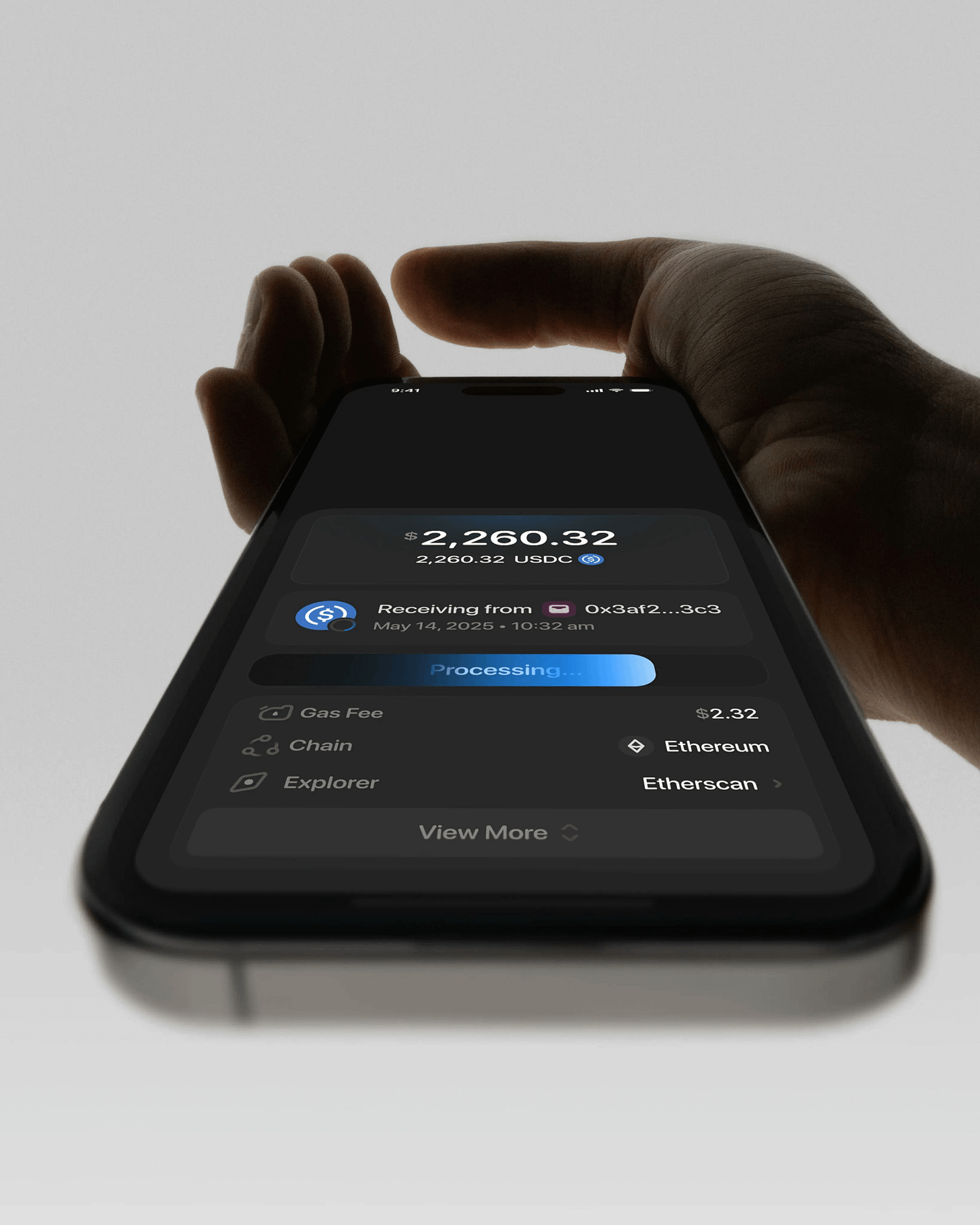
Cryptocurrency transfer interface by Studio Sphere
No fluff, just the essentials — balance, status, gas, chain and explorer. This crypto flow respects the user’s memory by stripping everything but what matters at the moment of action.
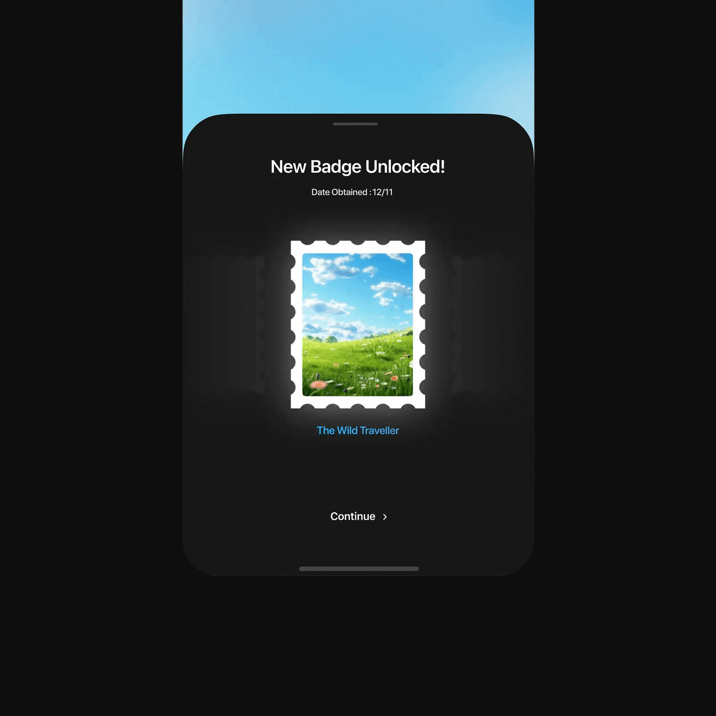
Badge unlock modal by Nachi
The badge modal lands like a mini celebration — tight copy, playful stamp art, and a single “Continue” that keeps momentum intact. Make the win feel real and get out of the user’s way so the habit sticks.
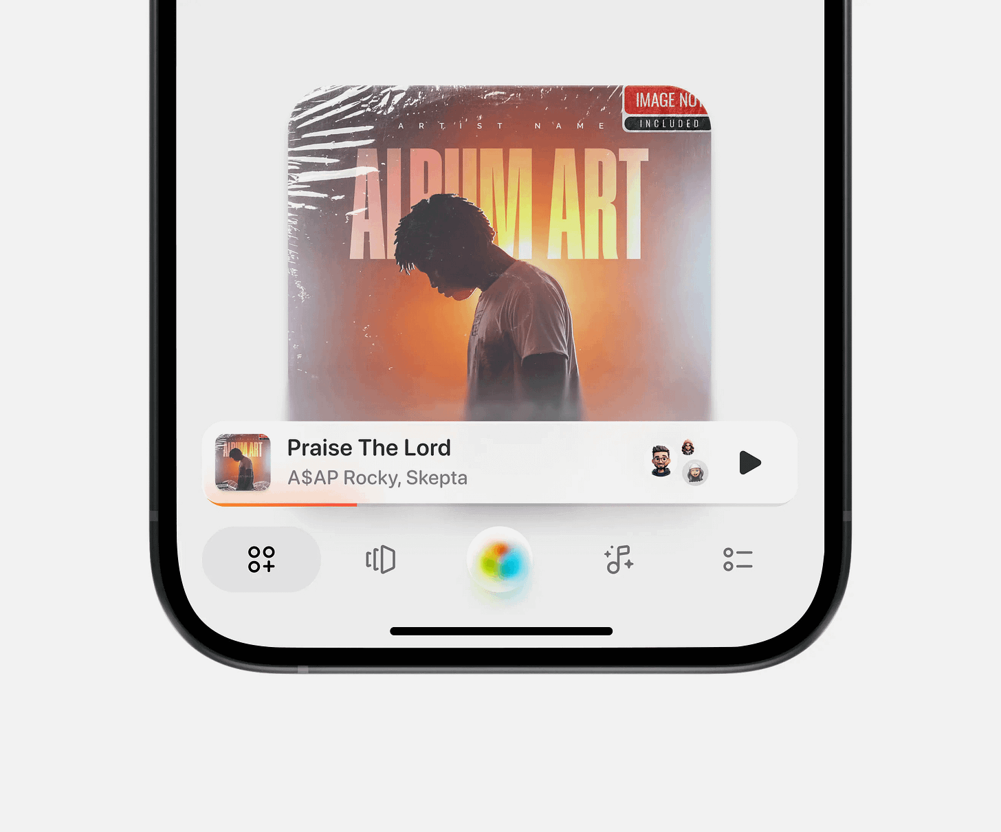
Music control interface by Dominik Tyka
Dominik’s use of depth throughout this screen is pure eye‑candy. The album art, a floating player, and that cheeky gradient nav button all feel tactile without tipping into clutter. It’s the right kind of illusion that spotlights content every mobile designer should steal.
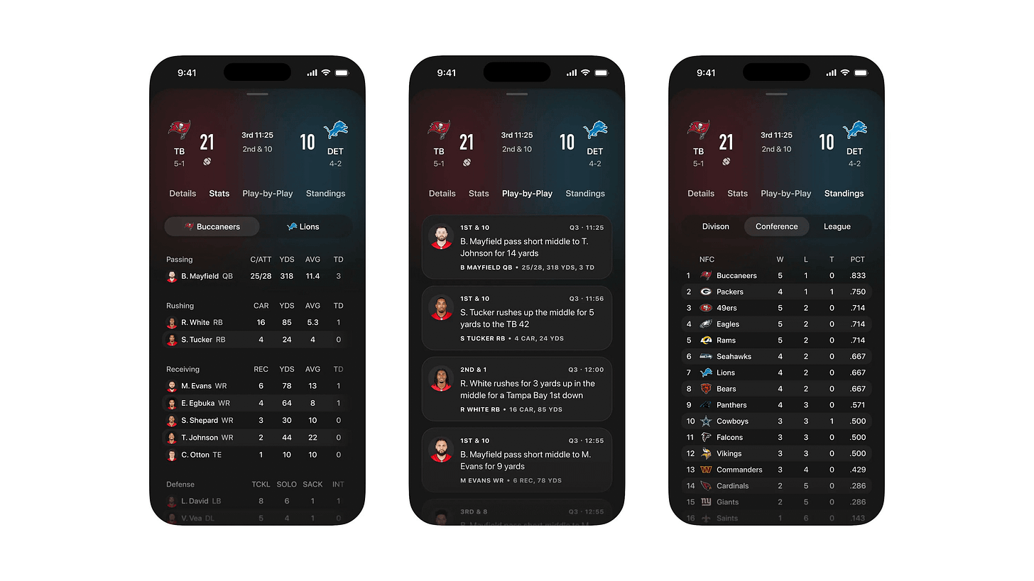
Football stats dashboard by Marco Cornacchia
Stats, plays, standings — this trio nails hierarchy so you never wonder “what matters right now.” Love how the live context breathes alongside season context without crowding. Designers, stack immediacy first and let depth trail behind so fans feel both the moment and the meaning.
That’s a wrap!
If you’re building mobile apps and any of this helped, share it with someone who ships. Follow the daily inspiration on X here, subscribe for the next drop, and tell me what you stole this week. I’ll feature the best.
See you in the next issue.
Are you a mobile design expert or know a design that should be shown off? It’s super easy to get featured on Handheld too. Fill out the form here → Get Featured!
Never miss an update by following us @Handhelddesign on X and subscribing to receive every new post - directly to your inbox.
Handheld is curated by me, Cam, a Product Designer specialising in mobile design. Follow me if you love mobile design as much as I do.


