

Every App Charges These 5 Taxes | Design Picks #27
This week, I ranked 7 designs by how well they eliminate psychological taxes—the mental energy, anxiety, and social awkwardness most designers don't even know they're charging users.

Handhelders,
Every app you use charges psychological taxes—mental energy, anxiety, social awkwardness — that drain users before they even realize it. Most designers don’t know they’re doing it.
This week, I ranked 7 designs by how well they eliminate these hidden costs. Check out the full commentary in the video above and written breakdown on the podium below.
🏆 The Podium
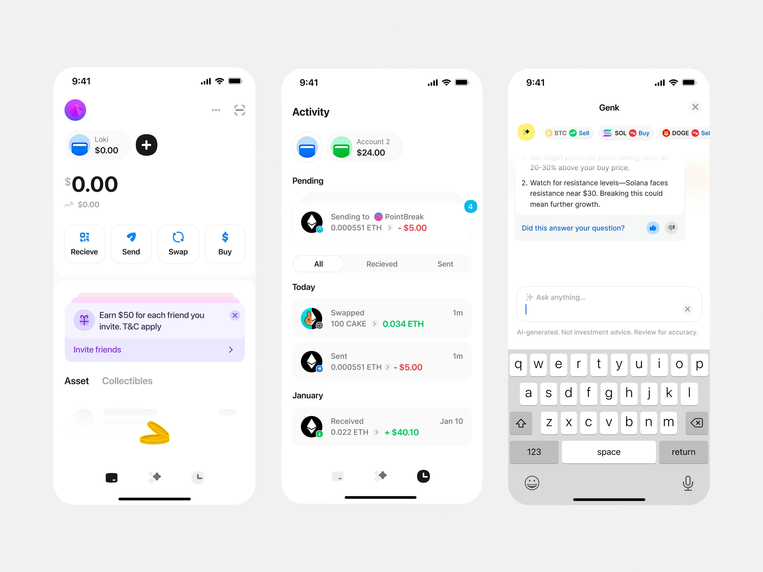
🥇 First Place — Crypto finance dashboard by Stats Studio
The intimidation tax is real. Most people never even start with crypto because the jargon makes them feel stupid. Stats Studio proves approachability and sophistication aren't opposites. Clean white palette, pastel accents, playful icons, and AI chat that lets you say "sell Bitcoin, buy Solana" in plain English. Everything's legible, nothing's dumbed down. This carries the cognitive load so newcomers feel capable from minute one. Gold medal because it eliminates the shame of being a beginner completely.
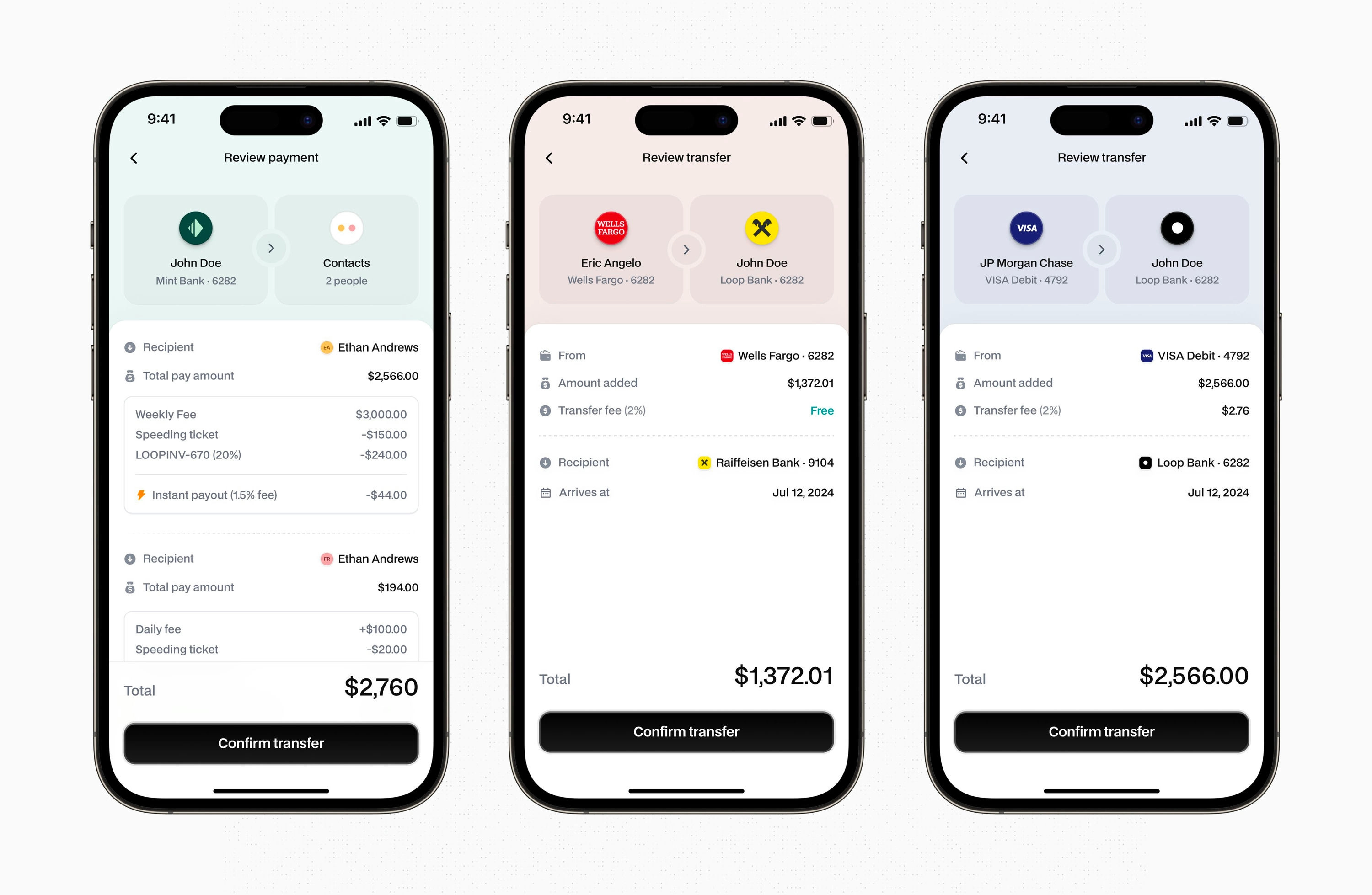
🥈 Second Place — Transfer review panel by Eric Angelo
The irreversible mistake tax keeps people up at night. You've triple-checked the amount, but did you check the recipient? One wrong tap, your money's gone. No undo button, no safety net. Eric Angelo dedicates the top third of the screen to what users actually fear: identity verification. Big profile image, clear name, account details. You're not confirming a transaction — you're being reassured. Silver medal because it transforms panic into control through pure clarity. This is what psychological safety looks like in finance.
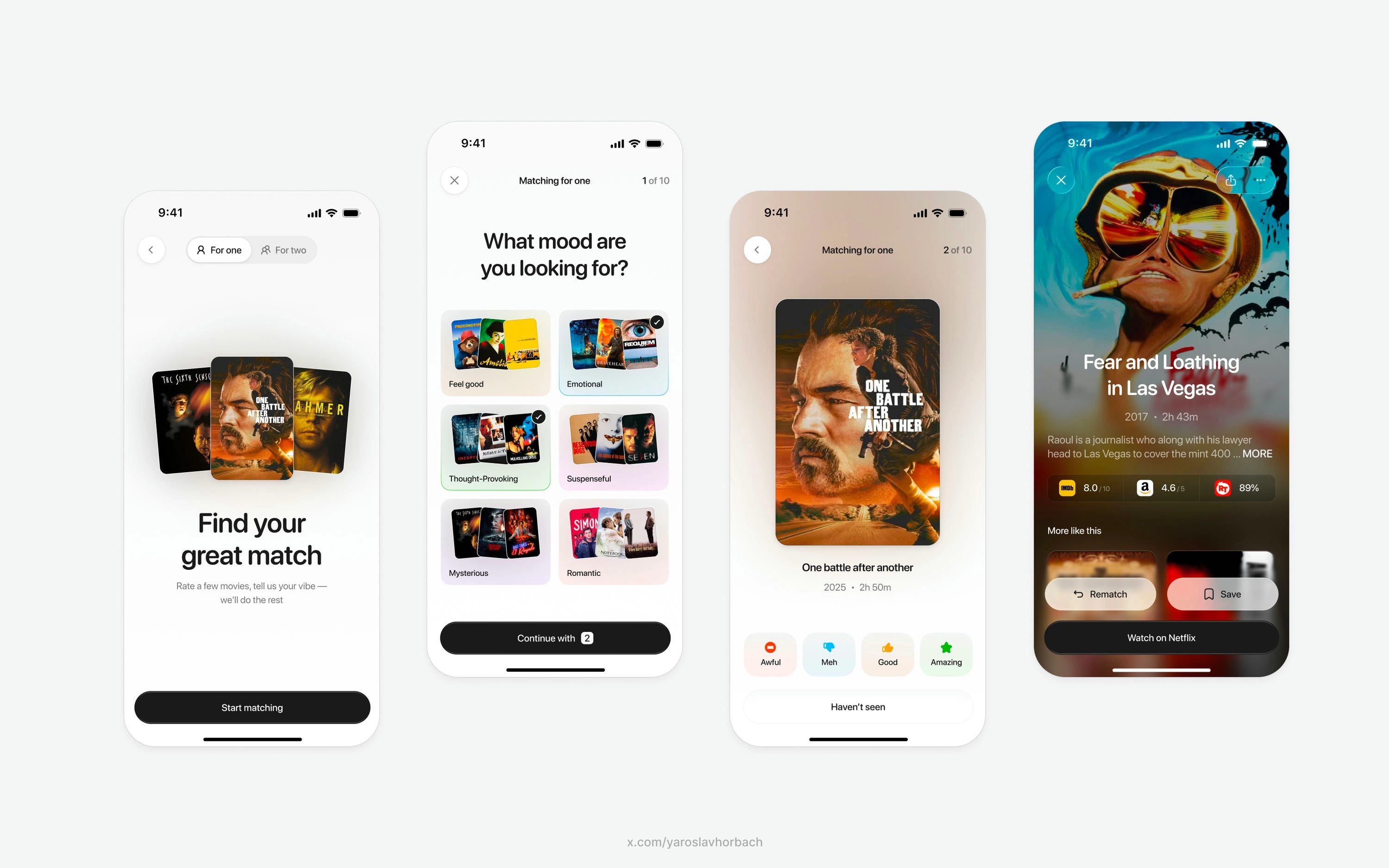
🥉 Third Place — Movie mood matcher by Yaroslav
The choice paralysis tax hits every Friday night. "What do you want to watch?" "I don't know, what do YOU want to watch?" Thirty minutes later, you're still scrolling. Yaroslav stops making you translate feelings into categories. "Feel good, heartbroken, suspenseful" — you see the vibe before clicking. Four rating options instead of two gives the algorithm actual nuance. There's a difference between liking something and loving it. Bronze medal because it turns decision fatigue into guided discovery.
#4 — Social finance hub by Alzea Arafat
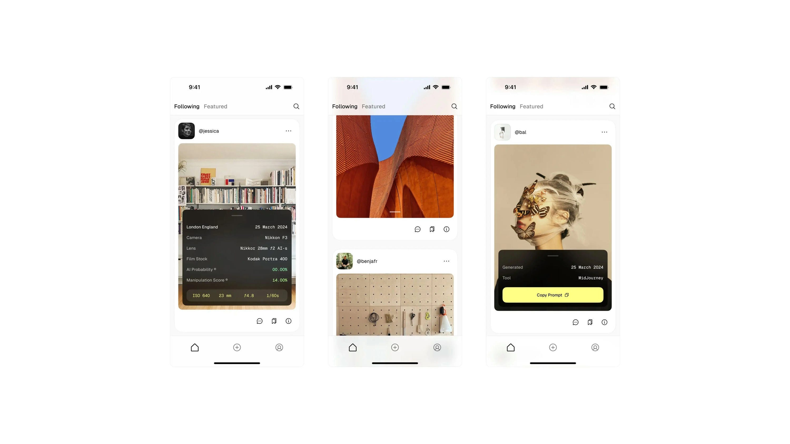
#5 — Creative showcase feed by Liam Mews
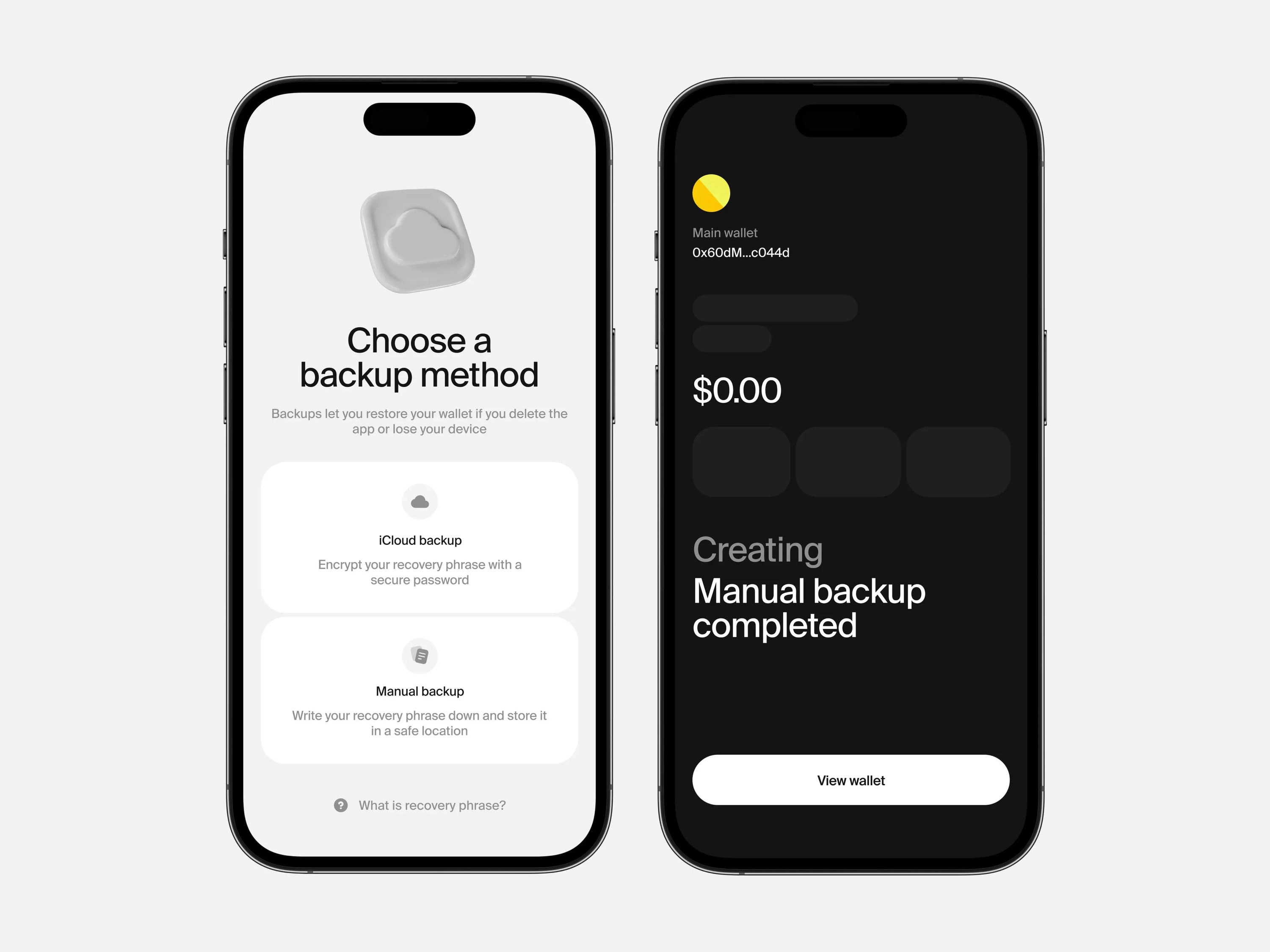
#6 — Crypto backup interface by Andrey Rybin
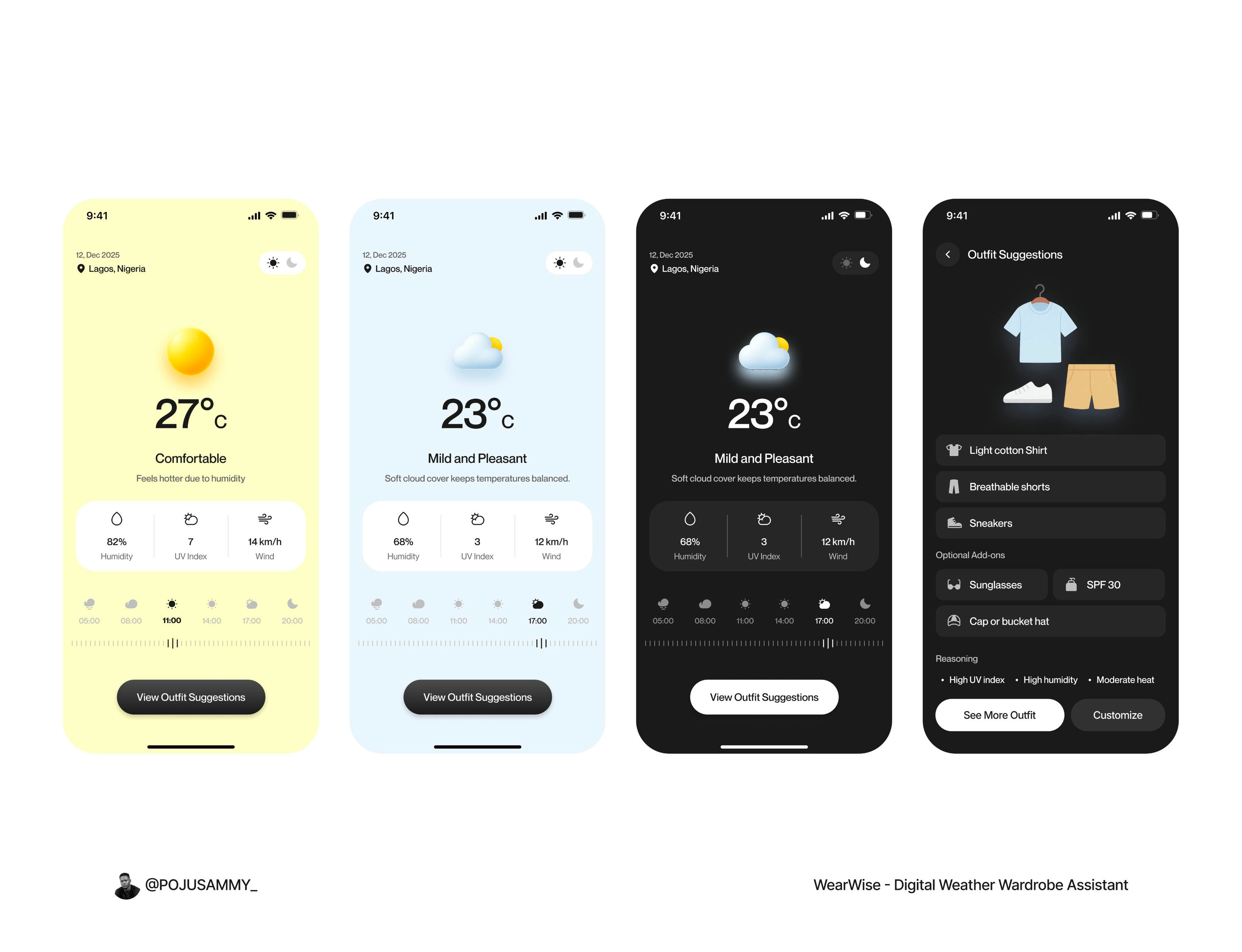
#7 — Weather wardrobe assistant by Adepoju Samuel
Watch the video above for full commentary on positions 4-7.
That’s a wrap!
Congrats to Stats Studio, Budhvin, and Yaroslav on making the podium this week.
If you’re building mobile apps and any of this helped, share it with someone who ships. Follow the daily inspiration on X here, subscribe for the next drop, and tell me what you stole this week.
Want to be featured? Post great work and tag @handhelddesign, or submit directly here.
See you in the next issue.
Handheld is curated by me, Cam, a Product Designer specializing in mobile design. Follow me if you love mobile design as much as I do.
I LOVED the video this week!! So engaging🔥 you’re giving us more & more each week