

Make Your Apps Feel Premium With These Depth Techniques | Handheld Design Picks #24
This week… vibrant tracking that makes progress feel rewarding, thoughtful flows that respect user time, and interfaces that prove personality elevates function.

Handhelders,
Every week I curate the 7 best mobile designs I come across and here we’re back with another week of rankings! Check out the full commentary on all the great work in the video above and written breakdown on the podium below.
🏆 The Podium
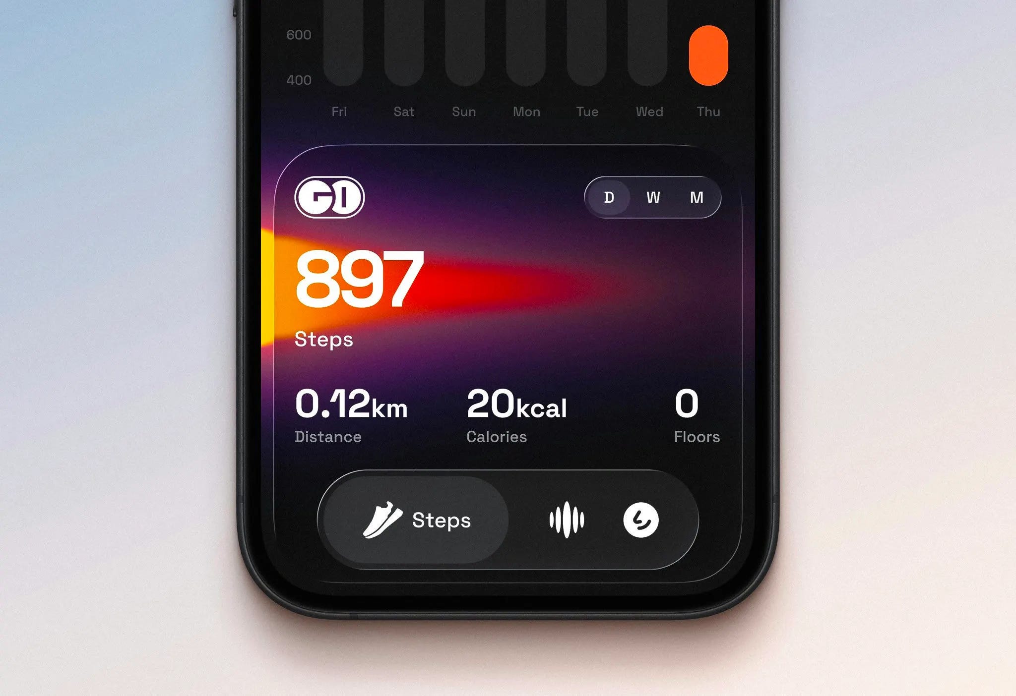
🥇 First Place — Vibrant step tracker by Ranjith
Ranjith's Gold Cub is probably one of the best design apps I've come across in the mobile design space recently. You can instantly tell—the dark mode with the gradient illustration behind, the custom font (not just SF Pro), the liquid glass nav bar that's custom and not the regular implementation. Ranjith takes all the nice elements from iOS 26 but puts their own spin on it, and that's what I really admire: a designer who puts their taste above anything else and it comes out looking amazing. If you want to analyze how to make a design unique while applying guidelines but also your own taste on top, this is how you do it. Go check out Gold Cub because it's amazing.
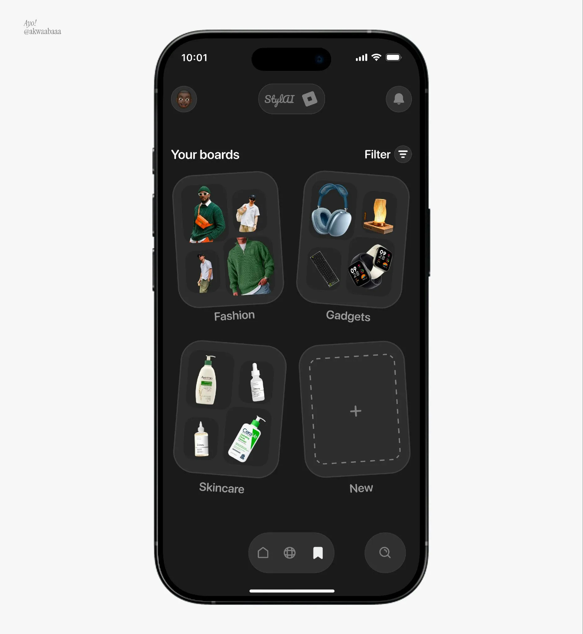
🥈 Second Place — Dark mode style boards by Turkson Isaac
This one is very unique—showcasing mood boards with tilted cards (probably inspired by Darryl Ginn who used to do this a lot) adds flexibility instead of rigid grids. I think it adds a lot here, especially for a more fun, experimental application with boards. The dark mode color scheme isn't too dark—the background is off-gray not jet black, which makes it very inviting and easier on the eyes, and the text is more legible. I'd love to see the animations for screen-to-screen transitions, like if you click the fashion board and zoom into it to see the posts. That would be a nice touch.
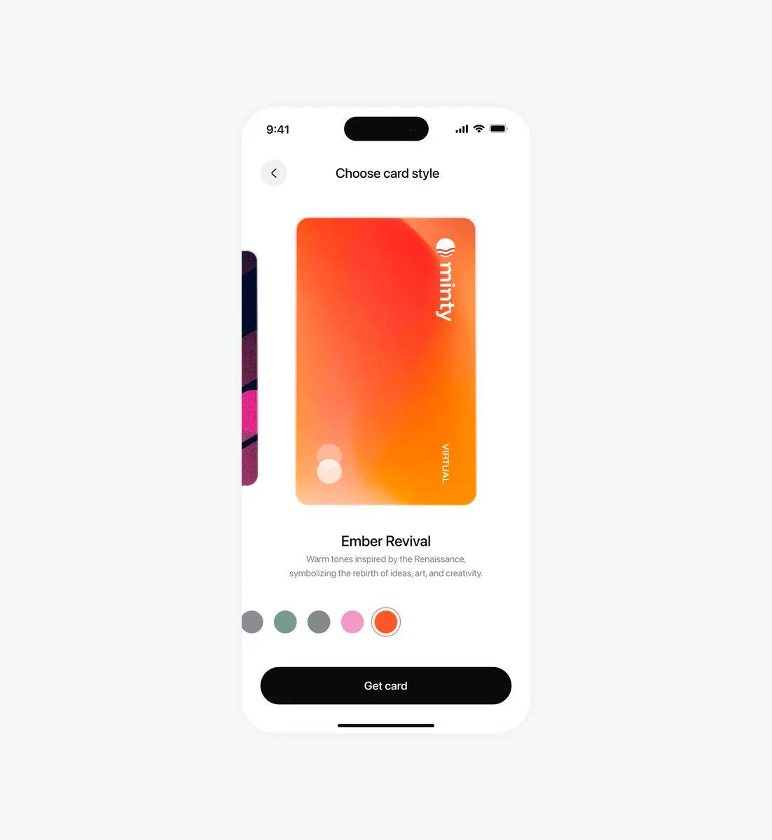
🥉 Third Place — Card customization display by Ayomide
I really enjoy how simple this is, and I feel a lot of users will love picking virtual card colors this way. This is one of the simpler renditions I've seen and it's very enjoyable. Rotating the card to portrait instead of landscape takes up more screen space and makes it way more eye-catching. The color picker below with the white border stroke is very simple and nice. Having custom names for the colors with little details of where they came from adds sentiment and makes it warmer and more inviting. They know where to put attention—the card is the only thing that matters and everything else stands back to let the card shine, no competing elements. They get that ideology down to a T.
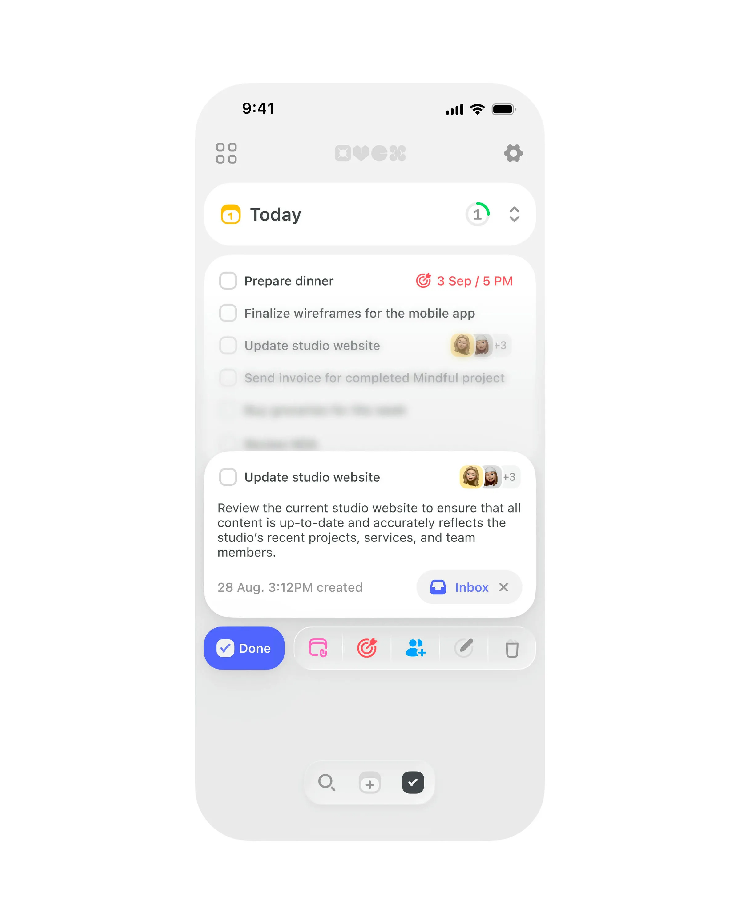
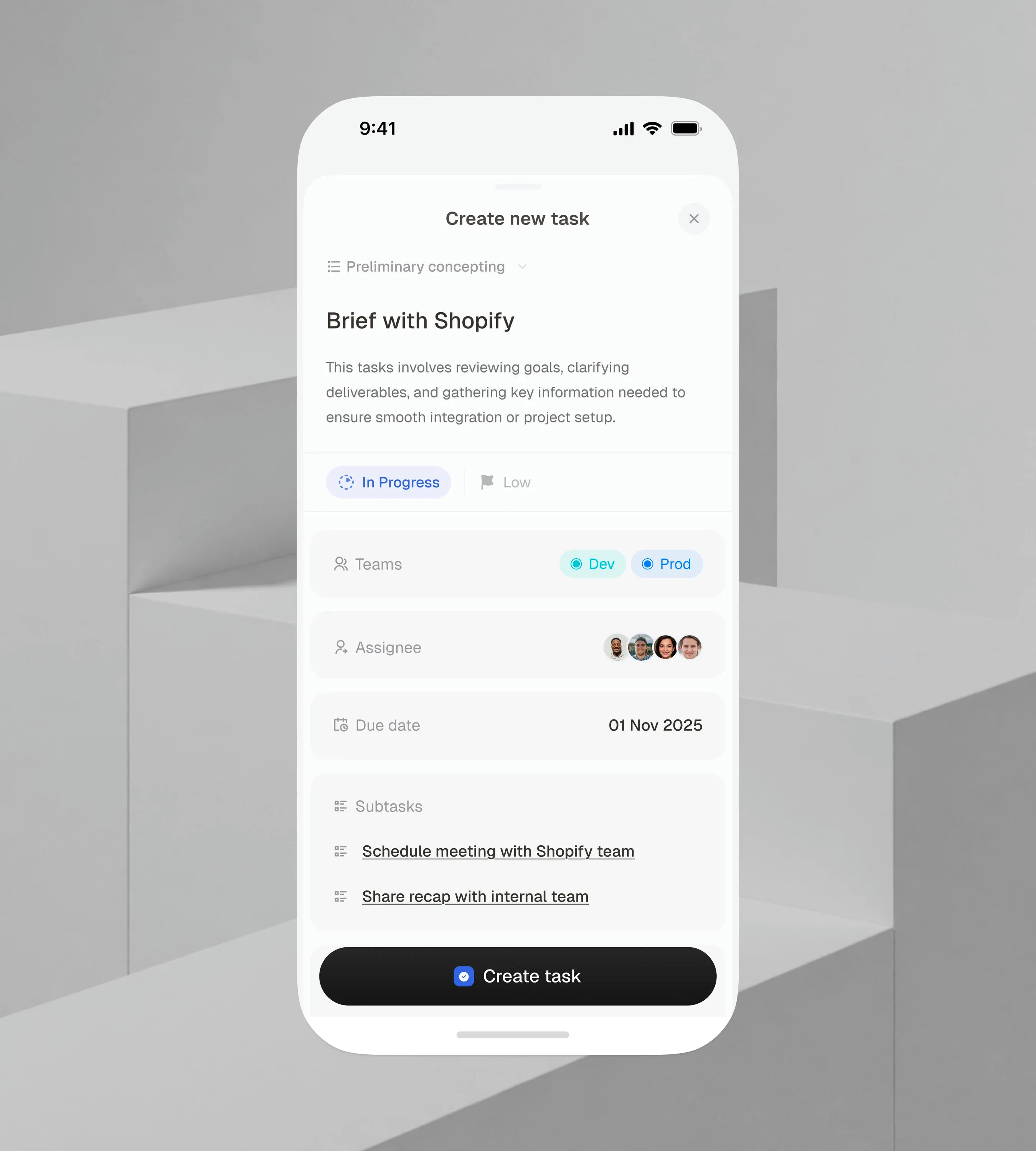
#4 — Task manager interface by Studio Sphere
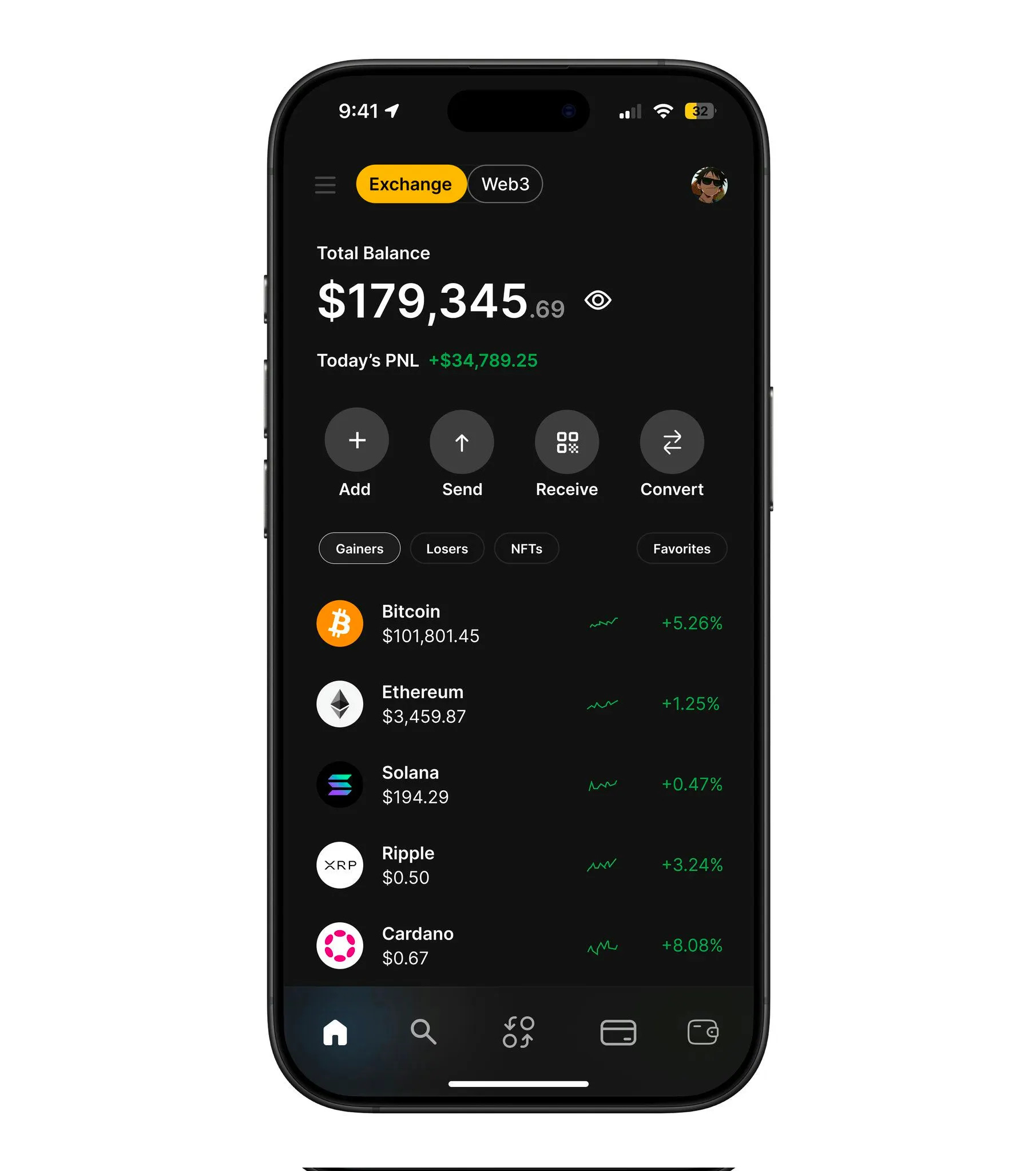
#5 — Crypto portfolio dashboard by Aman Ansari
#6 — Task management flow by Ikechukwu Joshua
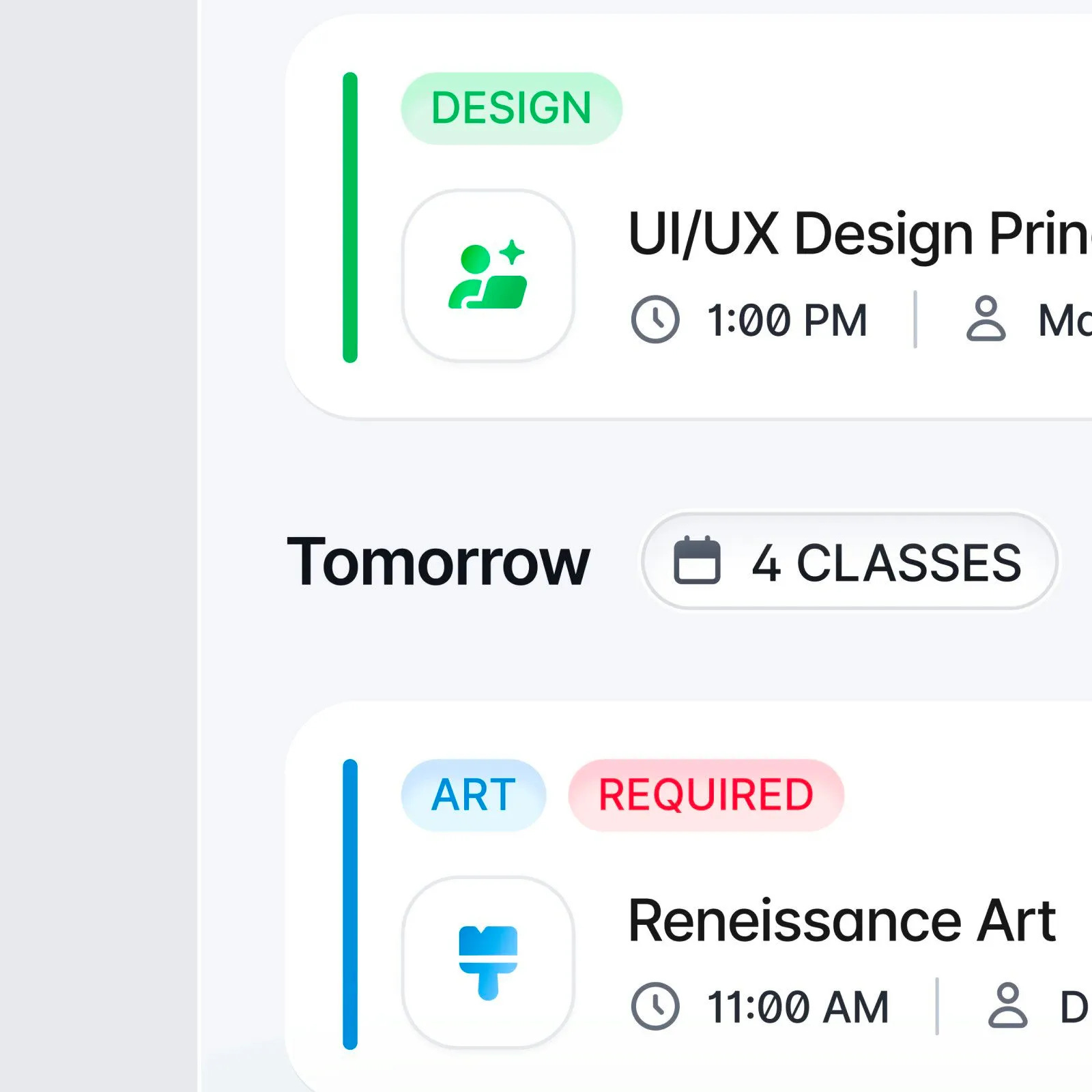
#7 — Class schedule preview by Michael Nowak
That’s a wrap!
Congrats to Ranjith, Ikechukwu Joshua, and Ayomide on making the podium this week.
If you’re building mobile apps and any of this helped, share it with someone who ships. Follow the daily inspiration on X here, subscribe for the next drop, and tell me what you stole this week.
Want to be featured? Post great work and tag @handhelddesign, or submit directly here.
See you in the next issue.
Handheld is curated by me, Cam, a Product Designer specializing in mobile design. Follow me if you love mobile design as much as I do.
Yesss, love these designs!! 🔥🥳