

Make Your Apps Stand Out With Vibrant Depth & Strong Visuals | Handheld Design Picks #25
This week… vibrant gradients that add depth without muddy colors, playful interfaces that make technical apps approachable, and strong visual branding that proves differentiation happens in the detail

Handhelders,
Every week I curate the 7 best mobile designs I come across and here we’re back with another week of rankings! Check out the full commentary on all the great work in the video above and written breakdown on the podium below.
🏆 The Podium
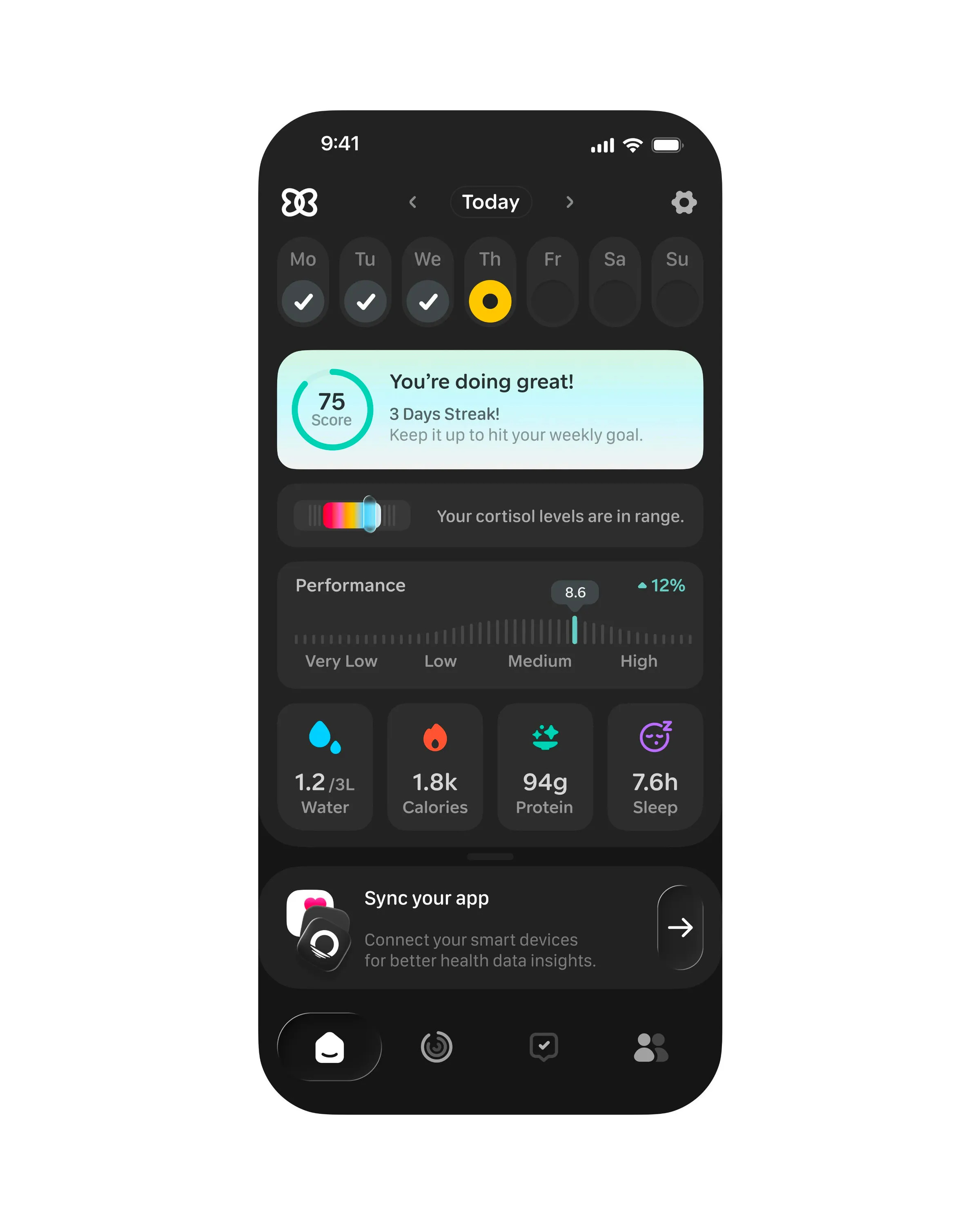
🥇 First Place — Health tracker dashboard by Studio Sphere
Studio Sphere nails the challenge of showing comprehensive health data without creating information overload. The four cards displaying water, calories, protein and sleep use single icons for instant comprehension alongside the key numbers people actually need. What elevates this is the liquid glass implementation—the cortisol slider's gradient indicator uses liquid glass, a detail most people miss. The "Doing Great" streak in the brightest color drives users back to the app. If you're stealing something here, it's Studio Sphere's restrained color system that guides attention exactly where needed. The four cards, cortisol levels, and daily streak all use color strategically, and even the dual tone icons at the bottom feel modern rather than dated.
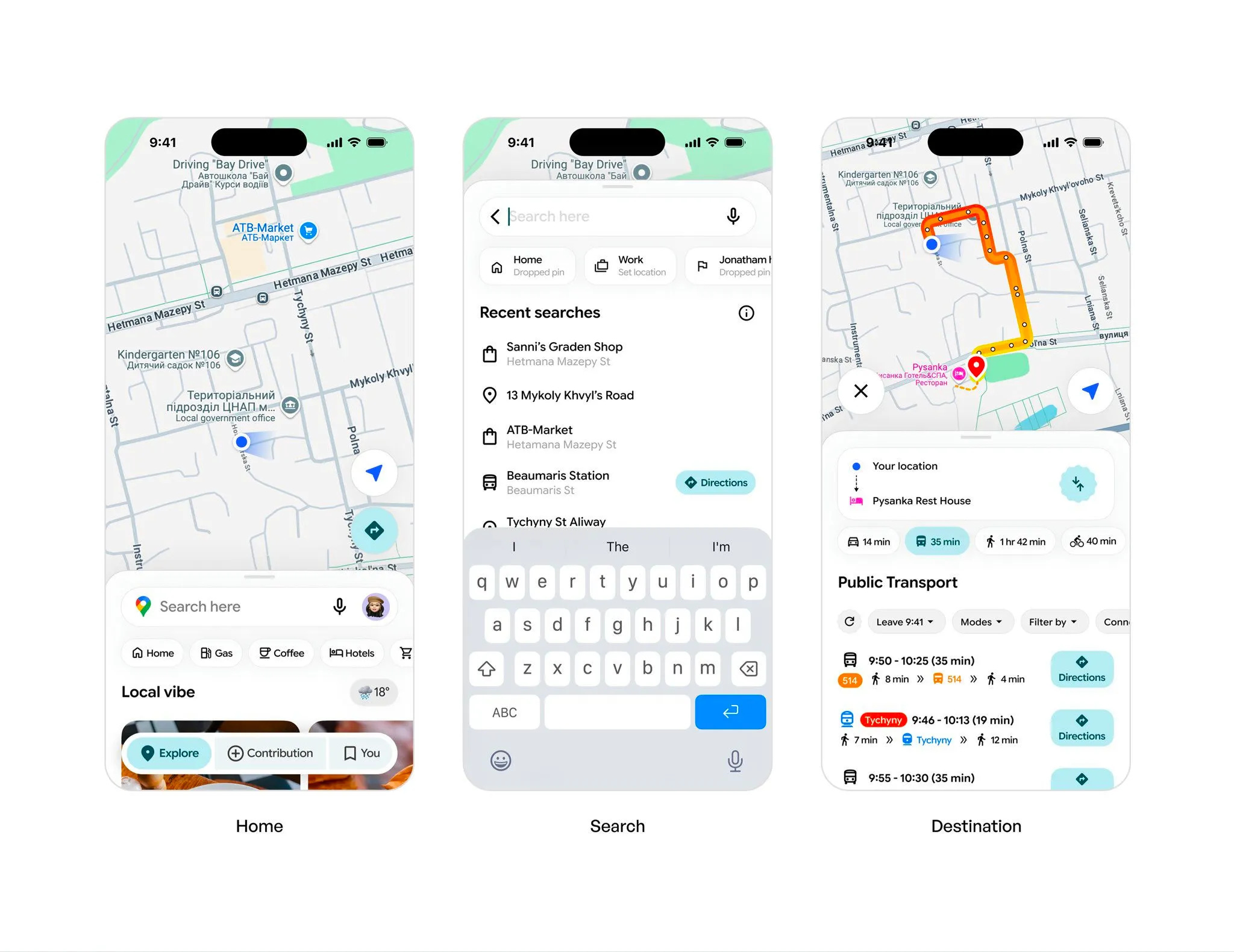
🥈 Second Place — Smart urban navigation by Budhvin
Budhvin reimagines navigation with a concept that genuinely feels like Google Maps evolved forward. The floating nav bar with those abstract Material Design-inspired shapes draws massive attention to what's currently active, while the color usage throughout guides your eyes exactly where you need to go—what page you're on, ready directions, buttons to press. What really works is how this makes functional design actually interesting to look at, because let's be honest, Google Maps isn't exactly pretty. The waypoint gradient is intriguing, though separating the route colors instead of blending might reduce confusion. Steal this approach of using strategic color placement to guide user attention while updating established patterns to feel more contemporary and engaging.
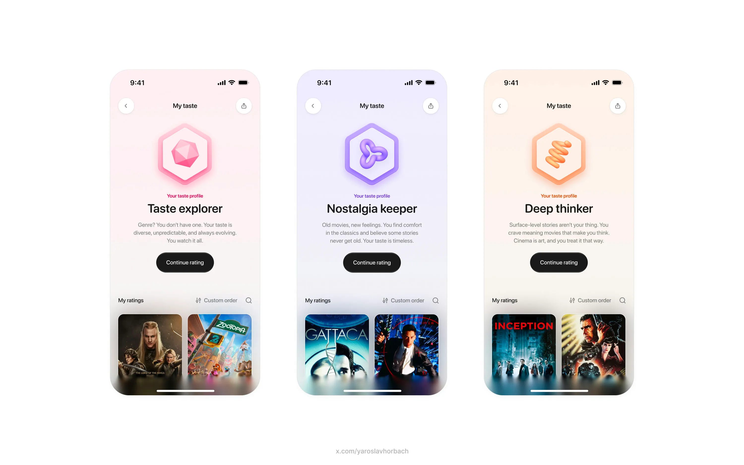
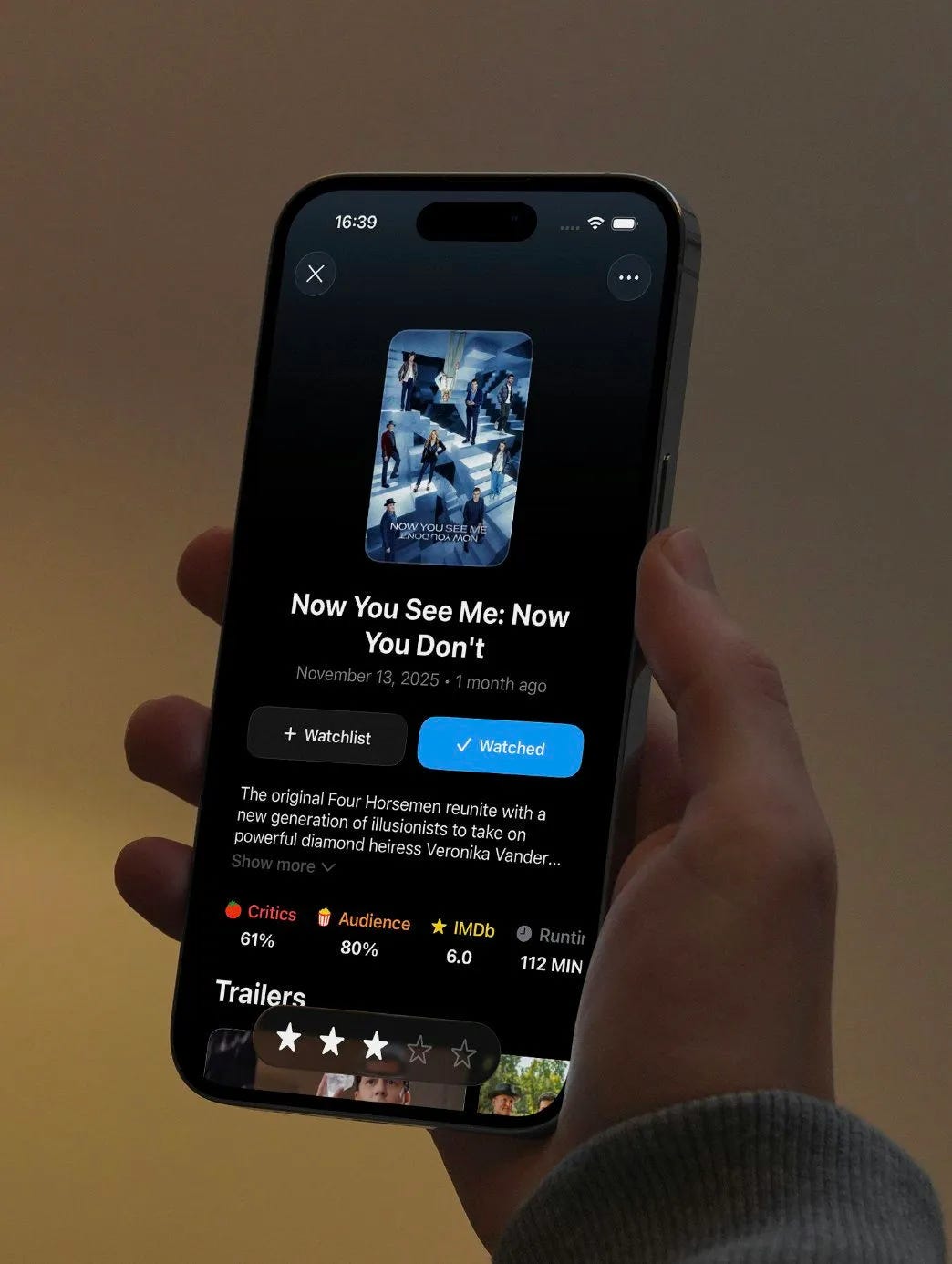
🥉 Third Place — Personalized movie profiles by Yaroslav
Yaroslav proves why streaks, emblems and trophies keep users coming back with this expertly executed movie taste profile design. The gradient backgrounds interact perfectly with the emblem colors, showing how you earned them through your actual viewing history. What really stands out is Yaroslav's use of depth—how the emblems appear to float above the screen through layered planes, and how the movie poster shadows pull colors from the posters themselves rather than using generic black shadows. Even the taste profile names like "Taste Explorer" and "Nostalgia Keeper" feel smartly considered. Steal this technique of adding depth through unconventional shadow treatments and layered visual planes to make your designs feel more dimensional and premium.
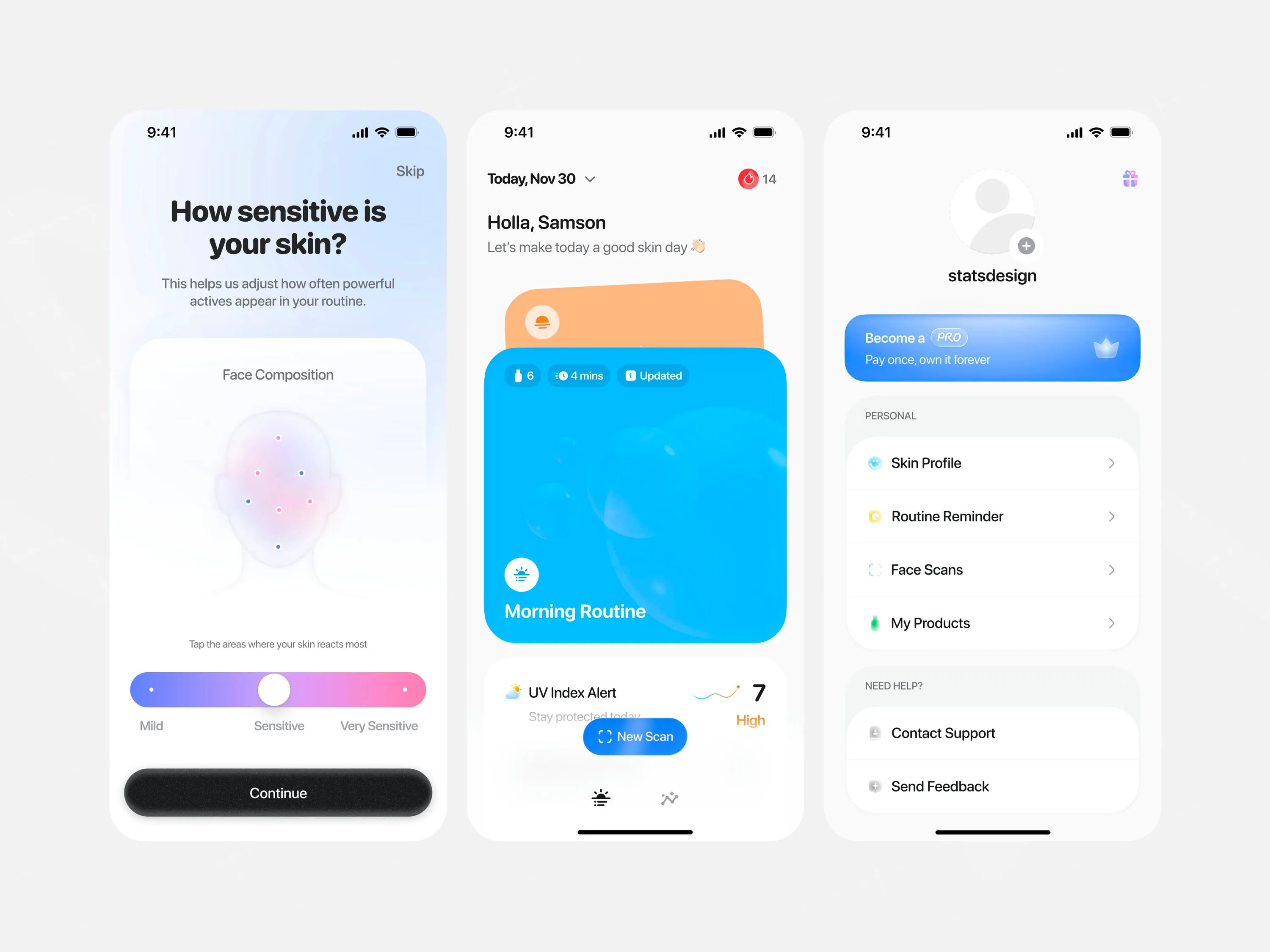
#4 — Skin routine advisor by Stats Studio
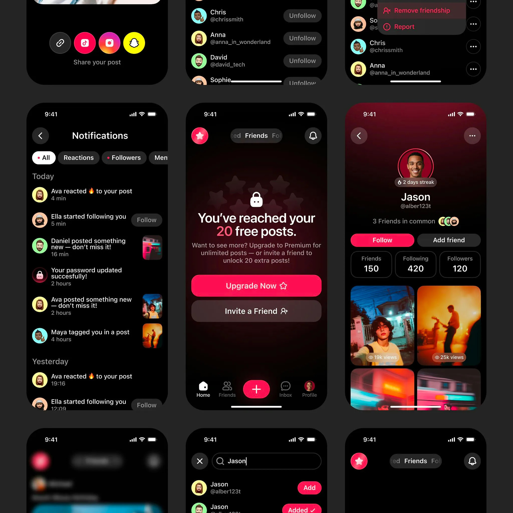
#5 — Social interaction hub by Jay Dwivedi
#6 — Movie review details by Shihab Mehboob
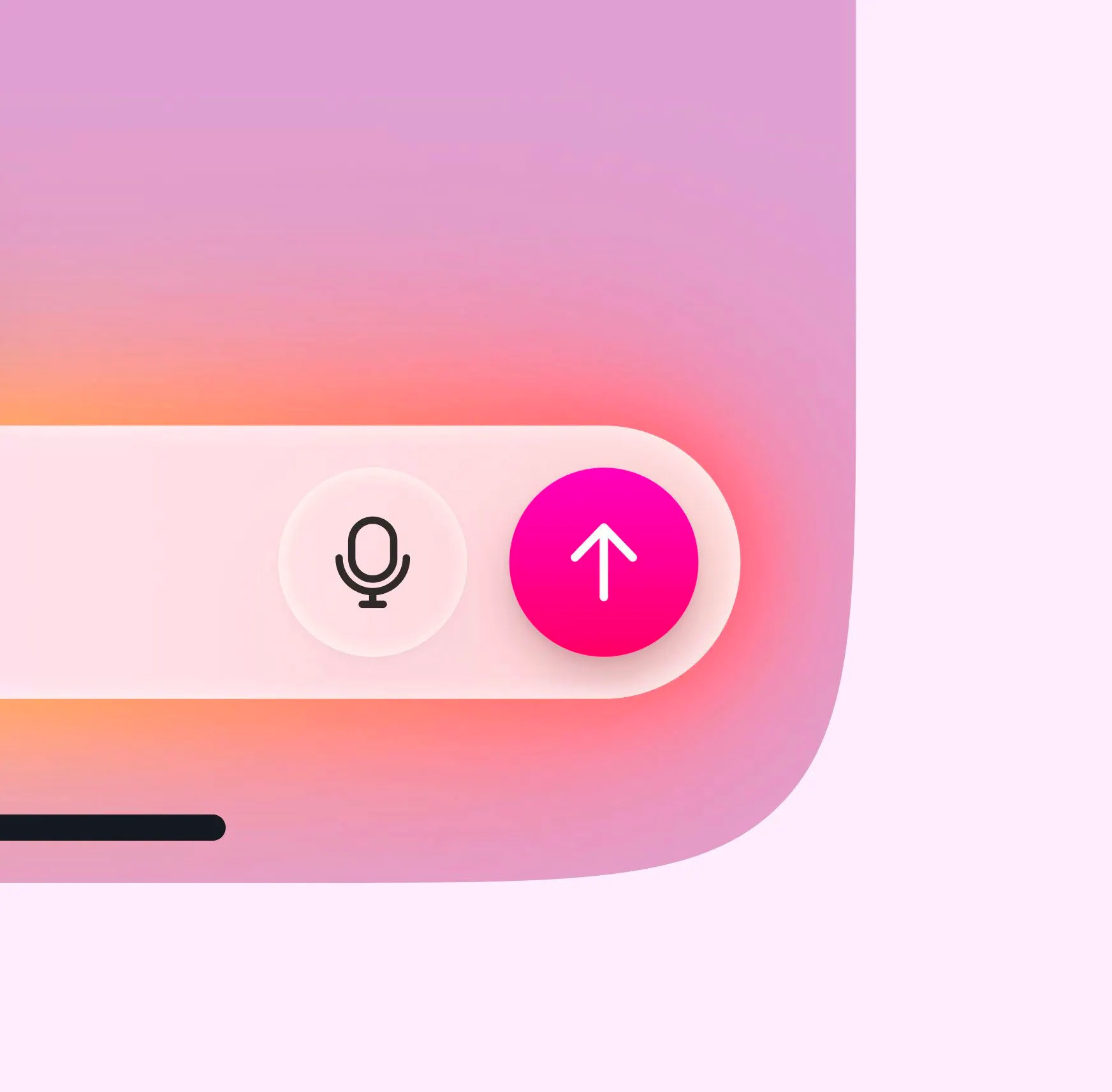
#7 — Vibrant voice interaction by Safayet Ahmed
Watch the video above for full commentary on positions 4-7.
That’s a wrap!
Congrats to Studio Sphere, Budhvin, and Yaroslav on making the podium this week.
If you’re building mobile apps and any of this helped, share it with someone who ships. Follow the daily inspiration on X here, subscribe for the next drop, and tell me what you stole this week.
Want to be featured? Post great work and tag @handhelddesign, or submit directly here.
See you in the next issue.
Handheld is curated by me, Cam, a Product Designer specializing in mobile design. Follow me if you love mobile design as much as I do.
studio sphere is on a rollll😭🔥 great picks this week