

Steal These Data Visualization Tricks From Top Designers | Handheld Design Picks #23
This week… a finance analyzer that makes credit scores feel less scary and a movie app that turns browsing into discovery.

Handhelders,
Every week I curate the 7 best mobile designs I come across and here we’re back with another week of rankings! Check out the full commentary on all the great work in the video above and written breakdown on the podium below.
🏆 The Podium
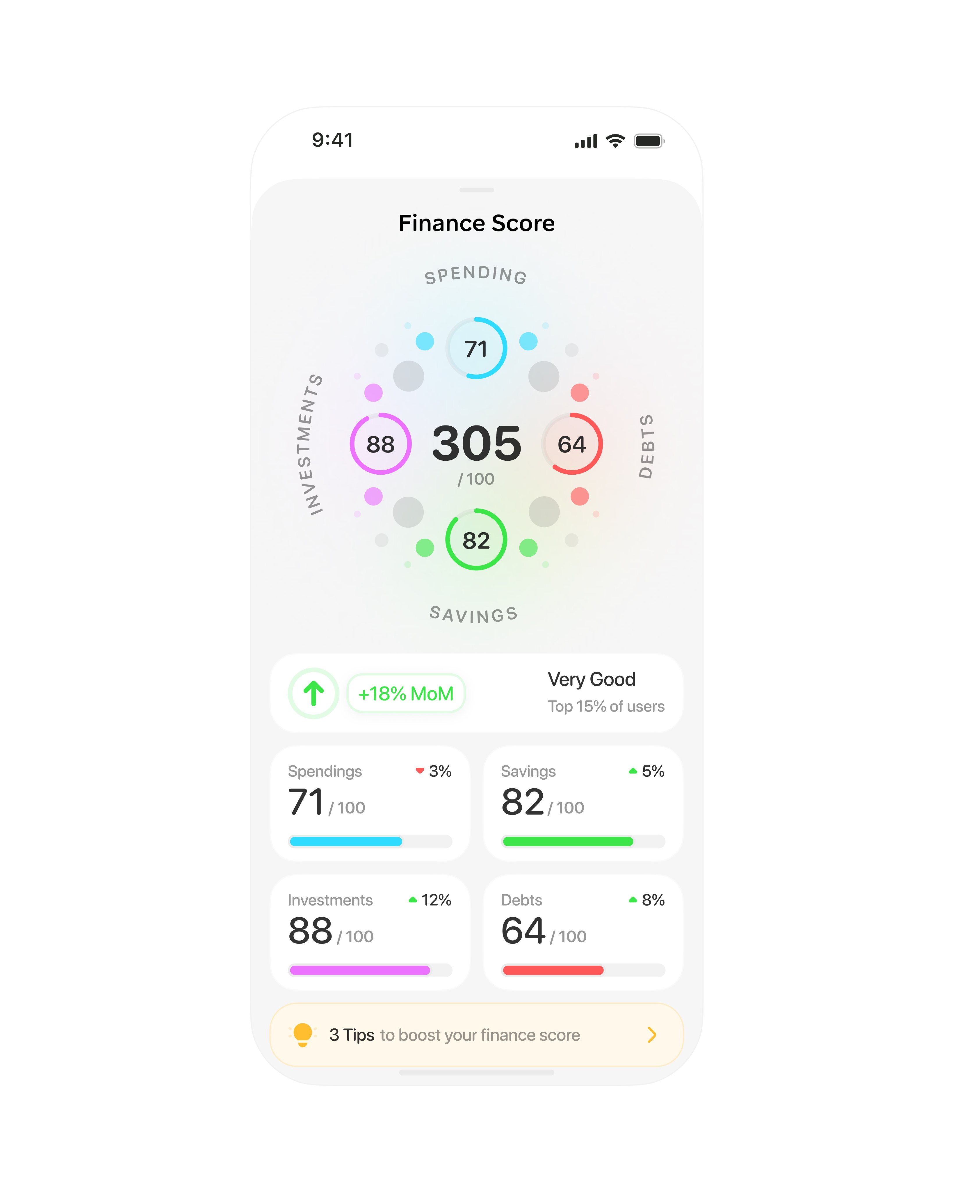
🥇 First Place — Finance score analyzer by Studio Sphere
Studio Sphere takes health data's ring visualization—one of the best UX innovations we've gotten in the 21st century—and applies it to finance. We're used to the half-circle credit score gauge, but this takes it further by showing all the different components (spending, debts, savings, investments) with thoughtful color psychology: green for savings obviously, red for debts, purple for investments to feel exploratory, blue for spending because that's normal. I haven't seen anything like this for the finance world. The way this blends health data visualization with finance is something we haven't really seen before, and I can't wait to see the wider project if Studio Sphere shares more screens.
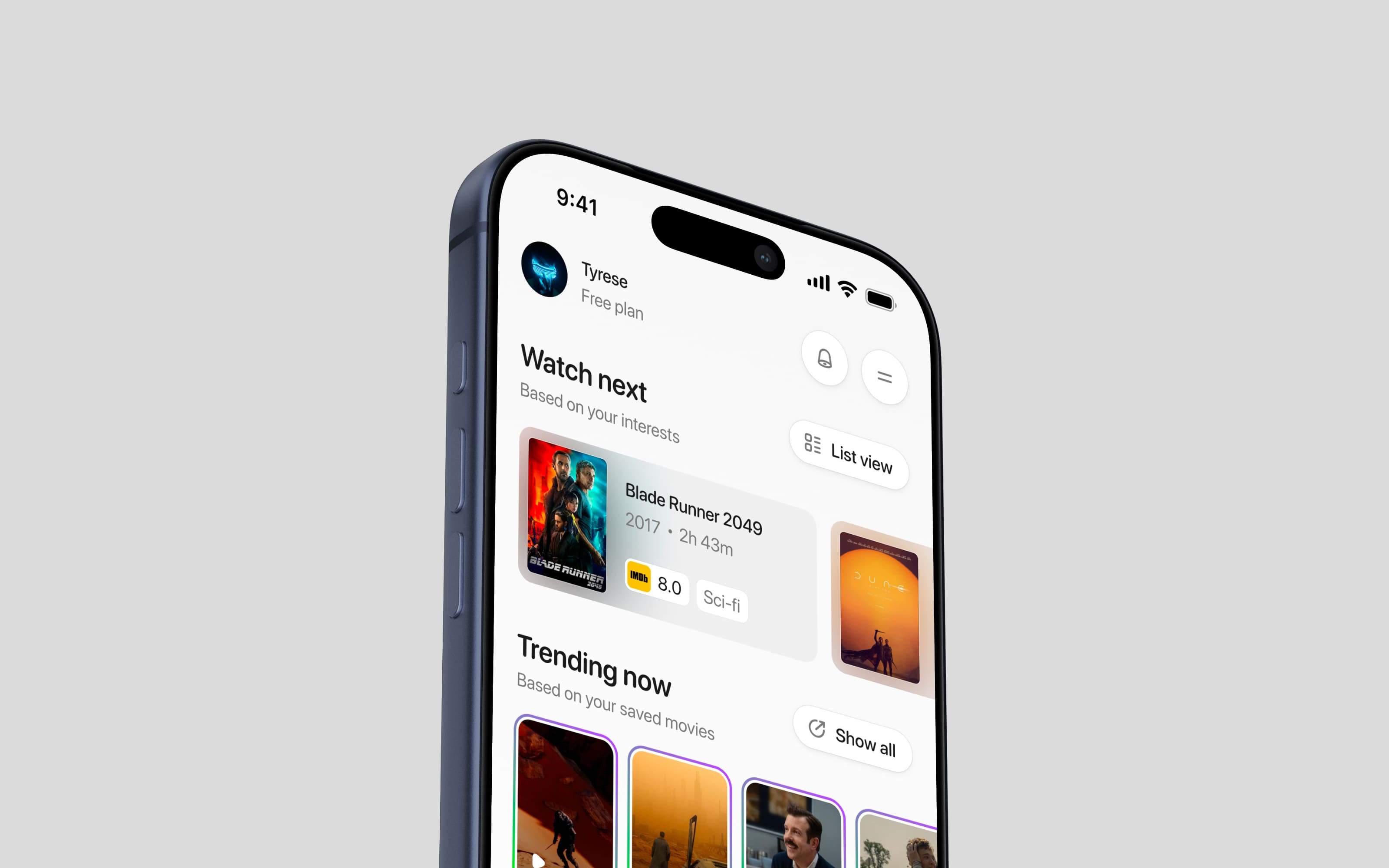
🥈 Second Place — Movie discovery stream by Yaroslav
I love movies—it's my second love after mobile design—so this one has a soft spot for me. The poster shadows actually bleed into the card backgrounds, the trending rings look like they'll be a story feature for quick trailer access, and the slight off-white gray background with white buttons and tight shadows makes everything feel clean and well put together. What really works here is taking Instagram's story rings and applying them to movie trailers—it's exactly like Studio Sphere's first place, where you take bits from different applications and create something totally brand new we haven't seen before. Look for inspiration outside your industry instead of in the same field, and you'll get novel ideas that really work.
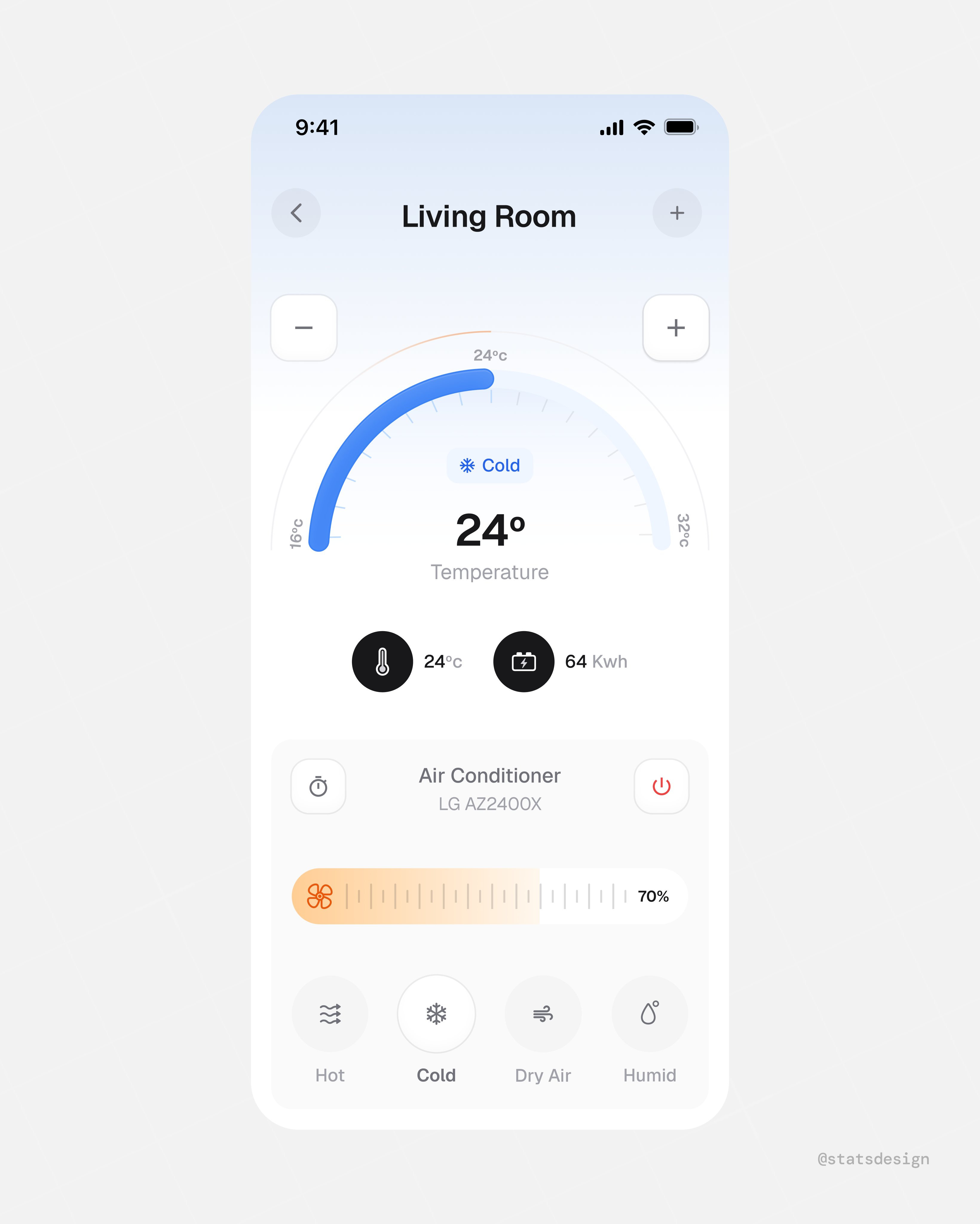
🥉 Third Place — Smart thermostat control by Stats Studio
There's an open market for home device applications that actually showcase information in a nice, intuitive way—Apple Home and Google Home don't do this well in my opinion. Stats Studio nails it with large buttons at the bottom so you can adjust temperature, heat, cold, dry air, or humidity with your eyes closed if you know the app. The oversized controls aren't just aesthetic—they're designed for the situation where users are half-asleep or rushing and don't want to be finicky with tiny controls. The calming gradient backgrounds (cool blues now, probably red when hot) create that visual connection between the actual device and the UI. Design for who the user is and what situation they're in, not just what they want to accomplish.
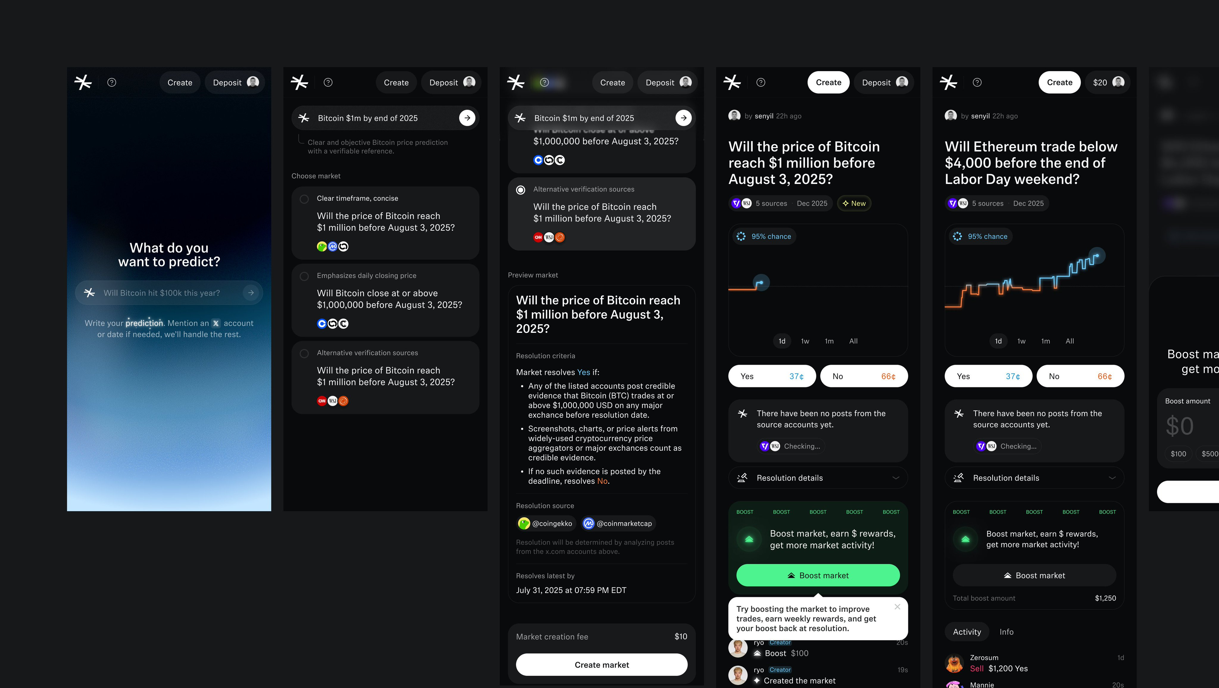
#4 — Crypto prediction platform by Muharrem
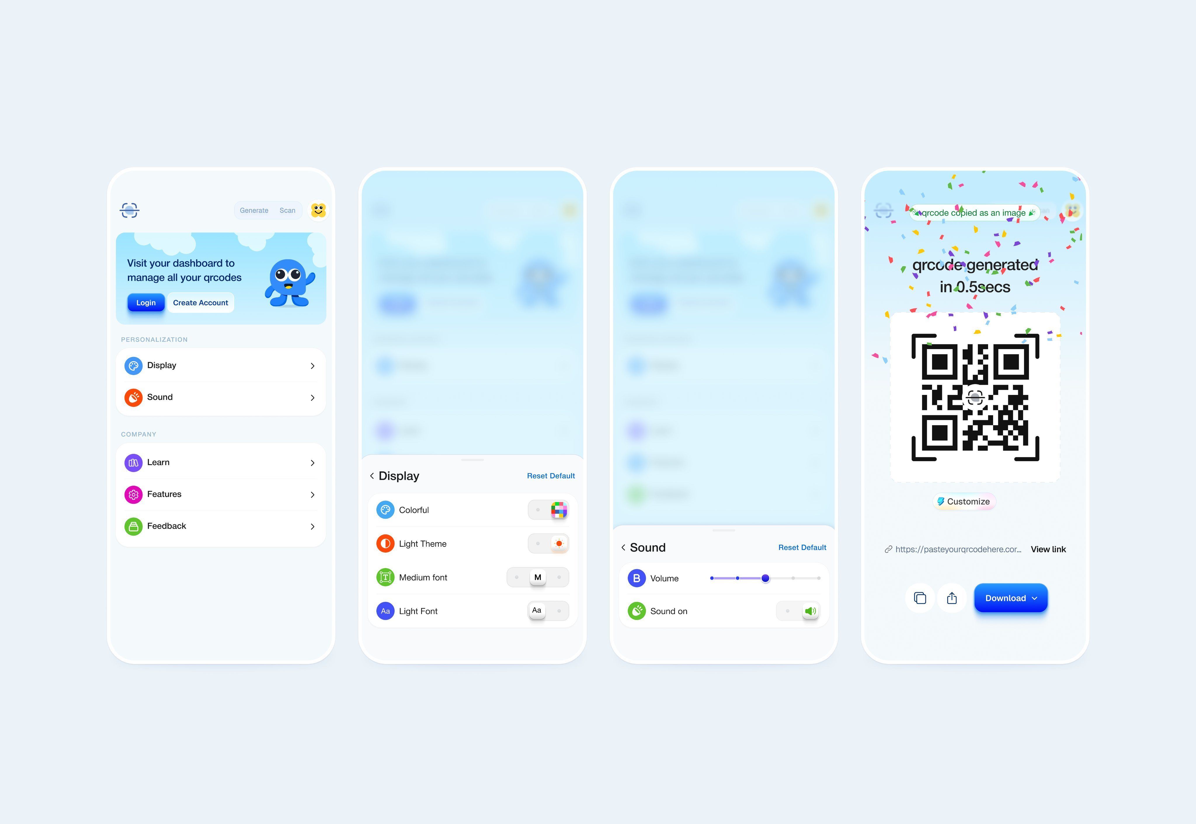
#5 — QR code manager by Paul Elite
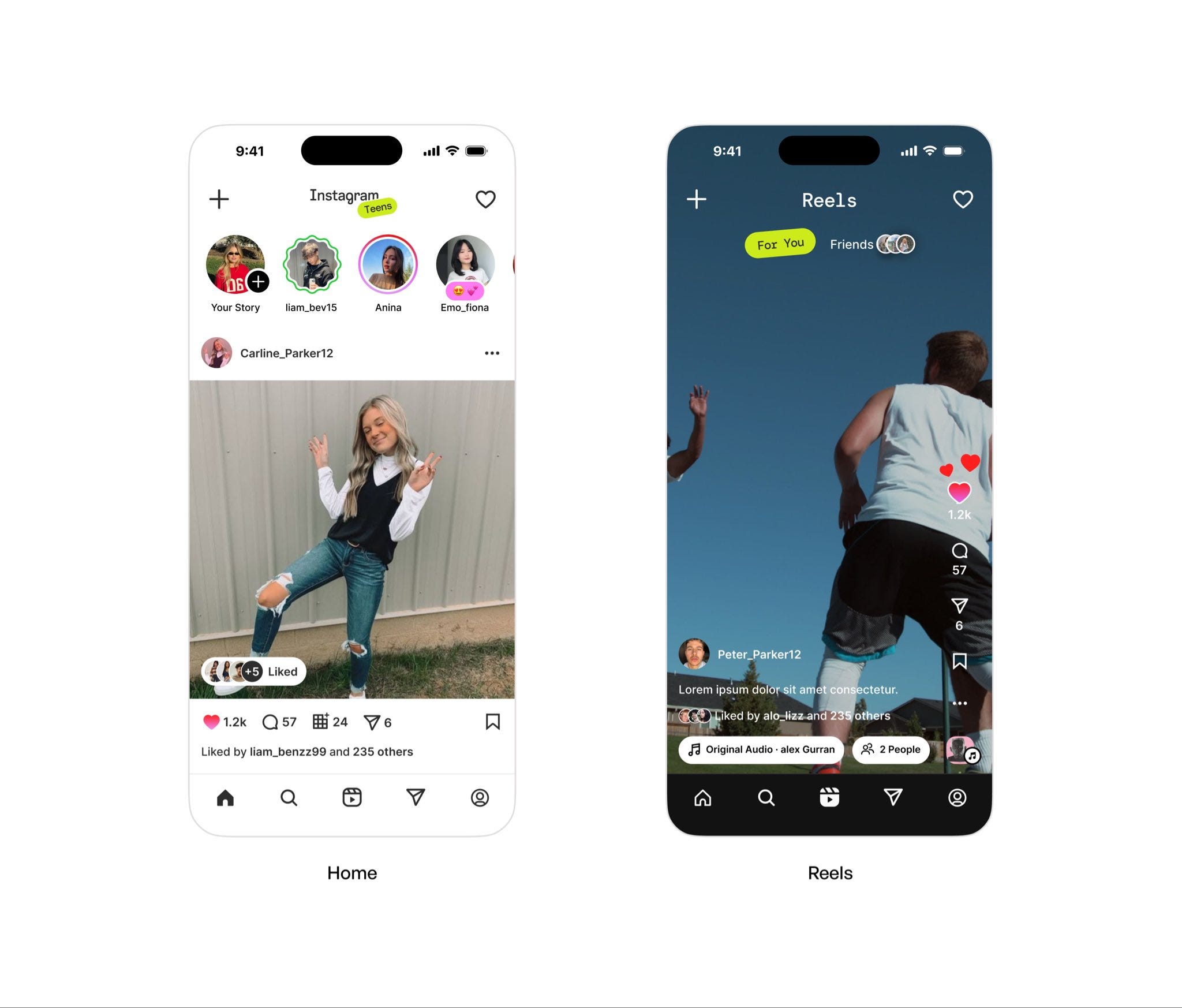
#6 — Teen social media flow by Budhvin
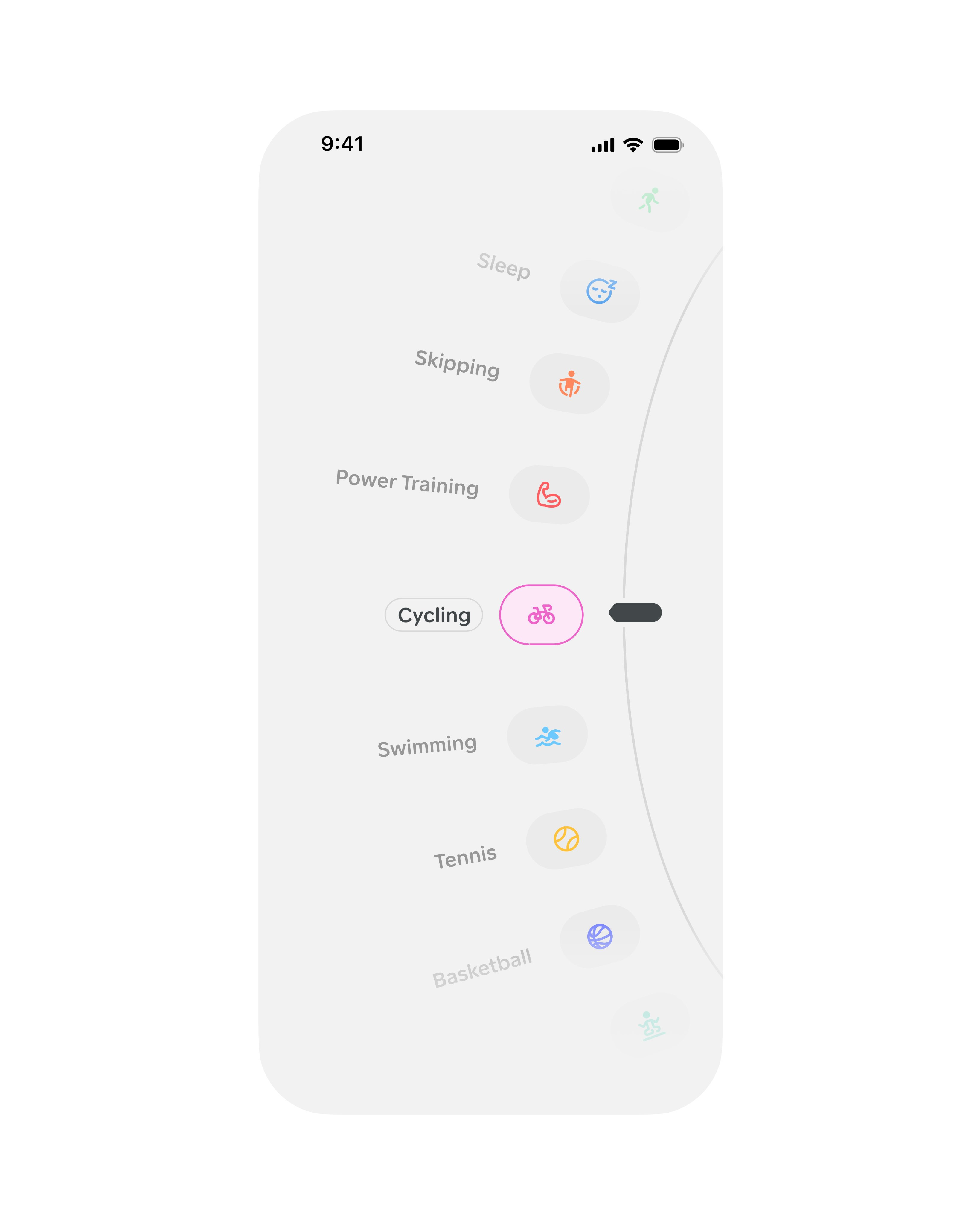
#7 — Activity selector wheel by Studio Sphere
Watch the video above for full commentary on positions 4-7.
That’s a wrap!
Congrats to Studio Sphere, Yaroslav, and Stats Studio on making the podium this week.
If you’re building mobile apps and any of this helped, share it with someone who ships. Follow the daily inspiration on X here, subscribe for the next drop, and tell me what you stole this week.
Want to be featured? Post great work and tag @handhelddesign, or submit directly here.
See you in the next issue.
Handheld is curated by me, Cam, a Product Designer specializing in mobile design. Follow me if you love mobile design as much as I do.
Big take away from me is looking at inspiration outside your direct field...thanks for this
Love this!!💪🏾🔥 strong picks TBH