

The Next 3 App Categories That Will Make Designers Rich | Design Picks #26
This week… a wellness tracker with visual hierarchy so clean it makes you want to build better habits and a brain scan UI that makes medical tech feel accessible.

Handhelders,
Every week I curate the 7 best mobile designs I come across and here we’re back with another week of rankings! Check out the full commentary on all the great work in the video above and written breakdown on the podium below.
🏆 The Podium
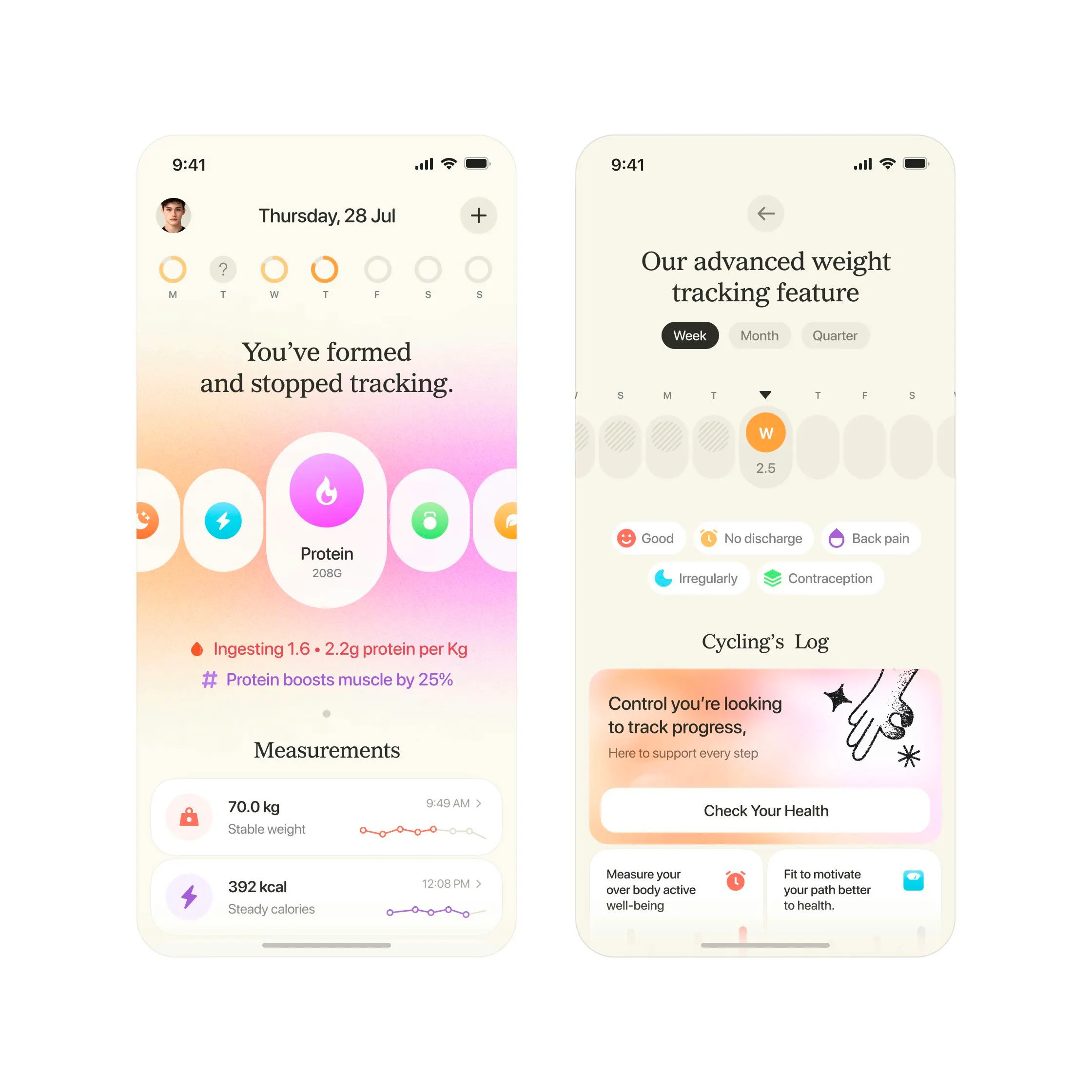
🥇 First Place — Health tracker overview by Sajon
Sajon nails the challenge of making health tracking welcoming instead of clinical with this serif-and-softness approach that breaks every wellness app convention. The off-white backgrounds with bordered white cards create breathing room, while the noisy gradients on progress indicators add tactile depth without overwhelming the data. Most health apps lean into intense dark mode with sharp corners and aggressive illustrations—this goes the opposite direction with clawed effects, serif headlines, and gradients that flow from card backgrounds into the icons themselves. What really works is how this demonstrates that strong visual design comes from understanding branding and marketing, not just product design—the two disciplines intertwine. Steal this technique of challenging category conventions with softer aesthetics and elevated typography, because when everyone in your space looks one way, differentiation means having the confidence to go the opposite direction.
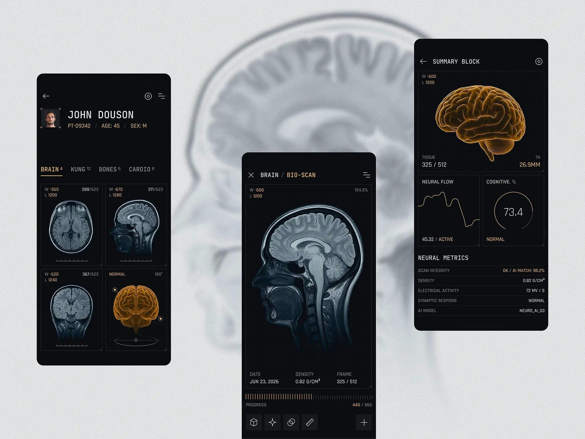
🥈 Second Place — Neural scan interface by Geex Arts
Geex Arts nails the challenge of making medical scan data approachable without dumbing it down with this expertly executed MRI dashboard. The brain visualization sits crystal clear at the center while cognitive metrics and neuro flow charts orbit around it without competing for attention. The dark mode palette with cool blue and purple accents creates that high-tech medical aesthetic everyone expects from sci-fi, but executes it with real usability that actual healthcare professionals could use. What elevates this is how it balances information density with visual accessibility—you get the technical precision doctors need while keeping it comprehensible for patients. Steal this technique of establishing one hero element then letting everything else support it, because futuristic design doesn't mean overwhelming your users with visual complexity.
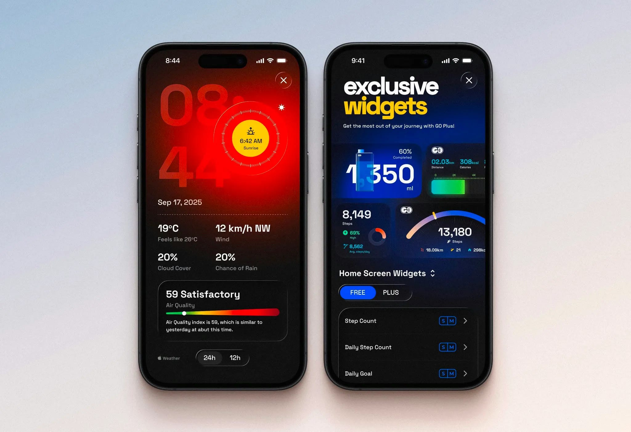
🥉 Third Place — Dynamic widget dashboard by Ranjith
Ranjith proves why going in a completely different visual direction is worth the risk with this widget dashboard that makes you rethink what wellness tracking can look like. The design pushes multiple progress bar treatments—gradients for air quality, ring indicators for steps, water illustrations showing daily intake—while maintaining a cohesive design language across every widget variant. Each widget has its own unique style but they all feel like they belong to the same family, showing mastery of design systems. What elevates this is the attention to details like the air quality slider that goes the extra mile, and the strategic use of liquid glass effects that actually enhance rather than distract. Steal this approach of exploring multiple visualization styles within one consistent design language, because differentiation in wellness apps comes from pushing visual boundaries while keeping the core experience intuitive.
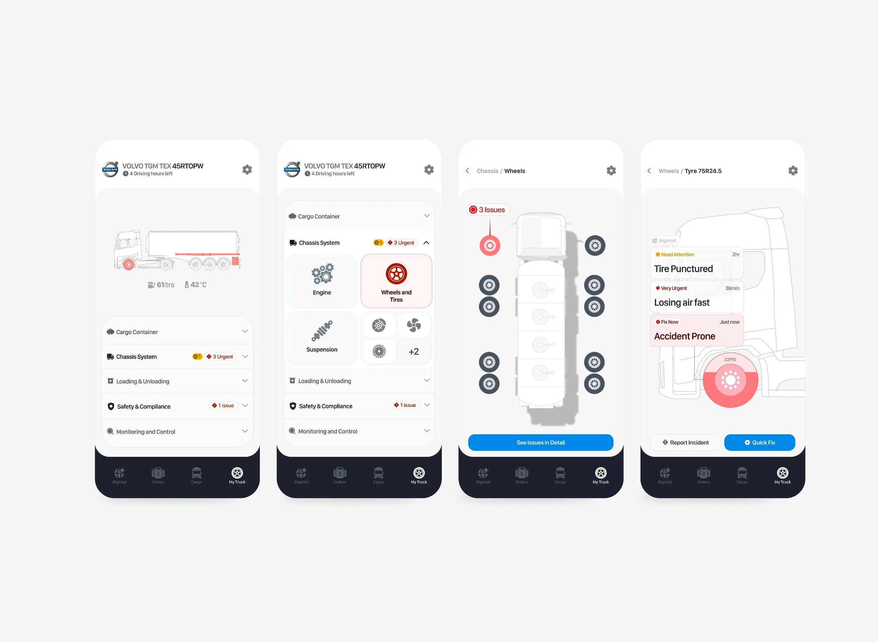
#4 — Vehicle diagnostics dashboard by Paul Elite
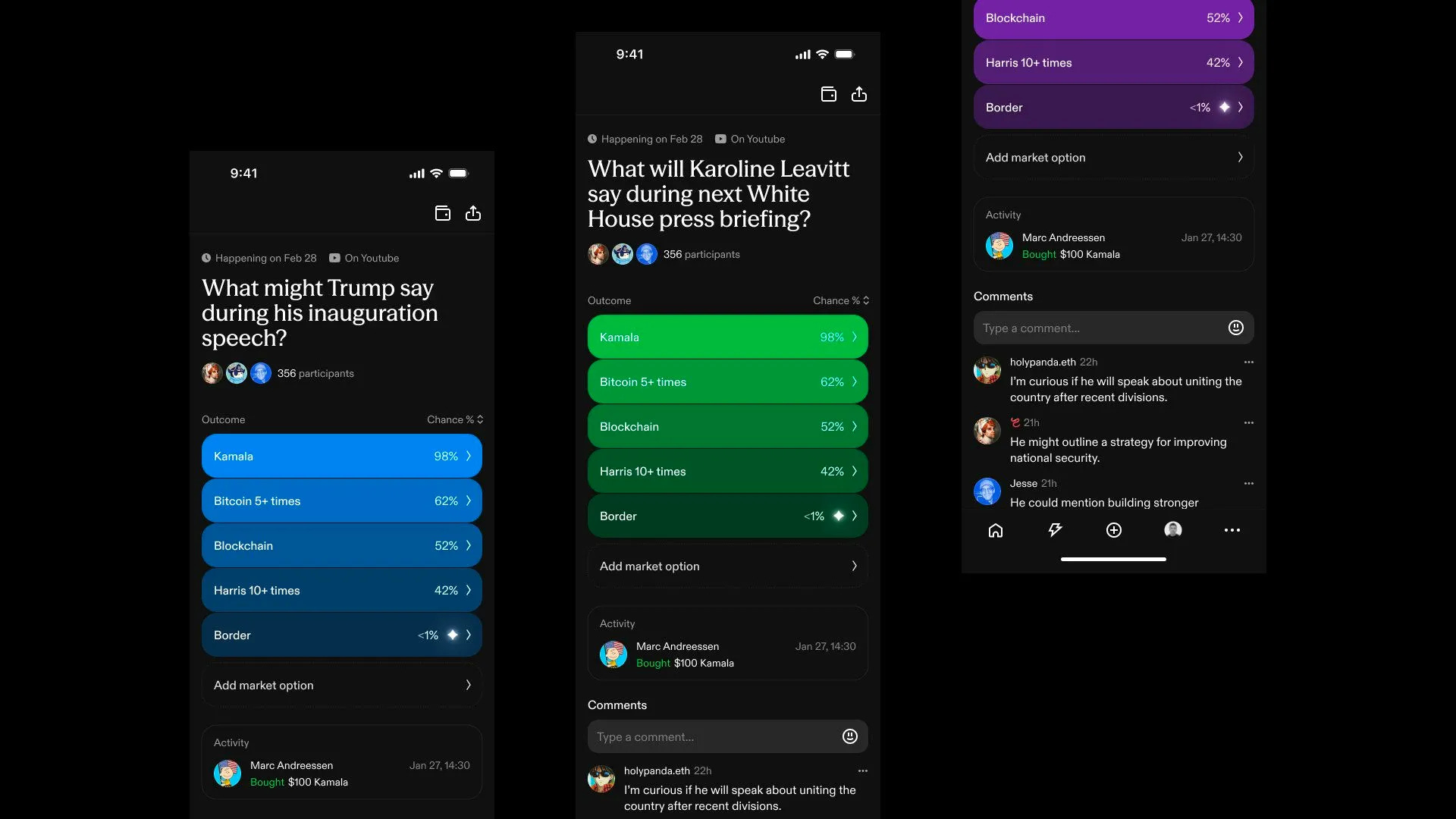
#5 — Prediction market dashboard by Muharrem
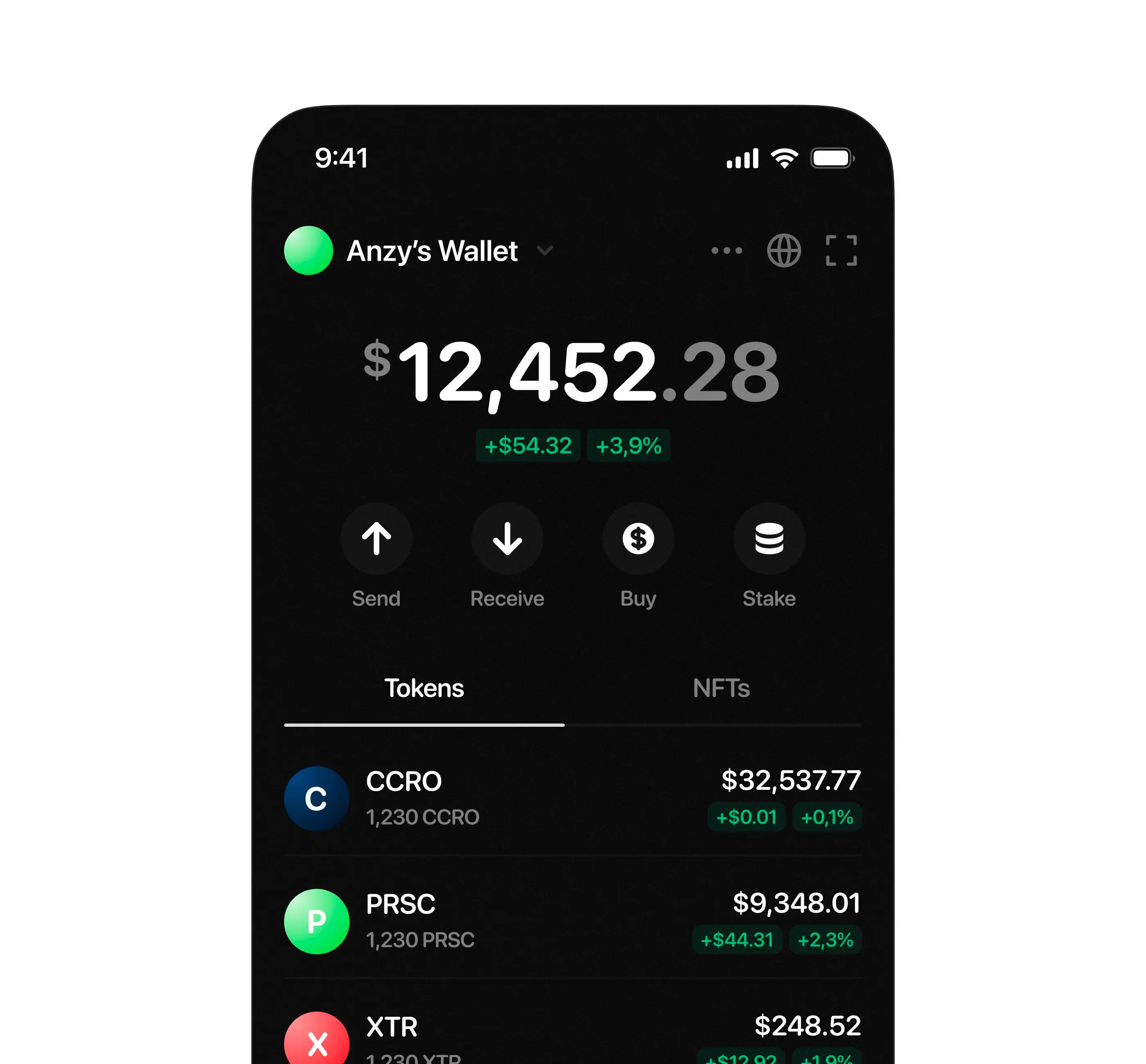
#6 — Crypto wallet dashboard by Anzor
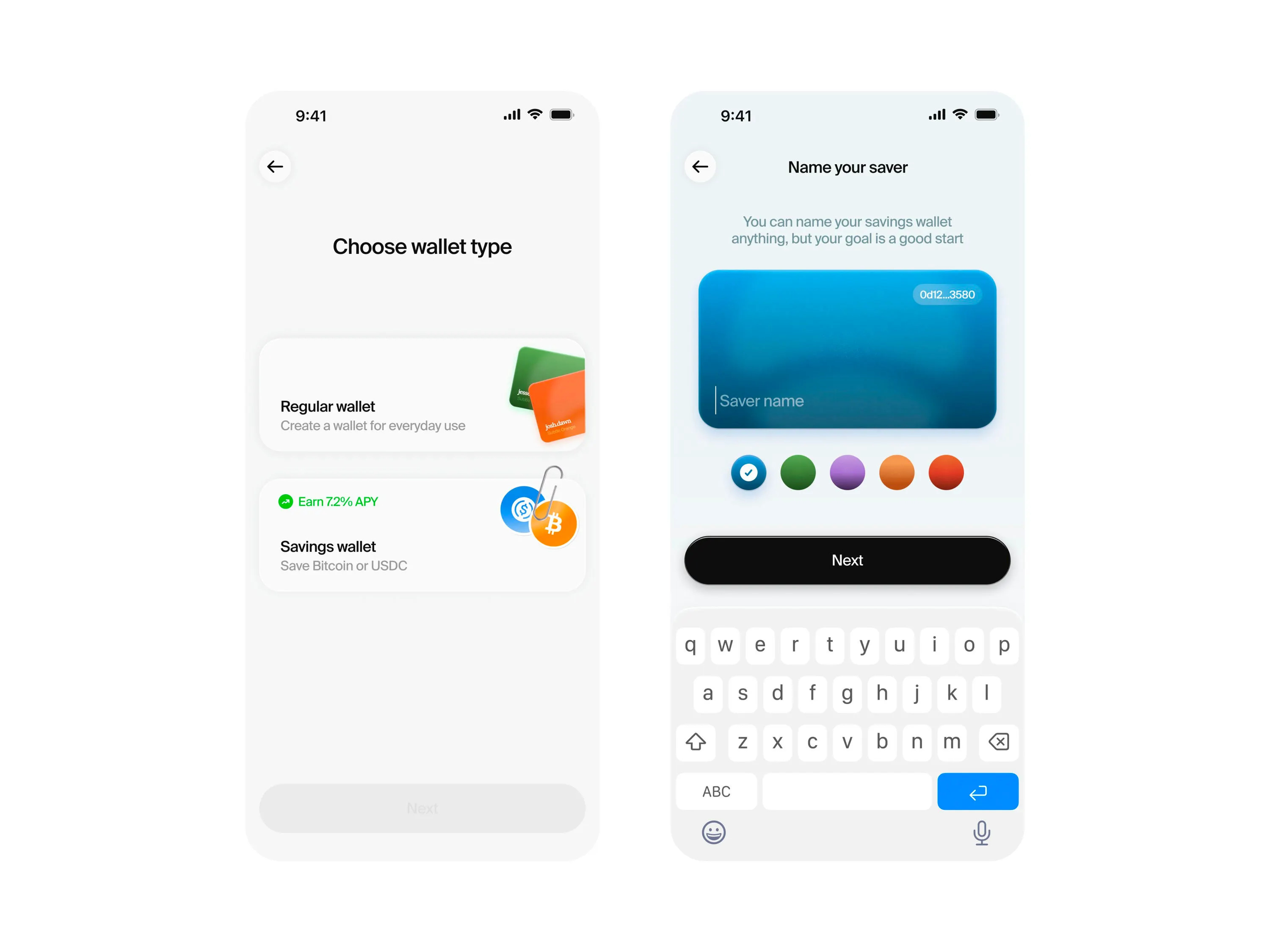
#7 — Wallet creation flow by Josh Grazier
That’s a wrap!
Congrats to Sajon, Geex Arts, and Ranjith on making the podium this week.
If you’re building mobile apps and any of this helped, share it with someone who ships. Follow the daily inspiration on X here, subscribe for the next drop, and tell me what you stole this week.
Want to be featured? Post great work and tag @handhelddesign, or submit directly here.
See you in the next issue.
Handheld is curated by me, Cam, a Product Designer specializing in mobile design. Follow me if you love mobile design as much as I do.