

This Is How Senior Designers Actually Use Colour (vs Juniors)
This week… gamified competition meets dark mode crypto, and earthy productivity proves minimalism doesn't mean boring.

Handhelders,
Every week I curate the 7 best mobile designs I come across and here we’re back with another week of rankings! Check out the full commentary on all the great work in the video above and written breakdown on the podium below.
🏆 The Podium
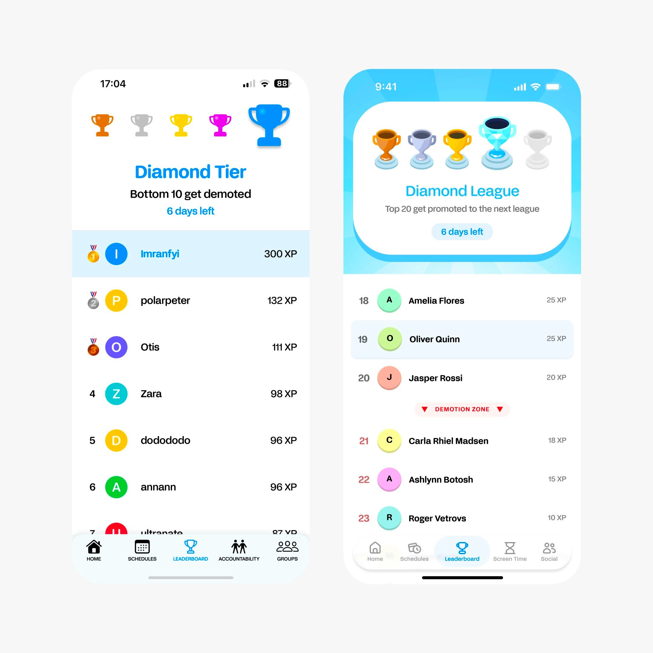
🥇 First Place — Gamified leaderboard tracker by Shane Levine
This is a before and after, and the entire philosophy changed. The old screen demotes the bottom 10 — Shane’s version promotes the top 20. Same mechanic, completely different emotional outcome. Colour earns its place here too; the trophy tiers use gold, silver, bronze with actual purpose, not decoration. If you’re building any kind of competitive feature, steal the reframe: make users want to climb, not afraid to fall.
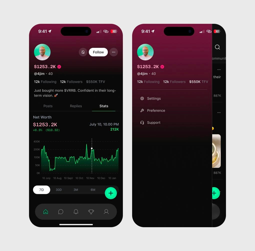
🥈 Second Place — Crypto portfolio dashboard by Jay Dwivedi
Dark mode in crypto isn't a style choice, it's a trust signal — and Jay leans into that deliberately. The dark canvas reads as serious and built for people who know what they're doing before you've clocked a single number. That red gradient glow in the background might be reacting to portfolio performance. If it is, and it glows red when you're down, that's a design decision I genuinely respect. Colour sets the tone before the data does — this is a good example of that.
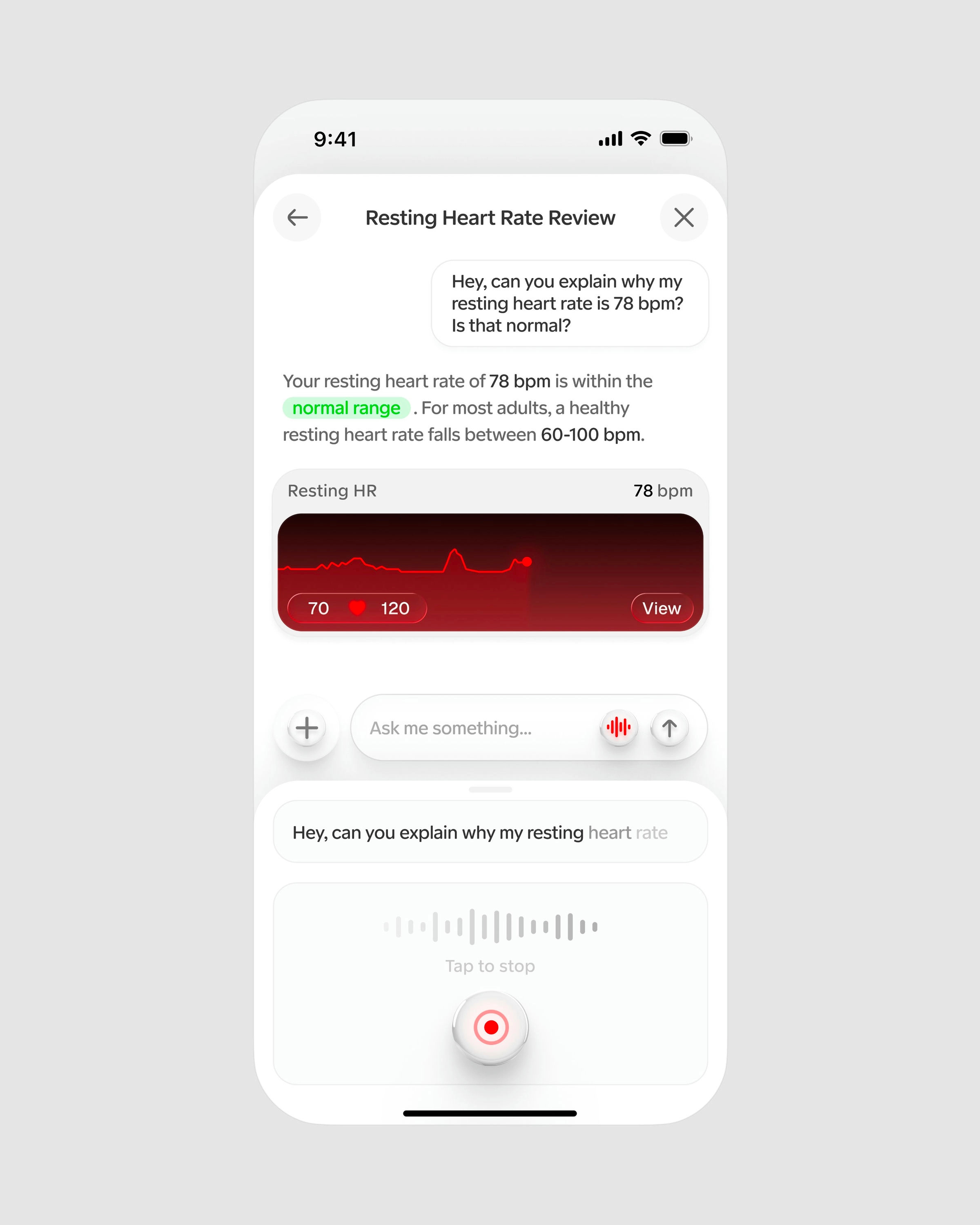
🥉 Third Place — Heart rate analysis by Studio Sphere
White doesn't mean boring. It means you borrowed trust from somewhere people already feel safe. Studio Sphere's health app pulls the same visual language as a doctor's office — clean, uncluttered, nothing competing for attention — so when your resting heart rate shows up, it actually feels like information worth paying attention to. The "normal range" tags inside the text blocks do a lot of quiet work. You're not just seeing a number, you're being told whether to worry about it. That's the whole job of a health interface.
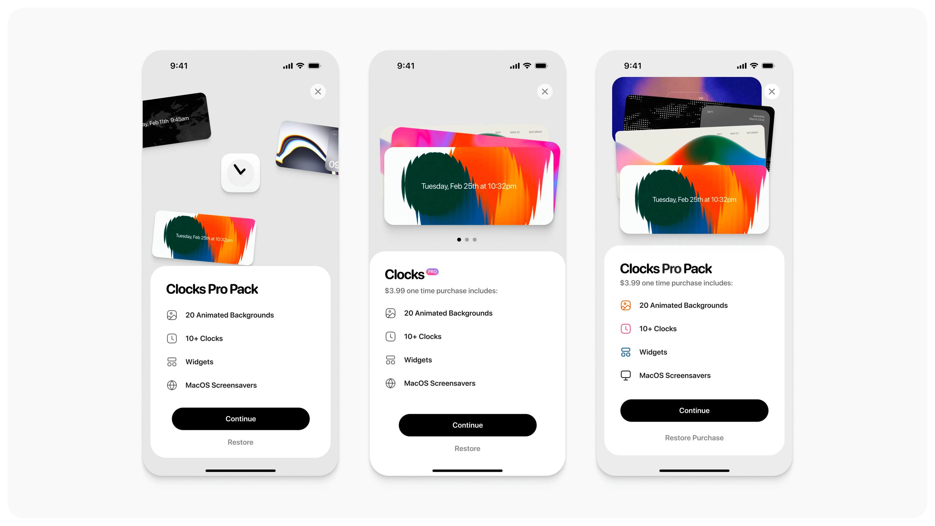
#4 — Vibrant clock customization by Daniel Destefanis
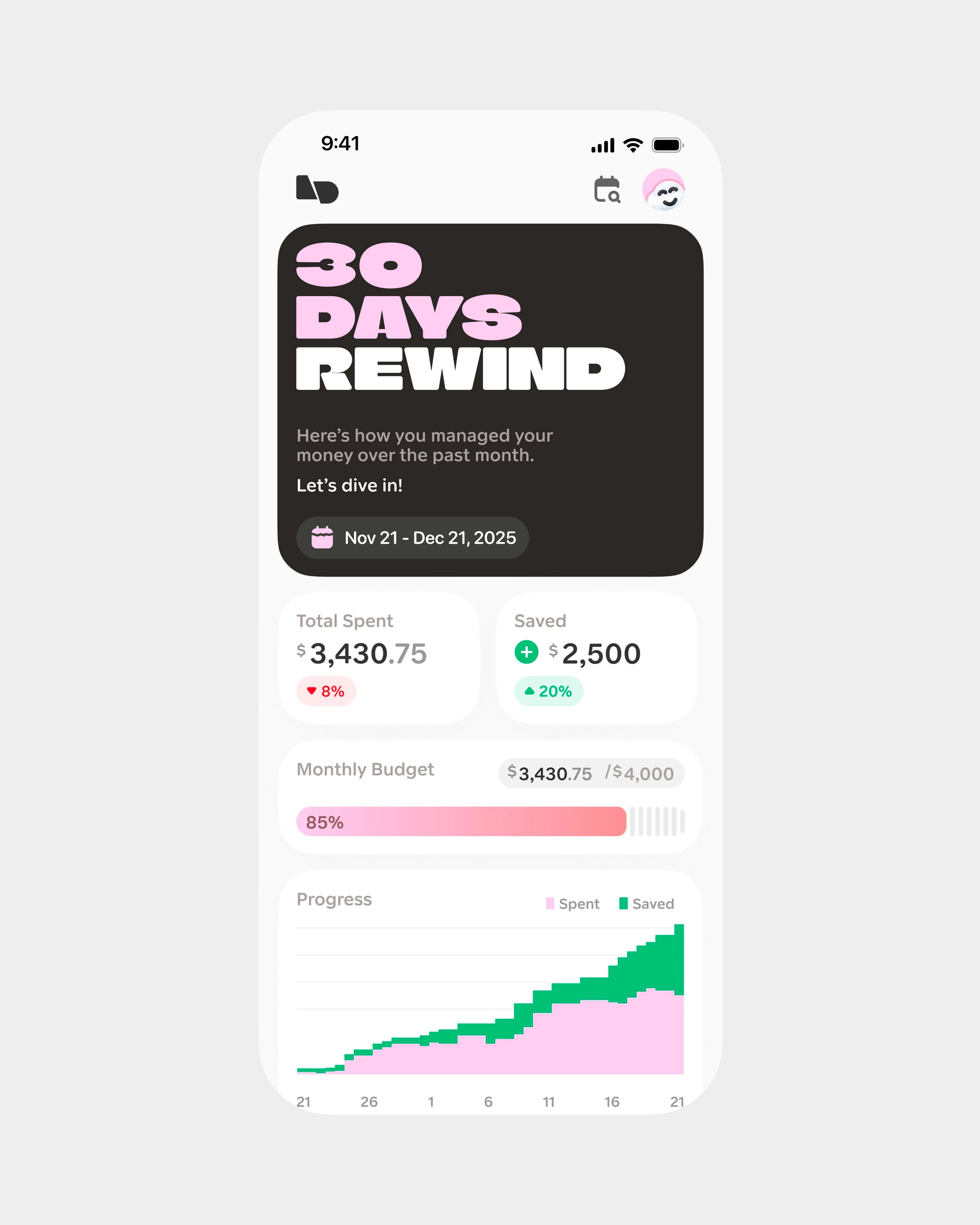
#5 — Monthly finance tracker by Studio Sphere
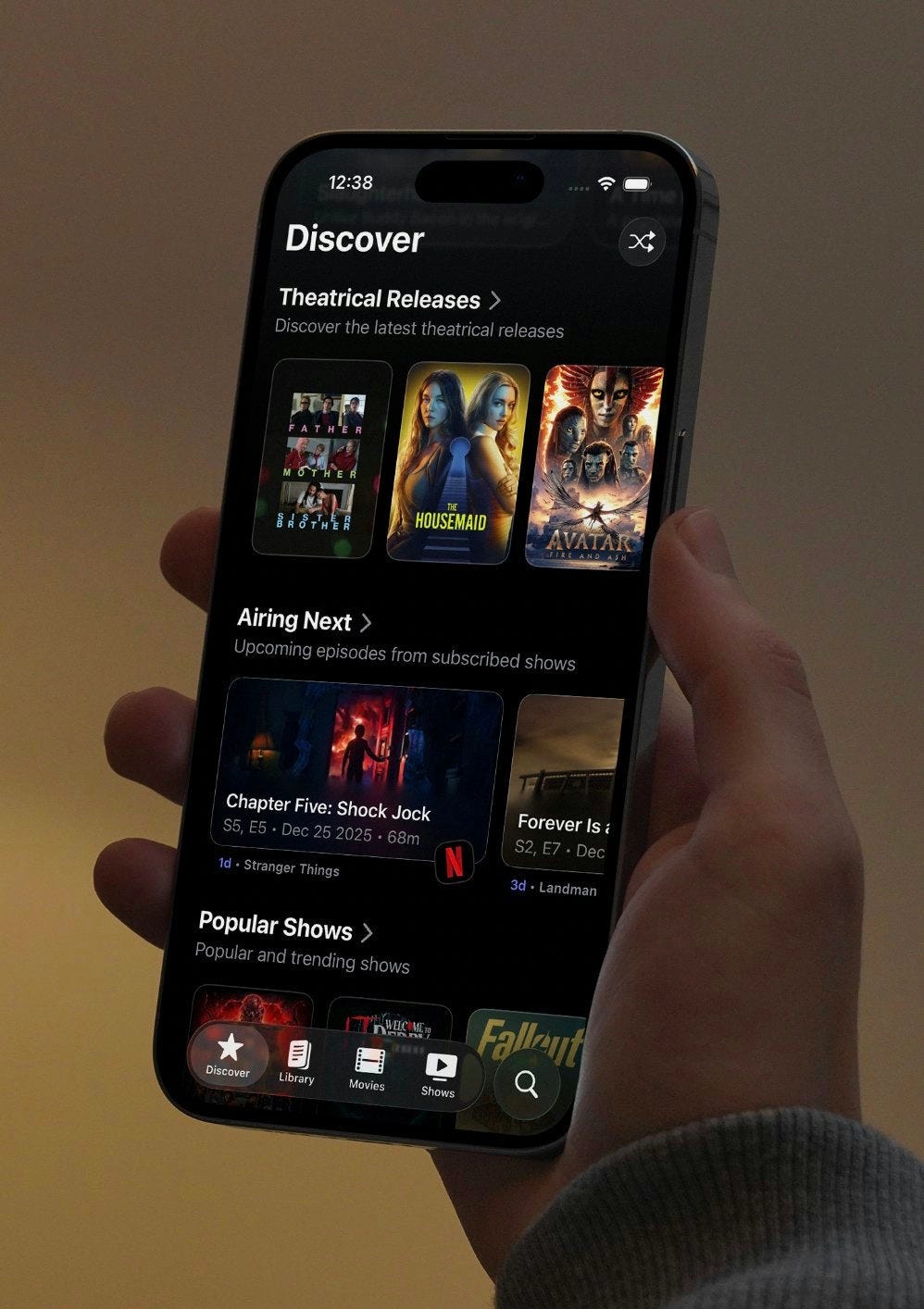
#6 — Entertainment discovery portal by Shihab Mehboob
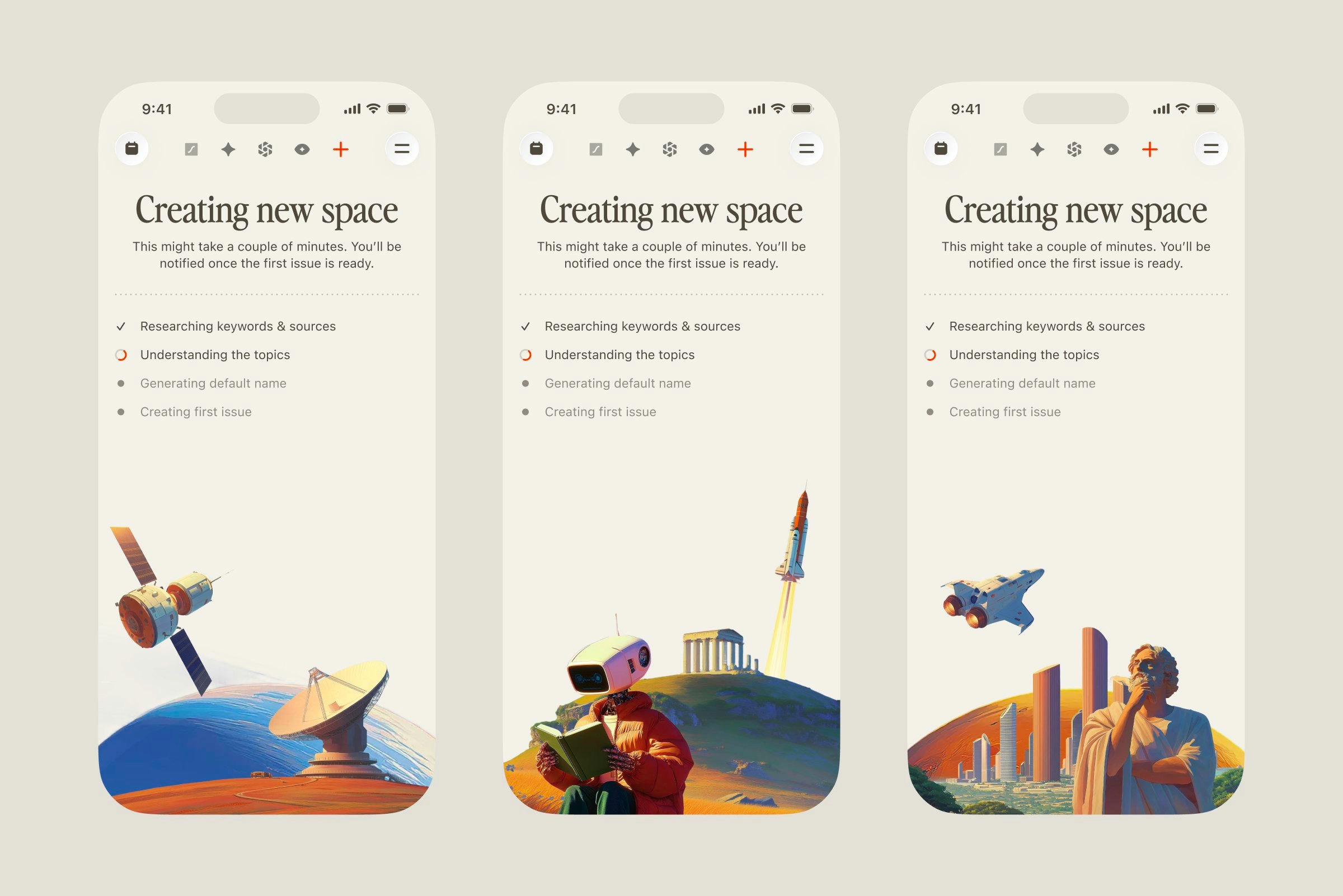
#7 — Space creation checklist by Roman Tesliuk
Watch the video above for full commentary on positions 4-7.
That’s a wrap!
Congrats to Shane Levine, Jay Dwivedi, and Studio Sphere on making the podium this week.
If you’re building mobile apps and any of this helped, share it with someone who ships. Follow the daily inspiration on X here, subscribe for the next drop, and tell me what you stole this week.
Want to be featured? Post great work and tag @handhelddesign, or submit directly here.
See you in the next issue.
Handheld is curated by me, Cam, a Product Designer specializing in mobile design. Follow me if you love mobile design as much as I do.
“Colour earns its place” is the line. Seniors use colour to signal hierarchy and emotion. Juniors use it to decorate. Big difference
You been spoiling us!!🔥🔥 love this weeks video and newsletter