

Built to Browse | Design Picks #32
A palette generator that makes output feel like interface, a recipe explorer with flawless hierarchy, and a fitness feed that mashes up Strava with Instagram.

Welcome back to Design Picks.
This week's top three all share a common thread — information architecture that makes dense content feel effortless.
Across all seven picks you'll find card layouts doing more than just containing content, accent colors pulling serious weight, and dark mode used with real intention. Plus, check the all-time Global Leaderboard at the bottom to see who's climbing the ranks.
Let's get into it.
Missed the last issue? Here's a quick look at Issue #31's picks.


#7 — Savings circle portal by Vicko
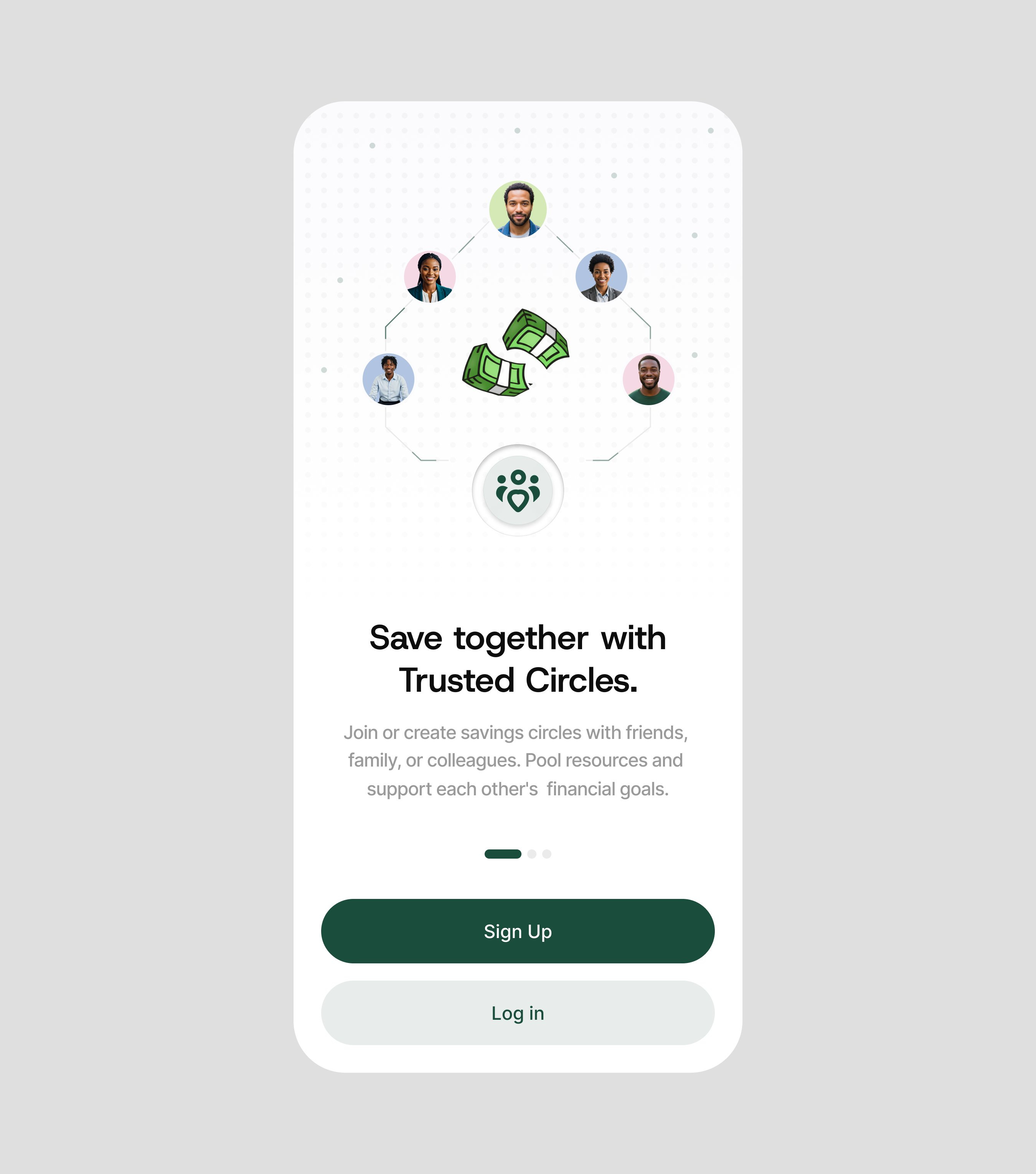
Clean and approachable in a way that most fintech apps struggle to pull off — the rounded corners, generous padding, and warm card layout make community savings feel like a group chat about money, not a banking app.
+1 point · View on X
#6 — Crisis management chat by Manneskja
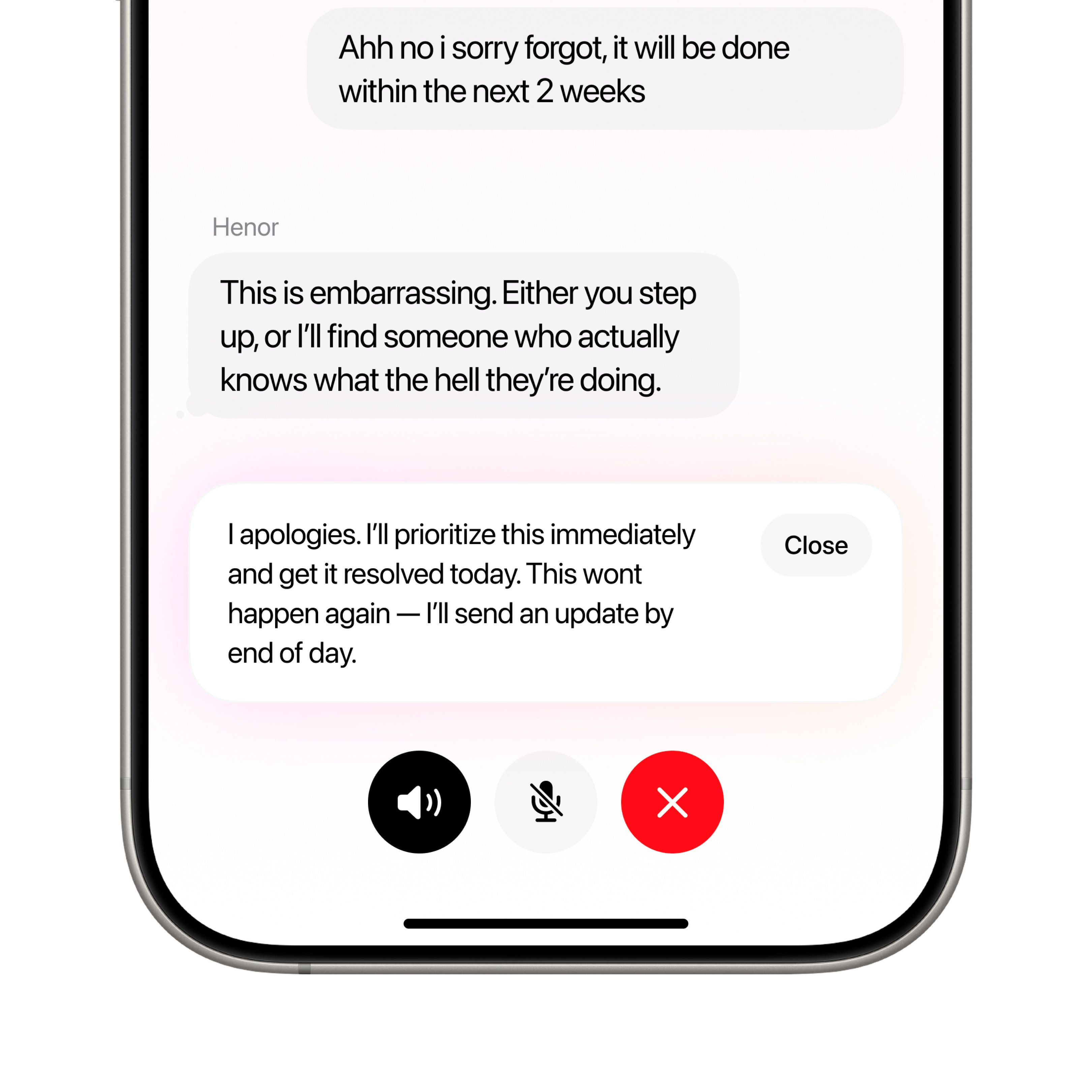
That subtle glow behind the message bubbles is the detail that elevates this from a competent chat UI to something special — it creates depth and visual hierarchy between active and read messages without adding any cognitive load.
+2 points · View on X
#5 — Flight booking interface by DesignBea
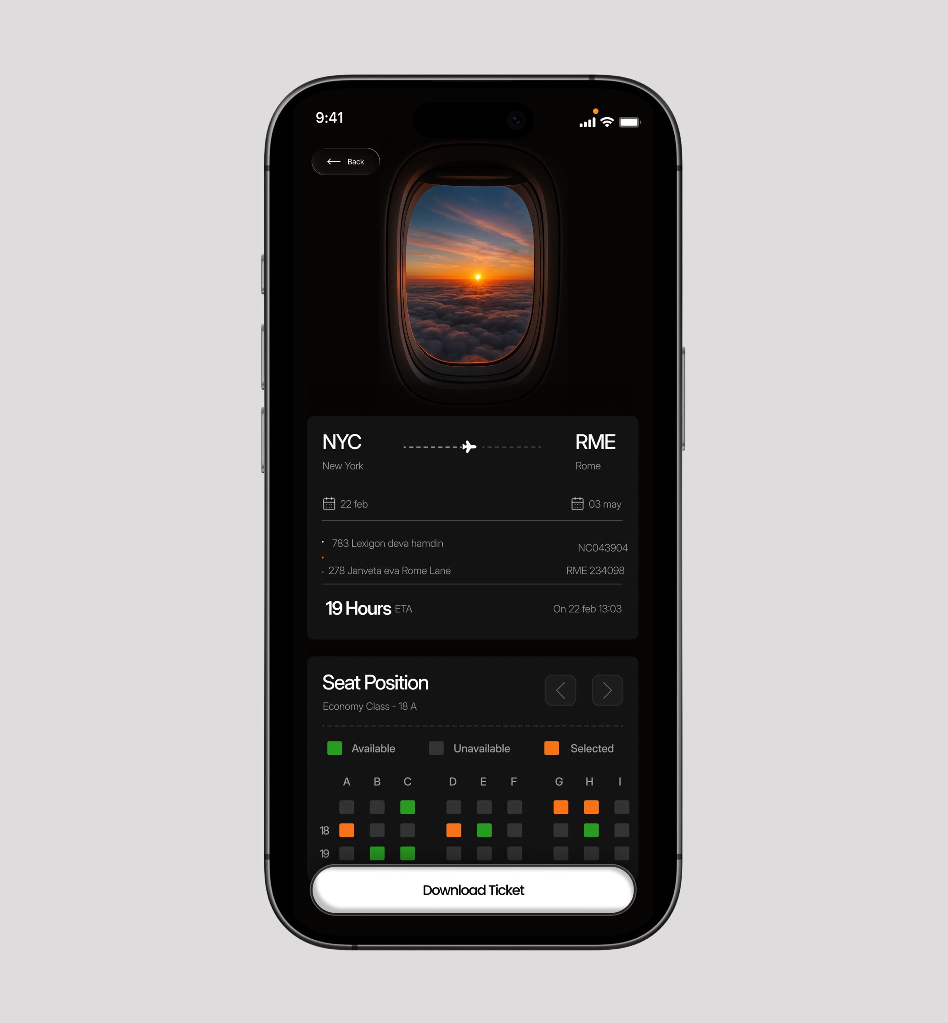
The airplane window illustration above the booking form adds a storytelling moment that most travel apps skip — it makes a transactional screen feel like the start of an adventure. The text spacing could use more breathing room, but the dark mode atmosphere and card-based booking flow show real potential.
+3 points · View on X
#4 — Health sync dashboard by Stephen
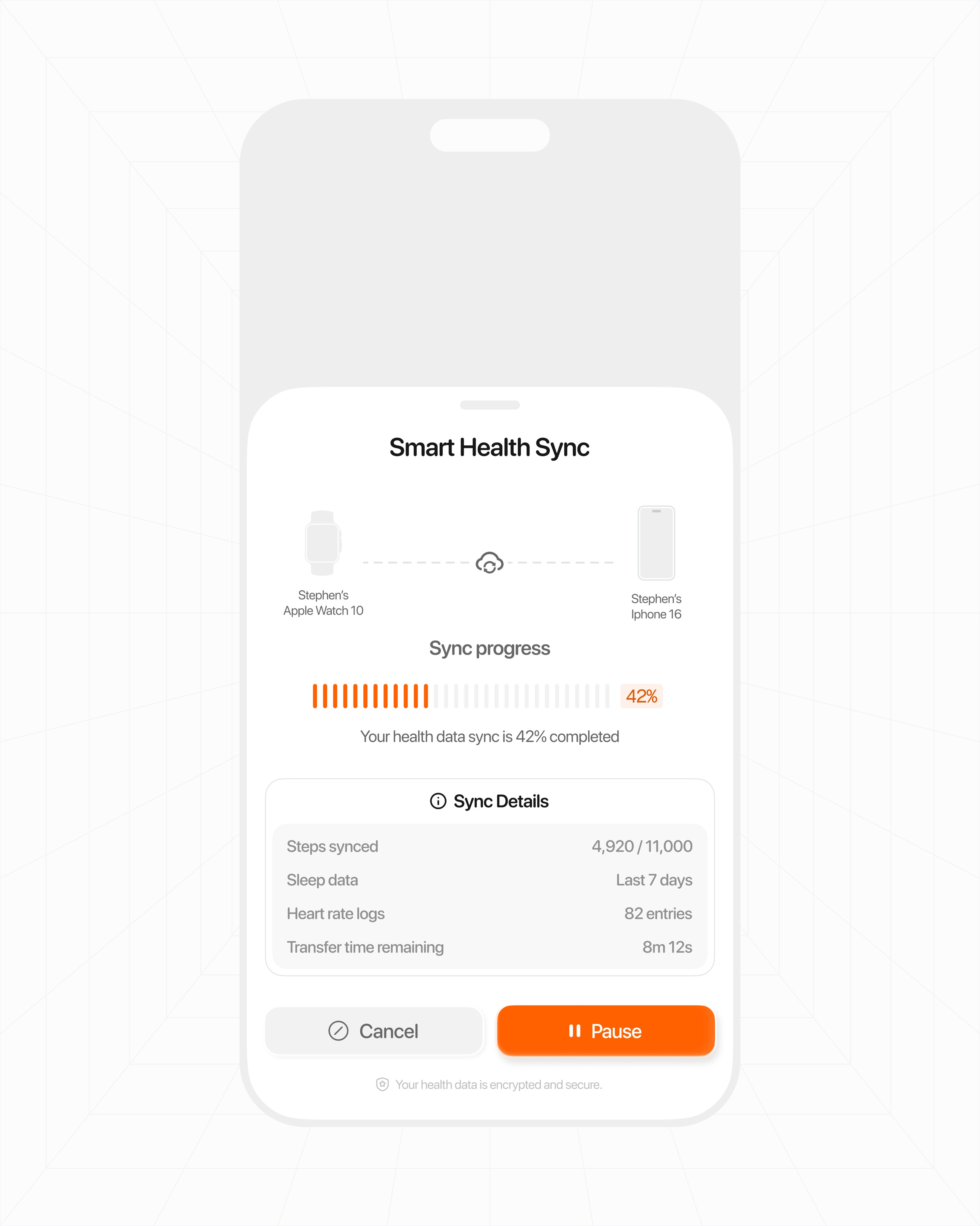
That accent orange is doing all the heavy lifting — against the clean white layout, it pulls your eye exactly to the interactive elements and status indicators that matter. A strong example of how a single accent color can replace complex visual hierarchy.
+4 points · View on X
#3 — Fitness lifestyle feed by Ayo
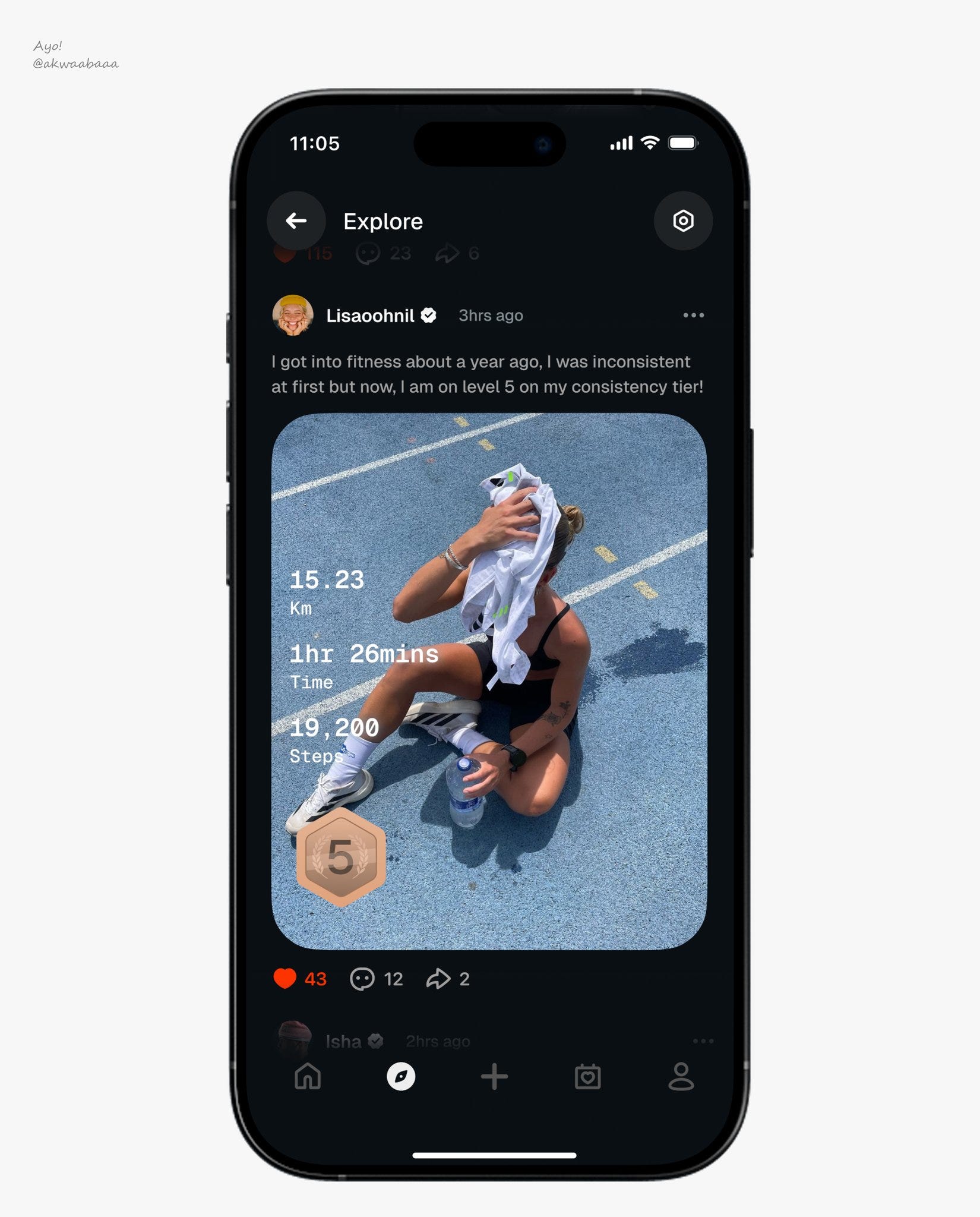
Ayo brings that Strava-style text overlay approach — the kind you see on workout summaries and Aura ring screenshots — and drops it straight into an Instagram-format feed. It's a smart collision of two familiar patterns that creates something genuinely fresh. The dark mode canvas makes every workout image and stat card punch harder than it would on white, and the social feed layout means users are scrolling through fitness content with the same muscle memory they use on Instagram. Steal this approach of borrowing data visualization conventions from one app category and embedding them into the content format of another — it's how you make a fitness feed feel premium instead of clinical. The density works here because it's all content the user opted into.
+5 points · View on X
#2 — Recipe explorer home by Goodness Okwudili
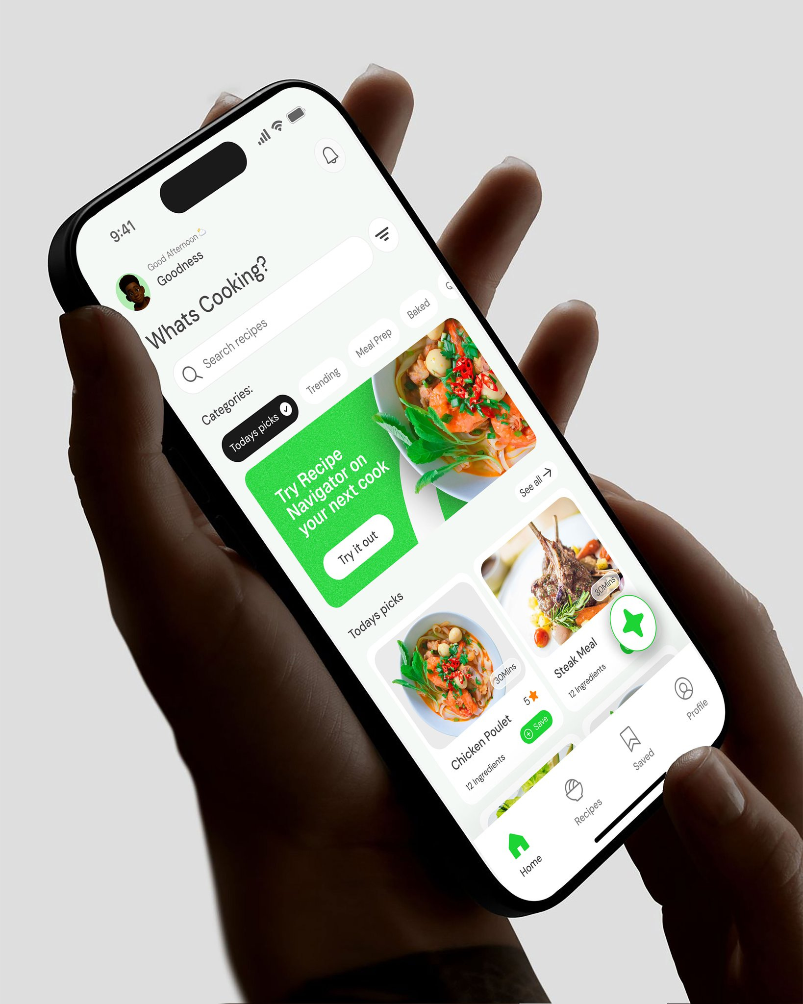
The information architecture on this recipe explorer is spot on. Goodness packs a lot into a single home screen — search bar, category tags, recipe cards with full-bleed photography — but nothing competes for attention because the hierarchy is doing all the work. The cards show just enough to make the decision to tap feel effortless: a vibrant food image, a title, and a whisper of metadata. That tag-based filtering system at the top is a smart move for a food app — it lets users narrow by cuisine or dietary need without ever leaving the screen they're already browsing. The whole thing reads like cooking should be fun, and the warm color palette against clean card backgrounds sells that feeling before you've even scrolled.
+7 points · View on X
#1 — Instant palette generator by mateja
Design of the Week
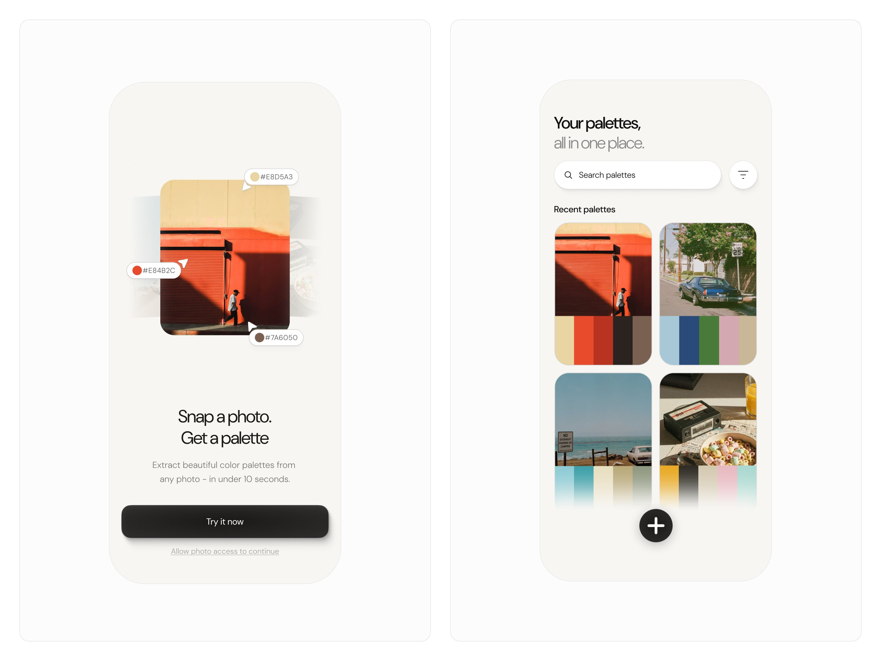
Mateja nails the one thing most creative tools get wrong — making the output feel like part of the interface, not a separate step. Look at those cards on the right: each one puts the source photograph up top with the extracted color palette sitting right beneath it in the same container, so the relationship between image and palette is instant. You don't have to toggle views or squint at hex codes in a sidebar — the data lives where your eyes already are. For an app that's going to be heavy on image content, this card structure is doing the heavy lifting of keeping things scannable without sacrificing the size of the imagery. The information architecture here is a quiet masterclass in segmenting data within a single component — and you can never get old with figuring out new ways to design cards and showcase information. Steal this technique of embedding extracted data directly below its source material inside the same card — it collapses a two-step cognitive process into a single glance, and it works for any feature where you're deriving something from visual input.
+10 points · View on X
📊 Leaderboard Update
This Week's Points
🏆 #1 — mateja (@uxmateja) · +10 pts
🥈 #2 — Goodness Okwudili (@king_goodness) · +7 pts
🥉 #3 — Ayo (@akwaabaaa) · +5 pts
#4 — Stephen (@srotimi_ui) · +4 pts
#5 — DesignBea (@Ui_meesha) · +3 pts
#6 — Manneskja (@StudioManneskja) · +2 pts
#7 — Vicko (@uiuxbyvicko) · +1 pt
Global Leaderboard — Top 15
Studio Sphere continues to lead the pack at 100 pts— nearly double second place, with 16 features and 3 Design of the Week wins. Ranjith holds steady at 42, and Stats Studio rounds out the top 3 at 29. This week all seven designers are brand new entries on the leaderboard — mateja makes the strongest debut, going straight to Design of the Week on their very first feature.
🥇Studio Sphere(@0xSphere) · 100 pts · 16 features · 3 wins
🥈Ranjith(@align_all) · 42 pts · 7 features · 2 wins
🥉Stats Studio(@statsdesign) · 29 pts · 4 features · 2 wins
4.Marco Cornacchia (@marcofyi) · 24 pts · 5 features · 1 win
5.Steve Lauda (@stevelauda_) · 21 pts · 4 features · 1 win
6.Abati Samuel (@AbatiSamuel) · 20 pts · 5 features
7.Sajon (@sajon_co) · 20 pts · 5 features · 1 win
8.Dimitar (@dimitroweb) · 18 pts · 3 features · 1 win
9.Yaroslav (@yaroslavhorbach) · 17 pts · 3 features
10.Nachi (@nachiiiUI) · 16 pts · 3 features · 1 win
11.Josh Grazier (@_joshrg) · 15 pts · 4 features
12.Outpace Studios (@outpacestudios) · 15 pts · 2 features · 1 win
13.Batuhan (@batukrskl) · 15 pts · 2 features
14.Paul Elite (@elitethedev) · 4 pts · 3 features
15.Vlad (@shapeofvale_xyz) · 14 pts · 2 features · 1 win
How did this week's picks land?
Enjoyed this week's edition? Forward it to someone who ships mobile apps. Have a design I should feature? Tag @handhelddesign or hit reply.
Congrats to mateja, Goodness Okwudili, and Ayo on making the podium this week.
If you’re building mobile apps and any of this helped, share it with someone who ships. Follow the daily inspiration on X here, subscribe for the next drop, and tell me what you stole this week.
Want to be featured? Post great work and tag @handhelddesign, or submit directly here.
See you in the next issue.
About Handheld
Handheld is a weekly breakdown of the best mobile design work shared on X. Every issue is handpicked, ranked, and pulled apart so you walk away with techniques you can actually use in your next project.
Curated by Cam, a Product Designer who spends too much time looking at other people's apps.