

Colour, Craft & Catharsis | Design Picks #33
A card collector that builds its colour system from a single illustration, plus a lava-lamp map navigator and a journal where you burn your entries.

Welcome back to Design Picks.
This week's top three all share a common thread — design that makes you feel something before you even interact with it.
Across all seven picks you'll find liquid glass textures, colour systems derived from content, destructive gestures used for emotional release, and dark mode executed with real craft. Plus, check the all-time Global Leaderboard at the bottom to see who's climbing the ranks.
Let's get into it.
Missed the last issue? Here's a quick look at Issue #32's picks.
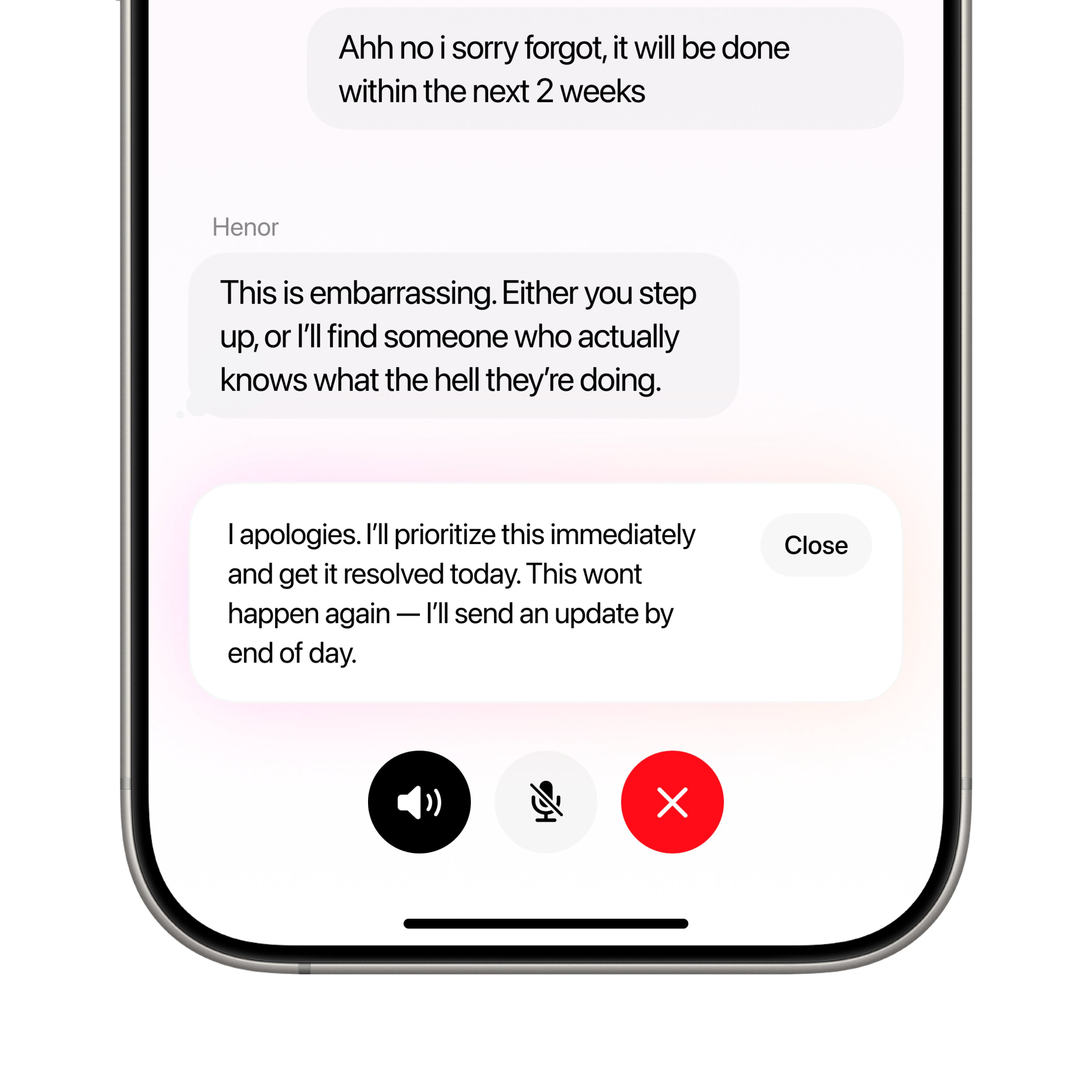
#7 — Skin diagnosis interface by Henor Kelmendi
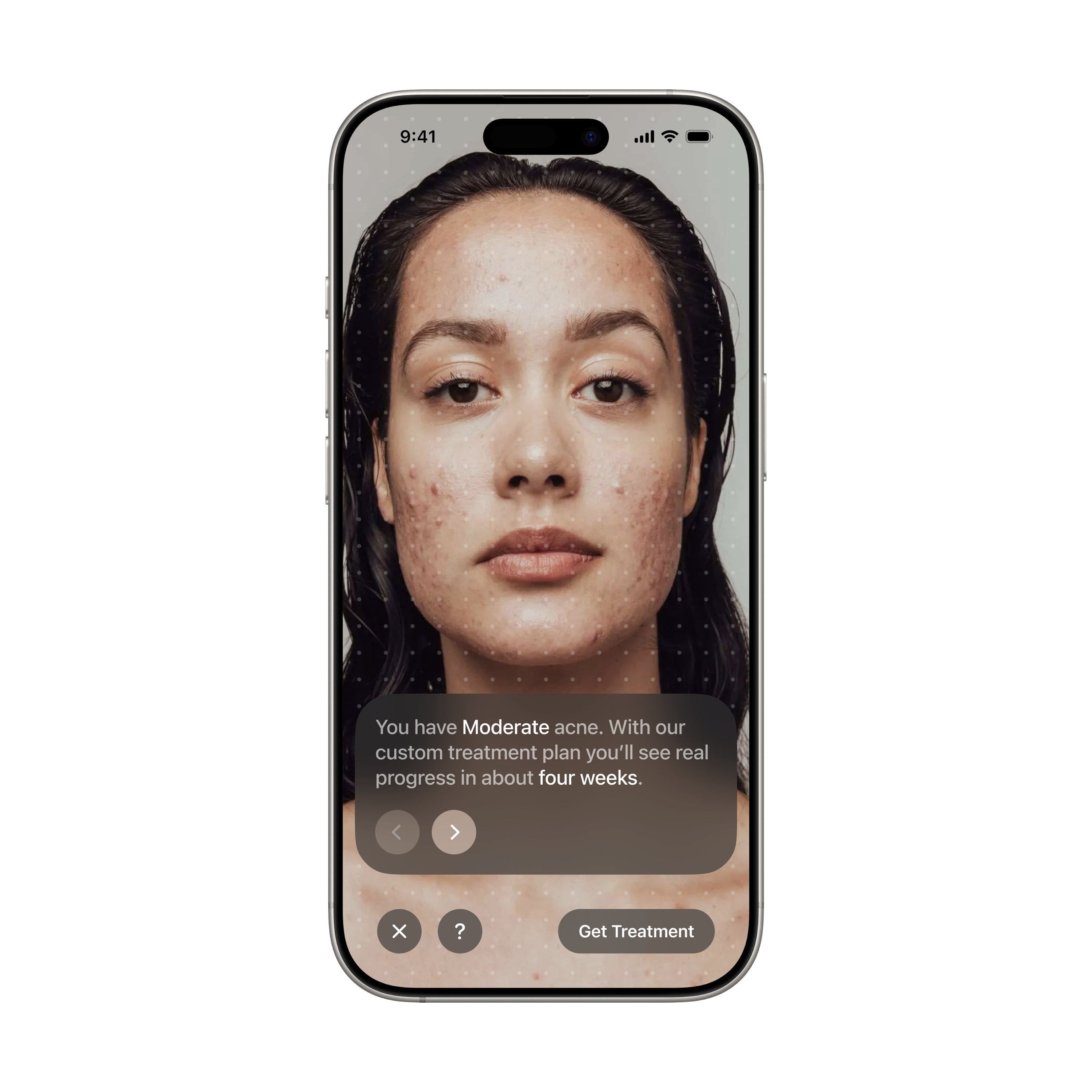
The scanning dots that simulate real-time analysis bridge the gap between submitting a photo and getting results, making the AI processing step feel visible and trustworthy — a clean, restrained interface that builds trust through what it doesn't do.
+1 point · View on X
#6 — Crypto sentiment pulse by Outpace Studios
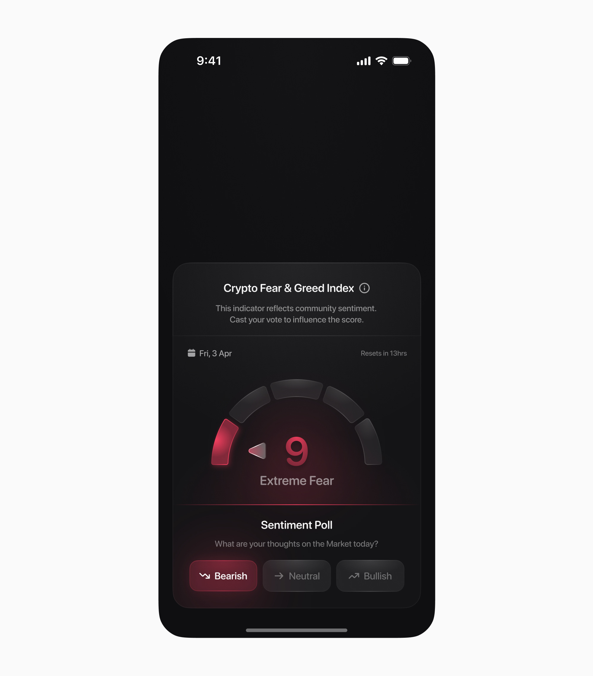
The sheer craft here — gradient colours, light speckles emulating liquid glass — turns a standard sentiment dashboard into something crypto users will actually screenshot and share, because the design itself becomes the content.
+2 points · View on X
#5 — Text analysis dashboard by Seif Abdelaziz
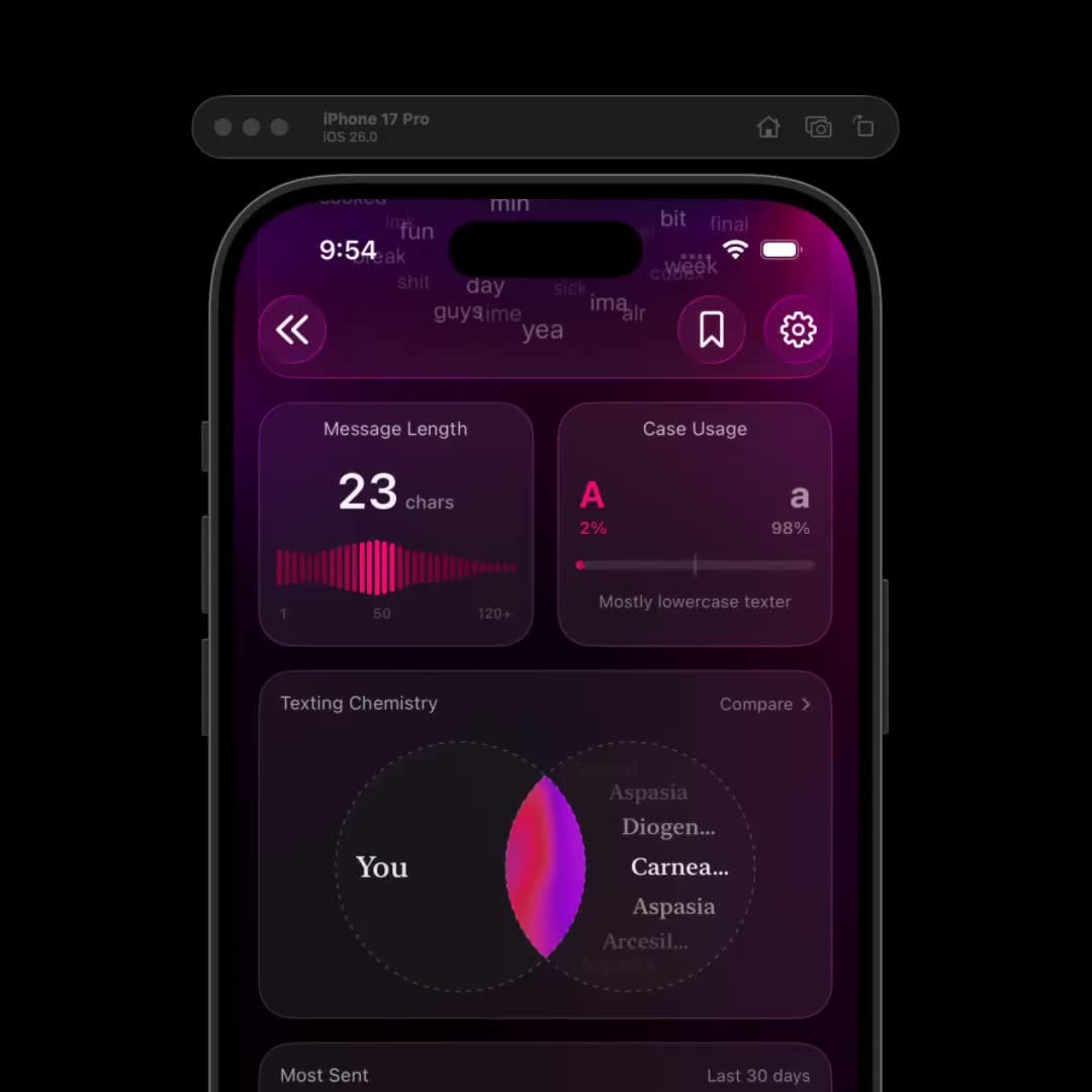
The vibrant colours against those liquid glass card backgrounds make this dashboard feel exciting rather than overwhelming — the dark mode canvas acts as a theater for the chart colors, and every element earns its place in the analytical narrative.
+3 points · View on X
#4 — Bubble pop game by daily wabi
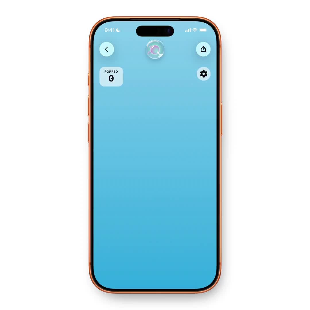
Wabi's micro-app concept is catching fire in mobile design, and this bubble popper shows even fun experiments get polished execution. But the real standout is the settings page — the toggle layout and colour usage serve as a reference for anyone whose app needs a clean, standout preferences sheet.
+4 points · View on X
#3 — Thought journal carousel by Ed 🥉
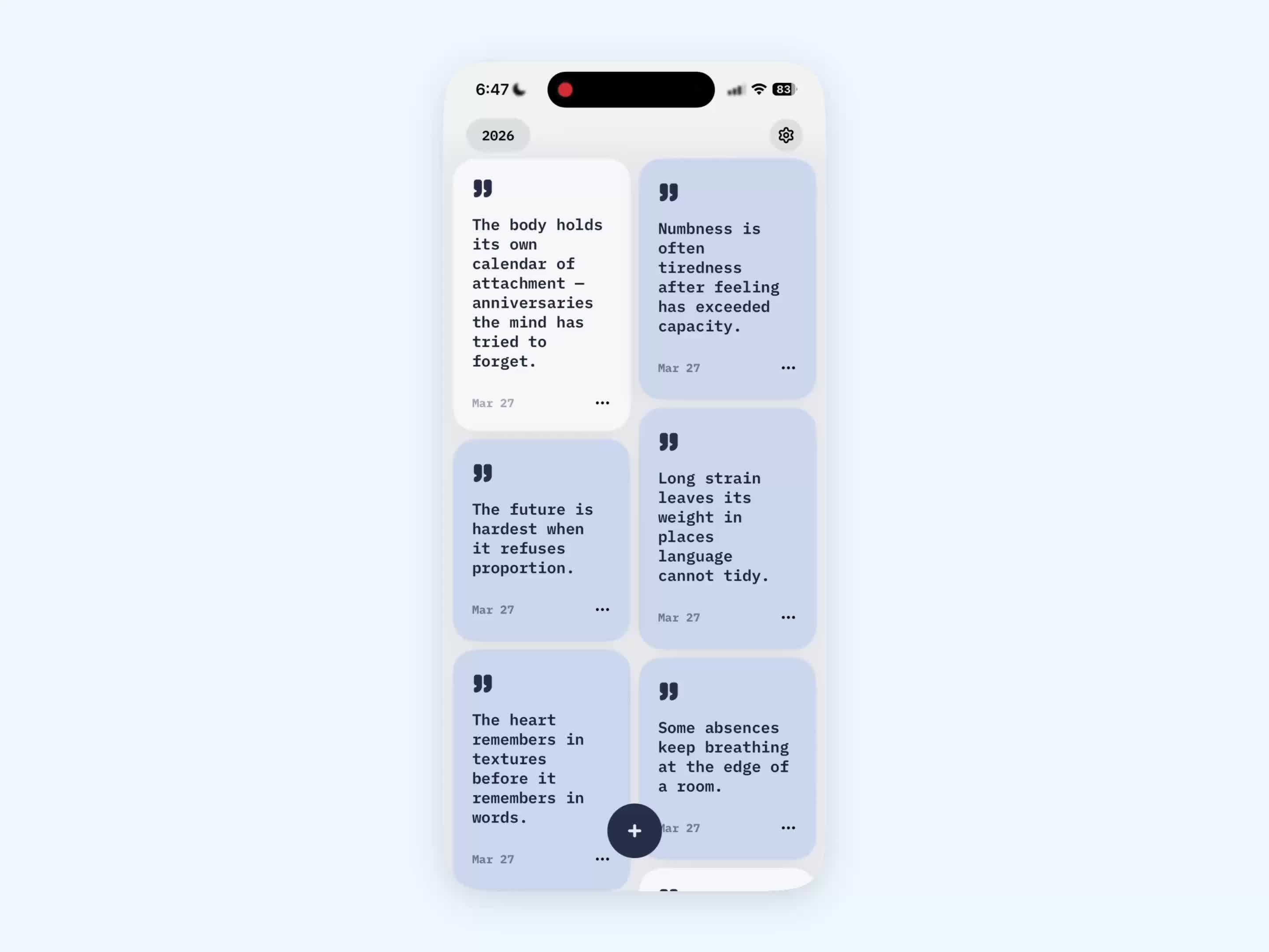
The burn interaction here is genuinely novel — it adds emotional catharsis to the journaling process, turning what could be a passive reading experience into something tactile and deeply satisfying. The calm card carousel with cool tones creates exactly the right headspace for daily reflection, and each entry sitting in isolation means you're never overwhelmed by a wall of past thoughts. The minimalist treatment reinforces the reflective mood without making the app feel sterile — there's warmth in the simplicity. The card-based navigation is psychologically smart for a product designed around daily emotional processing, because temporal separation between entries prevents the anxiety of seeing everything at once. Steal this approach of using destructive gestures as emotional release mechanisms — the burn interaction gives users agency over their own thoughts in a way that typing "delete" never could, and it's a pattern that could work in any app where users need to let go of something.
+5 points · View on X
#2 — Nightlife navigator by Daybreak 🥈
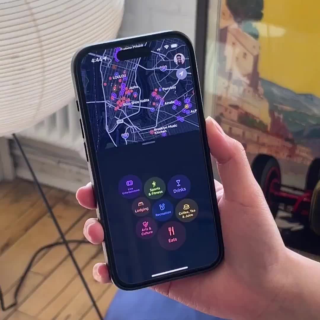
This moving orb style that feels like a lava lamp — fluid, organic, almost alive — is a completely distinct approach to map-based navigation. Rather than conventional static pins that feel clinical, this organic movement creates an emotional connection to the exploration process that no other nightlife app is doing right now. The dark mode canvas with vibrant accents matches the energy of going out at night perfectly, and the bold typography paired with an interactive list overlay gives users two ways to browse venues without switching contexts. The fluid motion design is the standout here — the visual language matches the content domain so well that the map interface pulses with the energy you'd expect from nightlife discovery. This is what happens when a designer actually thinks about how the interface should feel, not just how it should look.
+7 points · View on X
#1 — Card collector showcase by Rehan Ahmed 🏆
Design of the Week
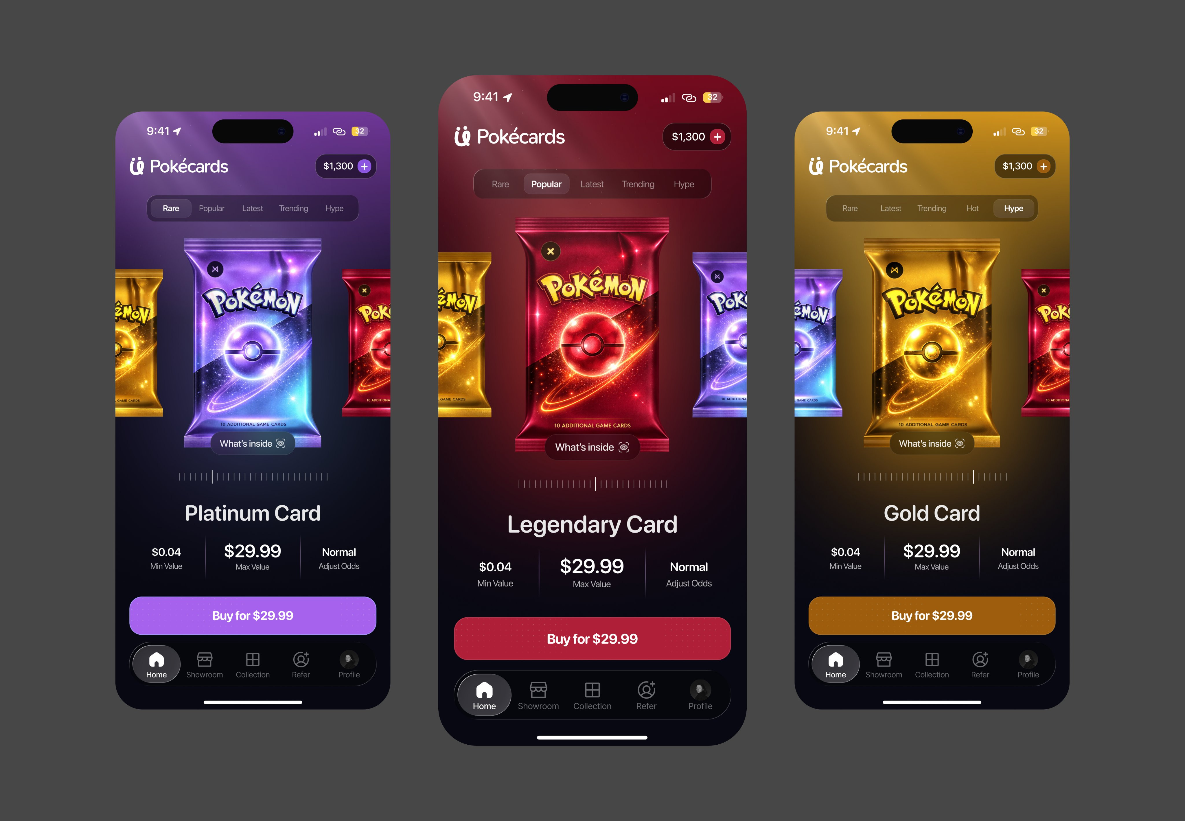
If you're looking for bright, attractive designs, it doesn't get better than this. The featured card — a character illustration that commands centre stage — becomes the gravitational centre of the entire screen's design system. Every button colour, every gradient in the background, all derived from the card's palette, creating a cohesive visual environment that shifts as users browse different cards. It's a collector experience that treats digital cards with the same reverence a luxury retailer gives a handbag, and the vibrant palette makes browsing feel like exploring a treasure chest rather than scrolling a marketplace. The e-commerce layout adapted for a collector showcase is smart — detailed complexity is justified here because collectors want to linger and appreciate every detail. Steal this technique of deriving your entire screen's colour system from a single hero content element — it creates a world around each piece of content that makes users feel immersed, and it works anywhere you've got featured imagery that dictates mood.
+10 points · View on X
📊 Leaderboard
Every design featured in Design Picks earns points based on where it lands — 10 for #1, 7 for #2, 5 for #3, then 4, 3, 2, and 1. Those points accumulate across every issue, building an all-time leaderboard that tracks who's consistently producing the best mobile design work on X. Think of it as the ranking system behind the rankings.
This Week's Points
🏆 #1 — Rehan Ahmed (@rehanxahmed) · +10 pts
🥈 #2 — Daybreak (@madebydaybreak) · +7 pts
🥉 #3 — Ed (@trpfsu) · +5 pts
#4 — daily wabi (@dailywabi) · +4 pts
#5 — Seif Abdelaziz (@sabziz) · +3 pts
#6 — Outpace Studios (@outpacestudios) · +2 pts
#7 — Henor Kelmendi (@Henorkelmendi) · +1 pt
Global Leaderboard — Top 15
Studio Sphere continues to dominate at 100 points — nearly double second place. Outpace Studios climbs to 17 with their third feature, while Rehan Ahmed and five other designers make their debut this week.
🥇 Studio Sphere (@0xSphere) · 100 pts · 16 features · 3 wins
🥈 Ranjith (@align_all) · 42 pts · 7 features · 2 wins
🥉 Stats Studio (@statsdesign) · 29 pts · 4 features · 2 wins
4. Marco Cornacchia (@marcofyi) · 24 pts · 5 features · 1 win
5. Steve Lauda (@stevelauda_) · 21 pts · 4 features · 1 win
6. Sajon (@sajon_co) · 20 pts · 5 features · 1 win
7. Abati Samuel (@AbatiSamuel) · 20 pts · 5 features
8. Dimitar (@dimitroweb) · 18 pts · 3 features · 1 win
9. Outpace Studios (@outpacestudios) · 17 pts · 3 features · 1 win
10. Yaroslav (@yaroslavhorbach) · 17 pts · 3 features
11. Nachi (@nachiiiUI) · 16 pts · 3 features · 1 win
12. Josh Grazier (@_joshrg) · 15 pts · 4 features
13. Batuhan (@batukrskl) · 15 pts · 2 features
14. Paul Elite (@elitethedev) · 14 pts · 3 features
15. Vlad (@shapeofvale_xyz) · 14 pts · 2 features · 1 win
How did this week's picks land?
Enjoyed this week's edition? Forward it to someone who ships mobile apps. Have a design I should feature? Tag @handhelddesign or hit reply.
Congrats to Rehan Ahmed, Daybreak, and Ed on making the podium this week.
If you're building mobile apps and any of this helped, share it with someone who ships. Follow the daily inspiration on X here, subscribe for the next drop, and tell me what you stole this week.
Want to be featured? Post great work and tag @handhelddesign, or submit directly here.
See you in the next issue.
About Handheld
Handheld is a weekly breakdown of the best mobile design work shared on X. Every issue is handpicked, ranked, and pulled apart so you walk away with techniques you can actually use in your next project.
Curated by Cam, a Product Designer who spends too much time looking at other people's apps.