

WE'RE NOW ON VIDEO! | Handheld Design Picks #21
This week… a Web3 onboarding flow that's full of fun and a logistics dashboard that makes complex data actually make sense.

Handhelders,
Firstly, Happy New Year 🎉
Hope you all had a great break and ready to get back to it. Before we get into the designs, I have a few updates to share…
We’re now on Youtube!
I’ve added video to the mix so you can actually see these designs in action, not just read about them. Mobile design is meant to be experienced, and honestly, trying to capture what makes a design work through text alone doesn’t always cut it. So now you get both: the full video breakdown above with all 7 designs, and the written commentary down here for the top 3.
I’m testing this format to see what works best for you. The goal is simple: showcase incredible mobile designers and their work in a way that actually helps you level up your own projects. Whether that’s through video, written breakdowns, or a mix of both — I want to know what’s useful.
So after you check out this week’s picks, hit reply and let me know:
Do you prefer video, written, or both?
What would make these breakdowns more valuable for you?
Anything you’d like to see more (or less) of?
This is for you, so your feedback shapes where this goes. Now let’s get into the work.
🏆 The Podium
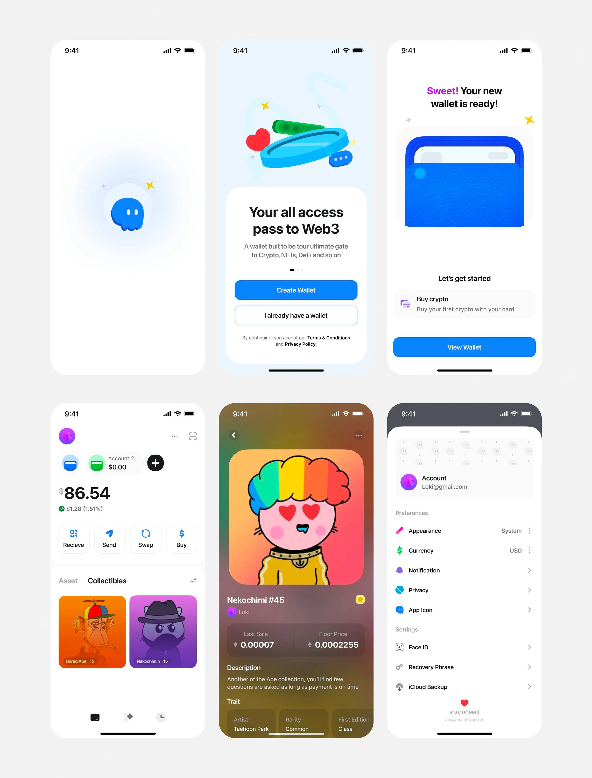
🥇 First Place — Web3 wallet journey by Stats Studio
Stats Studio nails the hardest part of crypto UX — making Web3 approachable. The soft rounded icons, generous border radiuses, and strategic use of color create a playful, welcoming experience that makes wallet creation feel simple instead of intimidating. What I would steal is: how every visual choice; from rounded text to soft icon treatments, compounds into an experience that doubles down on fun and simplicity. It's proof that thoughtful design characteristics can transform how users interact with complex products.
💬 From the Designer
On the Ghost crypto wallet project:
Ghost crypto wallet is an end-to-end modern cryptocurrency wallet designed to provide users with a seamless, secure & friendly way to manage digital assets.
On balancing information without overwhelming users:
“To balance information without overwhelming users, the design relies heavily on progressive disclosure. Instead of presenting all crypto concepts upfront, the onboarding flow introduces information gradually, only when it becomes relevant to the user’s current step.
Early screens focus on simple actions like creating or importing a wallet, using friendly visuals, minimal copy, and clear hierarchy. More complex concepts, such as recovery phrases, gas fees, or multi-network support, are introduced later with contextual guidance.
This approach helps beginners feel guided rather than instructed, while still ensuring power users can quickly access advanced functionality once onboarding is complete.”
On building trust through design:
“Trust was fundamental to the system design, achieved through clarity, consistency, and transparency, especially in high-stakes asset management.
Visual consistency across UI elements reinforces reliability. Clean typography, generous spacing, and a calm color palette create a professional feel without appearing sterile. Iconography and micro-interactions signal system feedback clearly (e.g., confirmation states, transaction progress).
Critical actions like sending funds or backing up recovery phrases are presented with extra friction—intentional confirmations, warnings, or multi-step flows—to prevent user error. Transparency around gas fees, transaction status, and wallet security settings builds confidence that the system isn’t hiding anything from the user.”
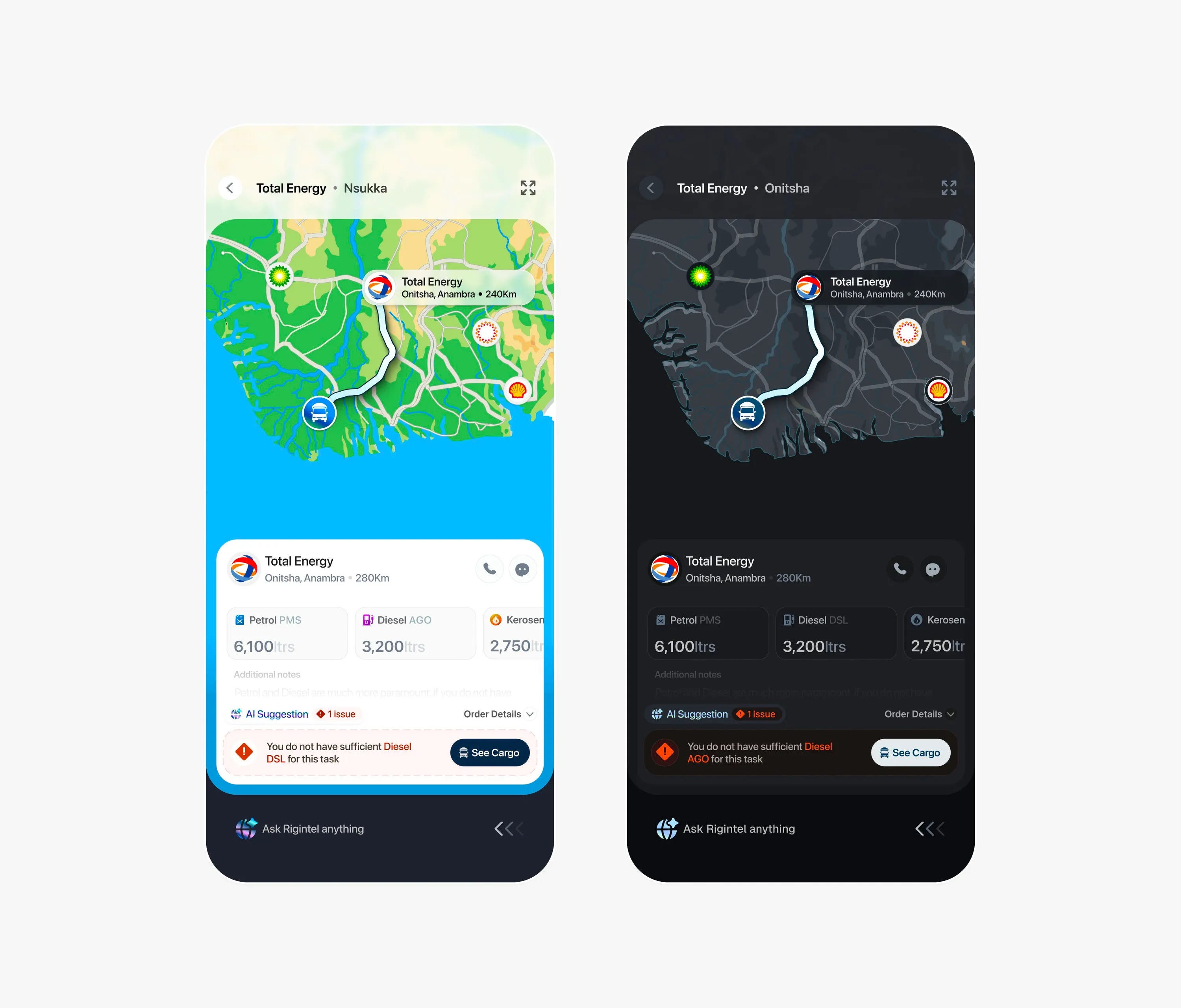
🥈 Second Place — Fuel logistics dashboard by Paul Elite
The custom-made map is what makes this design. Paul's hand-crafted styling paired with the functional routing for fuel logistics creates an app that's both beautiful and highly intuitive for its demographic. The swipe gestures, AI suggestions, and overlapping sheet interactions all point to one thing: making this fast for people who need it. Always ask yourself how you can make your app as intuitive as possible for the people who actually need to use it. Different demographics have different needs — nail those down before you even open Figma.
💬 From the Designer
On creating the custom map:
“My secret sauce for creating most of my assets including the maps in this interface is not really secret after all. It’s the pen tool!
My usual process is straight-up illustrating in Figma after I get a nice mental model of what I want to create.
For more complex scenarios (like this map) I mostly make the mainframe in Adobe Illustrator, and then correct and paint them in Figma.”
On designing for drivers on the road:
“Part of the goals for the app in general is as few screen taps as possible, so if you look beneath, you would find the AI agent listening, so aside from tapping, drivers can outright say the magic word ‘Rigintel’ and give commands right after that.
We are always listening.”
On information hierarchy:
“This was one of my most pressing problems in making this interface but I found a fix.
First of all I categorized all info into 2 categories:
Some information remains the same throughout the trip except specifically
Other routing information changes as the trip goes on
So, I tried to keep things as simple as possible but whenever I had a compulsory conflict, I would prioritize the information that change over the ones that do not.
This helped me always maintain some sense of hierarchy throughout the interface and served as a reliable metric I could imply even in other parts of the app.”
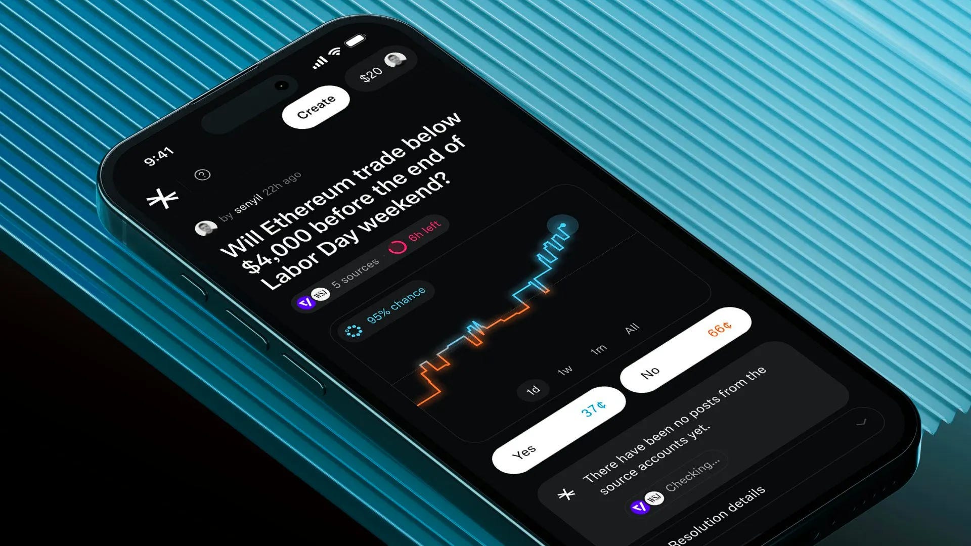
🥉 Third Place — Predictive crypto insights by Muharrem
Muharrem never disappoints. The sharp-cornered graph with glowy effects, the way colors shift as predictions dip between yes and no, and that perfectly balanced dark color scheme (not too stark, easy to read) all come together brilliantly. The lighter gray card backgrounds against the darker main background is a great touch that keeps everything scannable. Take note of the color scheme and layout in particular that makes everything so easy to scan at a glance. On another day this would be top one.
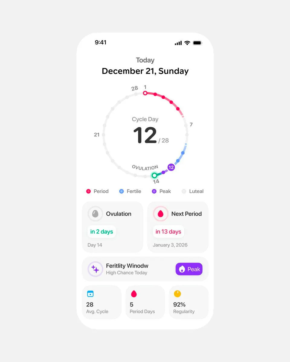
#4 — Cycle tracker dashboard by Studio Sphere
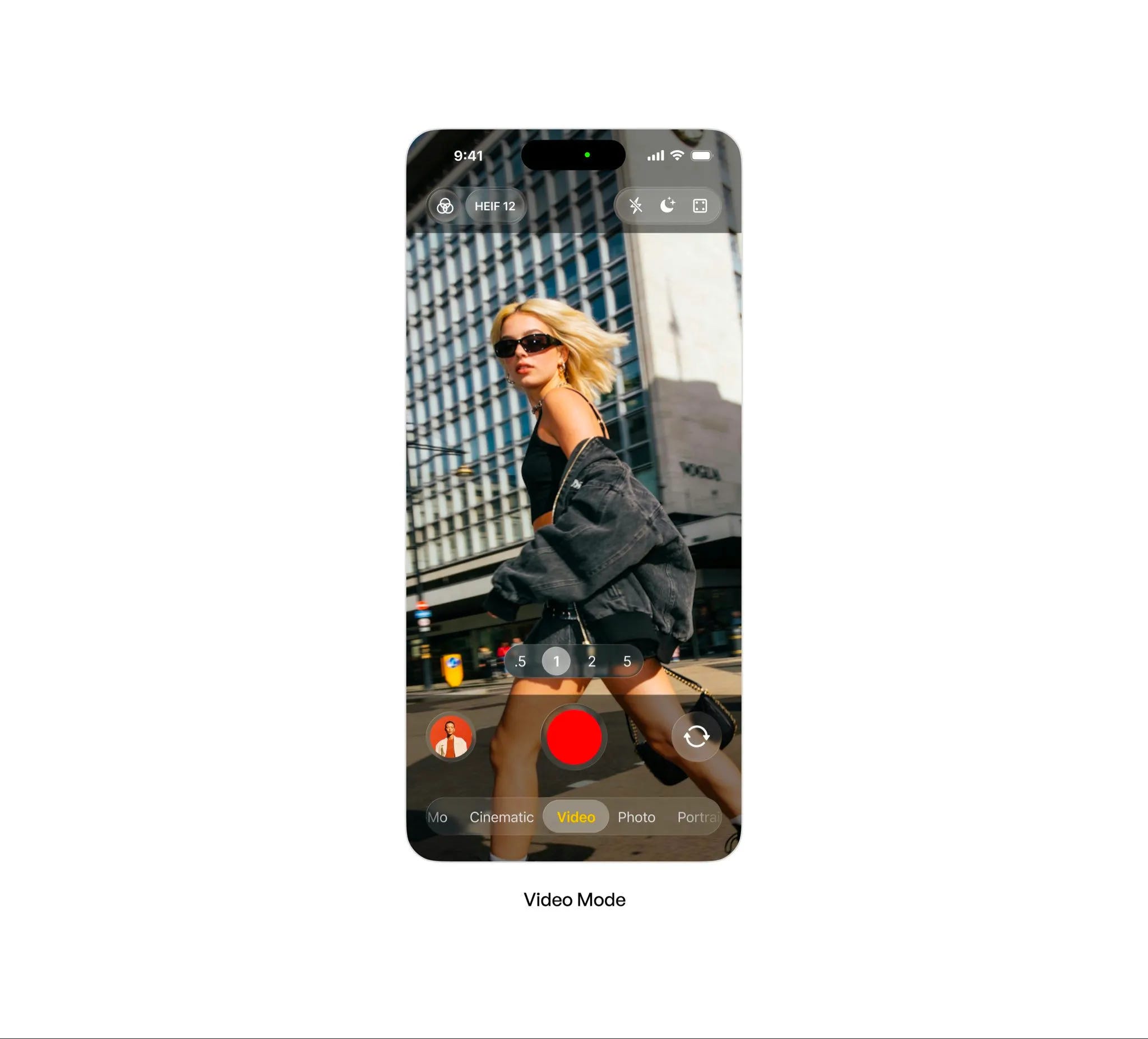
#5 — Dynamic video capture by Budhvin
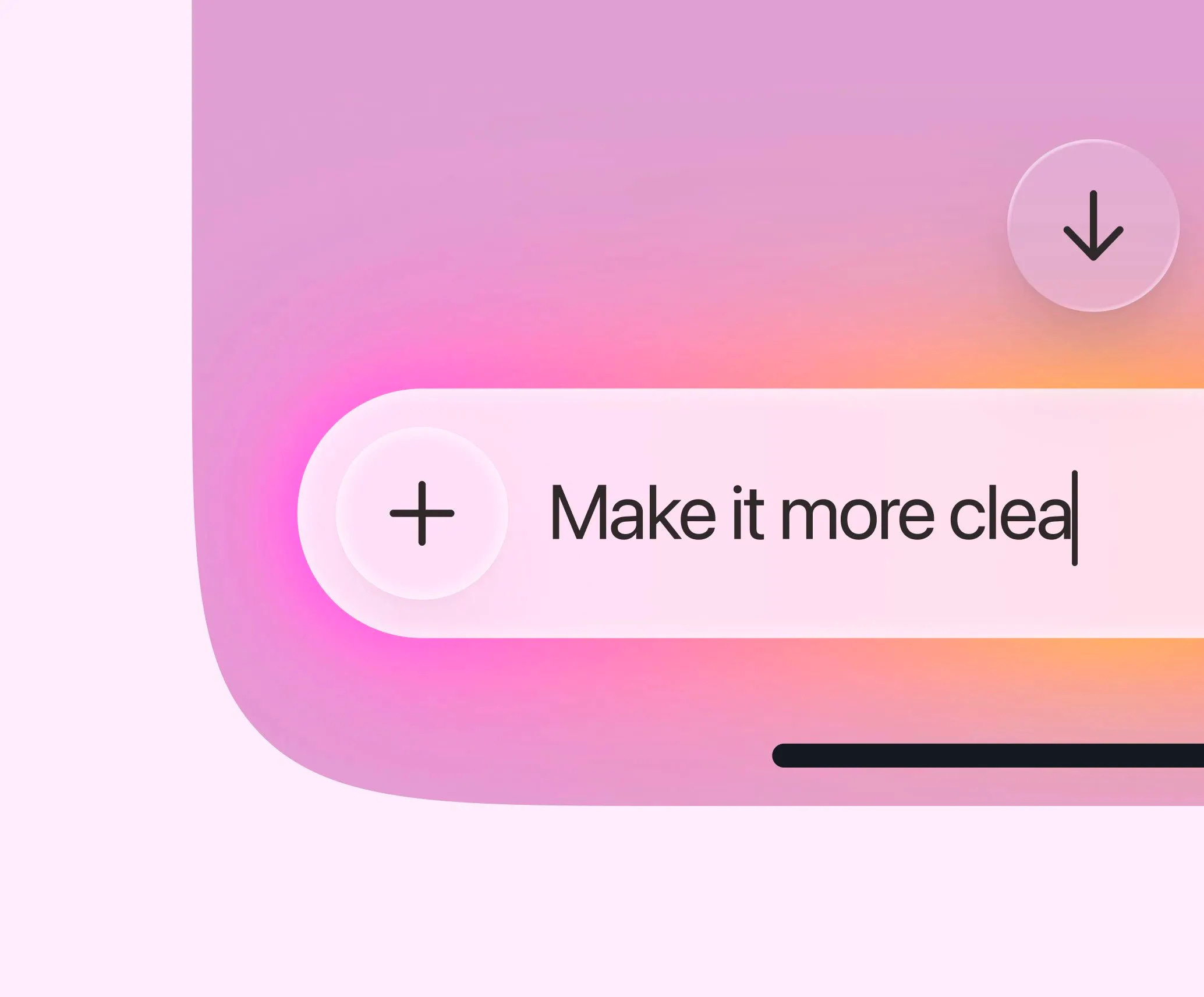
#6 — Gradient input box by Safayet Ahmed
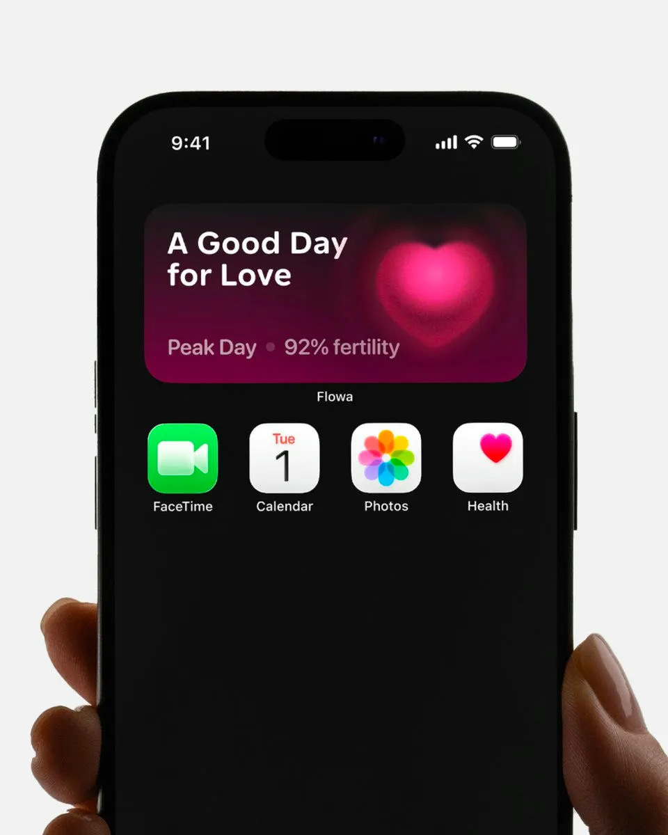
#7 — Fertility insight widget by Studio Sphere
That’s a wrap!
Congrats to Stats Studio, Paul Elite, and Studio Sphere on making the podium this week.
If you’re building mobile apps and any of this helped, share it with someone who ships. Follow the daily inspiration on X here, subscribe for the next drop, and tell me what you stole this week.
Want to be featured? Post great work and tag @handhelddesign, or submit directly here.
See you in the next issue.
New to the video format? Let me know if you prefer video, written, or both by hitting reply.
Want to be featured? Submit your work here: https://tally.so/r/npOKyJ
Handheld is curated by me, Cam, a Product Designer specializing in mobile design. Follow me if you love mobile design as much as I do.
WOW what a start to the year 🔥🔥🔥 I’m excited 🥳 great picks on the winners btw!